Studio Time

    • Fractals
    • Portfolio
    • Who am I?
    • Contact

  • Barbie in Bondage

    I managed to get myself involved in cleaning up an image drive that’s been the subject of far too many backups, image dumps and so on, for quite a few years now. The drive was useless because it had just become impossible to find anything on. It has a lot of stuff on it that really is usable, so… I bit the bullet and started searching out duplicates.

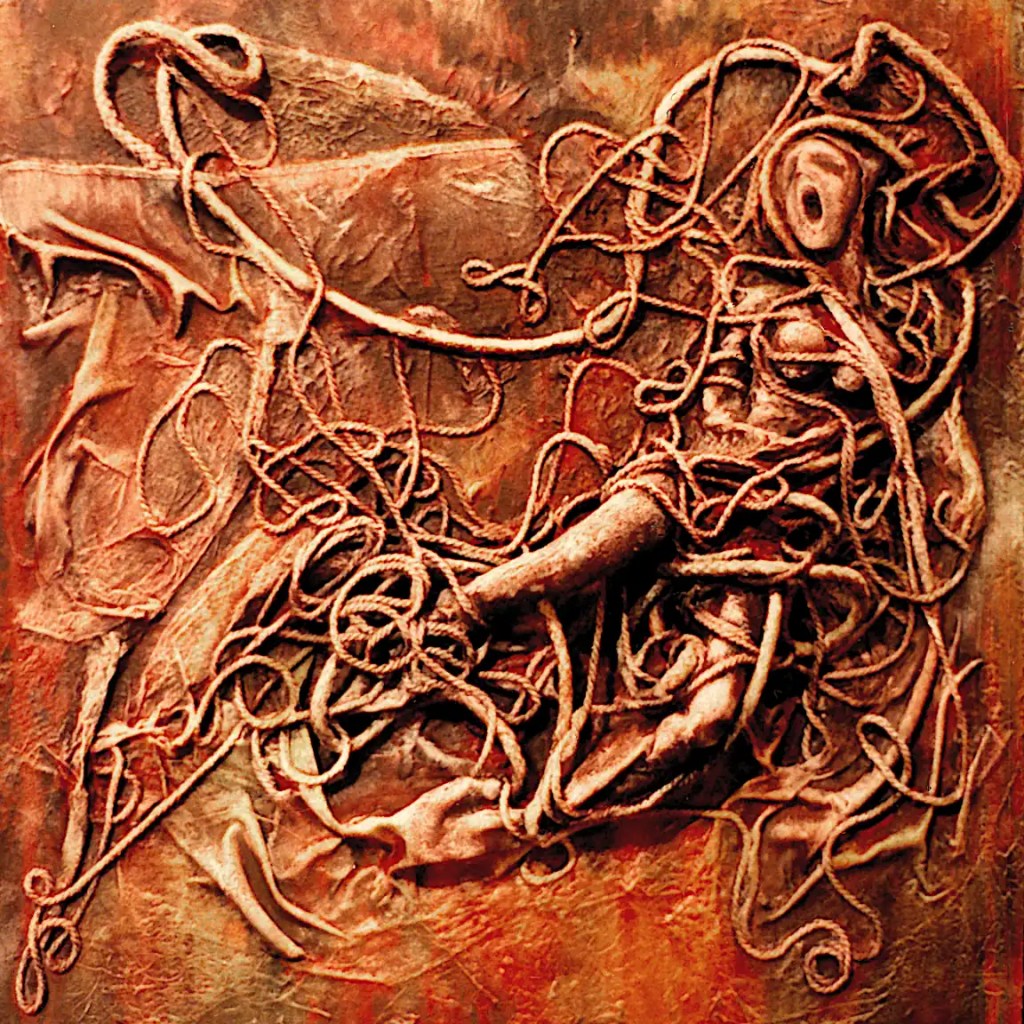
    While searching through stuff, I came across this absolutely horrible photo of a piece I did a while back. I no longer own the piece so I can’t improve on that.

    This was meant as a commentary on the doll (not Bellmer’s)… the sexist nature of it and so on. I’d originally intended to cut up a doll and tie it to the panel. That seemed a bit hokey and I’m not a big fan of violating copyright/trademark law, so I decided to build it from the ground up… maybe make a more general statement while I was at it

    I built the head from paper mache mixed with acrylic medium. The stuff is incredibly hard when it’s dried and as permanent as plastic. It’s not really workable once it’s dried. Even the most manly of power tools are going to be daunted by it. Much of the body is built the same way. There’s a few wooden balls and bits in there as well. That got covered with fabric and a few different sizes of cord that I’d soaked in medium. I painted over that with acrylic paint.

    A photo of this was used for the inside cover of Darkling Thrush’s “Myriad” CD. It’s a good album. You should give it a listen if you can find it.

    The painting’s 12 inches square… “acrylic on panel”.

    August 6, 2023
    Acrylic Painting, Collage

  • Pinup in the Surf

    This is one of several images that are based on the same reference image. It originally started as a 3D render of a model done in Daz 3d with a slightly altered version of one of their stock poses. The other images are done with a bit higher degree of, um… “realism”… fidelity to the source, whatever…

    If you’ve not used Daz 3D; It’s an extremely capable system for rendering 3d figures, scenes and so on. Probably one of the best methods of developing a reference images that exists. You can alter just about every aspect of your model; create expressions and poses, change the size of just about every body part, add your own textures and so on. The basic program and a few very nice starter models are free. You can buy things like accessories and a variety of figures; cartoon, realistic etc.

    It’s not Blender… You’re not going to be making full-length films in it. It is fairly easy to use and really extensive. It makes for a pretty perfect program for artists that are looking for reference material, that don’t want to shoot things themselves or limit themselves to what’s available in the public domain. You can do some very nice finished artwork in it as well.

    Anyway… 🙂 This only vaguely resembles the reference. I had a large print of one my renders tacked to the wall and decide to use it for proportions and so on.

    This is basically a figure on the beach with waves washing up around them. It’s something of a study in complimentary colors. It’s 18×24… oil on commercial canvas panel.

    August 5, 2023
    Automatism, Digital Emissions, Figure, Oil Painting

  • Greener Nudes

    This is just about working out some basic color relationships and developing the forms. I’m going fairly slow with the colors… scrubbing in layers of different colors rather than simply filling in the forms. That way, I get color relationships working in the forms themselves as well as more chances for what Bob Ross calls “happy accidents”. …Something that’s part and parcel of Surrealist technique as well as most abstract painting; exploring or experimenting with just about anything for that matter. …Of course, there’s always those “unhappy accidents” as well. Thankfully, you can “erase” with oils.

    I really feel the need to fill this with spheres. To add complexity for one thing… to play with pattern and color as well. And, because they’re fun. I think I’ll do that after breakfast.

    Colors: Sennelier’s Mars Yellow, Alizarin Crimson, Lemon Yellow and Titanium White, Winsor Newton’s Phthalocyanine Green and Rembrandt’s Cadmium Red Light.

    August 4, 2023
    Automatism, Green Nude, Oil Painting

  • Green Nude

    I decided that the Queen needed to dry for a day or two. I paint with a lot of glazes. “Dry to the touch” is generally good enough. Occasionally, something needs to get a little more solid.

    This has been hanging around waiting for me to finish it for a while now. (I may have mentioned somewhere that I usually work on 20-30 images at a time.) This first image is what it looked like prior to yesterday’s session. I probably could have just cleaned it up and called it finished. I rather like what’s going on in the image.

    I decided that it needed to be green and a bit more contrasty before I could truly love it. After the past few days with the Dark Queen, I’m liking the “psychedelic” idea as well. This seems like the sort of image that would support that and I think I can push it a little bit further.

    This second image is the painting after I outlined the forms in Winsor Newton’s phthalocyanine green and blended that back in to things. I rendered things a bit with Sennelier’s Naples yellow light and scrubbed in the purples with a mix of their dioxazine purple and titanium white.

    This is destined for the next group show at the Collective Gallery. I should probably pay it some attention.

    One of the benefits of having a digital copy is that I can quickly try out changes on the computer and get an idea of what things will look like if I make a specific change. I can always click undo or work on a copy or something. I have some ideas I want to try out. 🙂

    August 3, 2023
    Automatism, Green Nude, Oil Painting

  • Tammy’s Pearls Had Grown Tarnished

    Tammy is that woman that believes that money is the root of all happiness. You probably know her. She’s a combination of Norma Desmond and Donna Reed. She was probably happy once.

    Like most everything I do, this is primarily about color and form.. technique and experimentation; It started as a sort of vague portrait of Tammy… the figure’s probably obvious, the green form is a mirror and the pearls are just sort of suggested here and there. It was generated from an automatic drawing that I tweaked just a bit.

    Tammy’s preparing for a night on the town. This was meant to be a sort of comment on aging, misplaced priorities and so on… Nothing I do is really that specific though. I’d love to be able to express what Kathe Kollwitz could. It’s not really a priority though. 🙂

    I found Tammy, and the idea of a woman crying into her mirror as she prepares for one more pointless evening, to be far too depressing to actually paint. On the other hand, I couldn’t get her out of my head for the entire time I did work on this. The brightish colors are probably a sort of reaction to that… my escape.

    This is 18×24… oil on a commercial, canvas panel.

    August 2, 2023
    Automatism, Oil Painting

  • The Wings of the Dark Queen

    I figured that I may as well put in the red forms… I added the orange form on the right… That empty green space was just throwing things off and I want another largish orange form on that side. I’m thinking it will balance the striped objects, pull things forward a bit and set the queen herself back a little in space. I’m a little frustrated with that dark space on the lower right as well but I think that may work in the final image. I need to make it a little more interesting though.

    I scrubbed purple madder into the robe/hair form. The color there is actually pretty accurate (The greens in this image… not so much.) I scrubbed the left side back nearly to black. The texture there is the texture of the canvas. That entire form will have a narrow highlight across it and the color will change a bit. It’s actually somewhat close to what I was looking for. I blocked in the wing/arm forms with purple madder and titanium white as well. I’ve decided that purple madder is the true color of evil. Black doesn’t hold a candle to it. 🙂 (Caput mortuum, on the other hand…)

    The next real decision, for me, is what to do with those forms inside the robe. I can go with a bright blue that will add contrast and blend with the colors in that space or go with something jarring like an orange or yellow. Blue wouldn’t be my typical decision… I should probably go with that. I’m going to do the bones in the wings a bright yellow. It might make for an interesting interplay between the two colors.

    Most of these colors will get more intense. 🙂 I’ll eventually clean up her lipstick.

    Colors: Winsor Newton’s cadmium red deep, purple madder and cadmium yellow deep, Sennelier’s alizarin crimson and titanium white and Rembrandt’s Chinese vermilion and cadmium red light.

    August 1, 2023
    Acrylic Painting, Digital Emissions, Oil Painting, The Dark Queen

  • An Oilier Queen

    I decided that I like the psychedelic feel to this. So… I set up a Santana/Doors/Hendrix/Big Brother/Airplane and, of course, Ultimate Spinach playlist and broke out the phthalos. I can’t think of any colors that are more suited to psychedelics.

    I decided that I needed a few more striped objects to balance things out, repainted all of the greens with a combination of phthalocyanine green and lemon yellow, glazed over the black form with phthalocyanine blue and scrubbed phthalocyanine blue into the shadows here and there; again, for balance. I started on the yellowish form and tried to balance that as well.

    The colors are actually a lot more intense in the painting. Seeing that I’m still shooting in near dark to counter the glare… the photo doesn’t show them all that well and turning up the saturation just makes things noisy.

    Colors: Sennelier’s burnt sienna, titanium white and lemon yellow, Winsor Newton’s phthalocyanine green and Rembrandt’s phthalocyanine blue.

    July 31, 2023
    Acrylic Painting, Digital Emissions, Oil Painting, The Dark Queen

  • An Oily Dark Queen

    This has gone a little slower than I expected. The simple stuff, that I’d normally paint in without thinking about it, has decided to be difficult. I didn’t think it showed enough progress yesterday to warrant a post.

    Black is a color that I typically use for outlines and details. It struck me as necessary in order to convey a “Dark Queen”. It may have been a bad decision. 🙂 It will get glazed over anyway. I think I’ve got things figured out now. At least, I’m pretty sure I know the way they’re going to go.

    Colors are: Sennelier’s caput mortuum, carbon black, cobalt blue, burnt sienna, raw sienna and titanium white… Winsor Newton’s purple madder and Rembrandt’s gold ochre.

    July 30, 2023
    Acrylic Painting, Digital Emissions, Oil Painting, The Dark Queen

  • Untitled

    This is a photograph sent to me by this painting’s current owner. I believe she shot it with her cell phone. It is considerably better quality than the images I shot with 35mm film way back when.

    The painting is 60×48 inches… Oil on linen. It’s the result of 3 weeks of long days; back when I still had the energy (and economy (or lack thereof)) to work 20 hours and sleep 4 every day. There was no sketch for this… I went straight to paint with it. It’s painted entirely with a one inch bristle brush, that I bought for fifty cents, at the little hardware store down the street. ( 🙂 It was a phase.)

    This may have actually had a title at some point. If it did, it’s long forgotten.

    July 29, 2023
    Automatism, Oil Painting

  • The Dark Queen’s Underpainting

    This is all worked in with acrylic paint. I’m working out some of the details. Seeing that the sketch was fairly well finalized when I transferred it… I don’t really need to do a lot of that.

    Colors used are: Winsor Newton’s cobalt green, hooker’s green, permanent alizarin crimson and cadmium orange… Golden’s cobalt teal, Sennelier’s cobalt blue and Golden’s Open Acrylic dioxazine purple and C.P. cadmium red light.

    Golden’s open acrylics are formulated so as to emulate oil paints. They are convenient and they do “emulate” pretty well. They don’t quite get it, but they are much nicer than traditional acrylics; they keep longer and work easier.

    I am phasing out acrylics aside from a set of basic colors. I don’t actually use them for anything other than underpaintings or “utility” paints. It doesn’t make sense to pay for an additional tube of expensive colors like cobalts or cadmiums. This is something of an attempt to use up some half empty tubes. I’m a little short on earth tones, so I’m skipping a few of the elements in the underpainting. I’ll just go straight to oil. I’ll probably just buy basic sets of Utrecht, Sennelier Abstracts or Blick brand acrylics in the future.

    July 28, 2023
    Acrylic Painting, Digital Emissions, Oil Painting, The Dark Queen

Previous Page Next Page

Copyright © 2023-25. Richard Taylor. All rights reserved.

Website Built with WordPress.com.

  • Subscribe Subscribed
    • Studio Time
    • Already have a WordPress.com account? Log in now.
    • Studio Time
    • Subscribe Subscribed
    • Sign up
    • Log in
    • Report this content
    • View site in Reader
    • Manage subscriptions
    • Collapse this bar