Studio Time

    • Fractals
    • Portfolio
    • Who am I?
    • Contact

  • Back in Gear

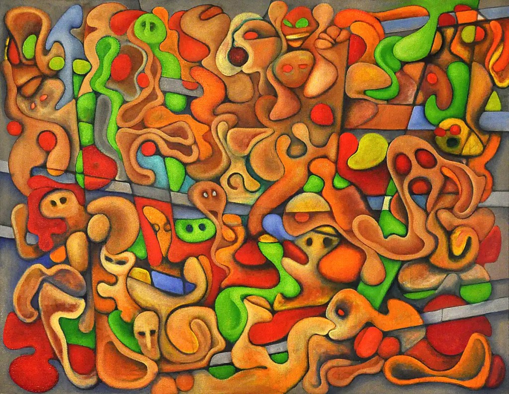
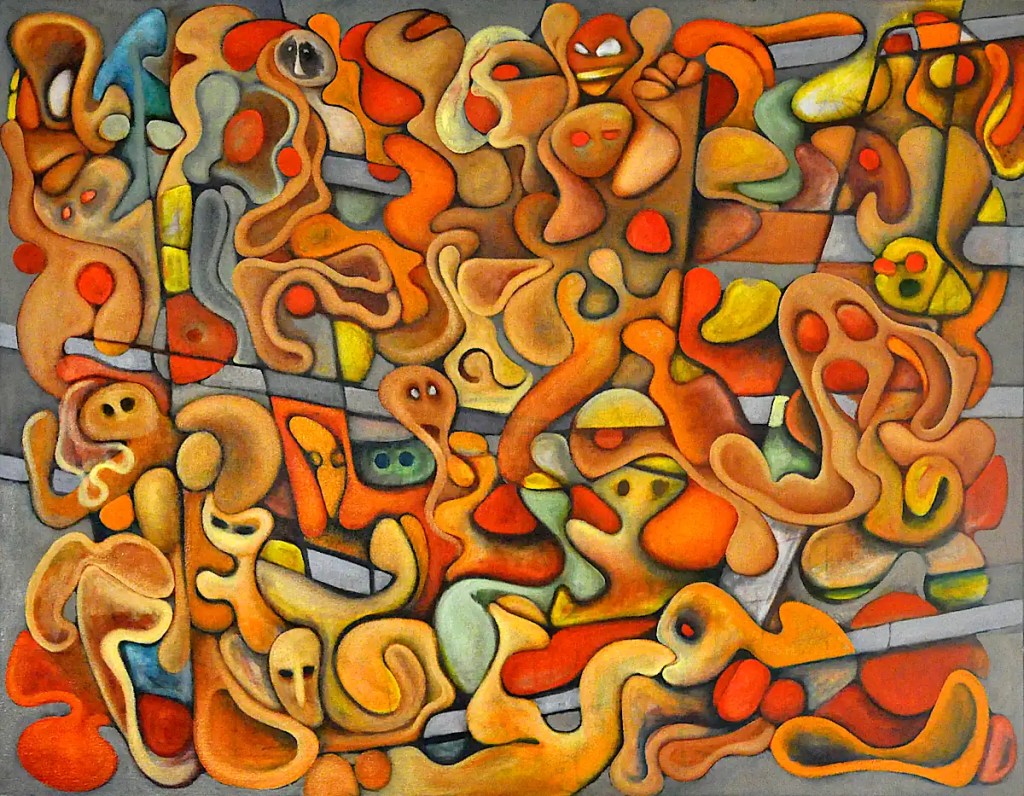
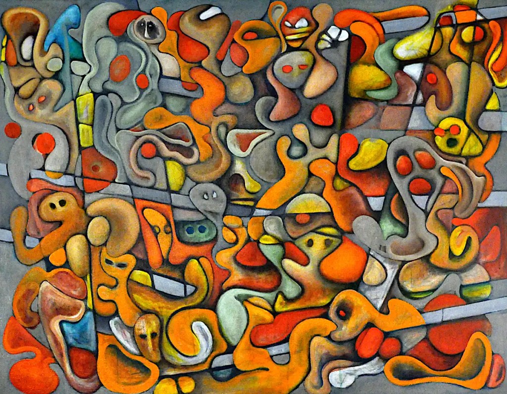
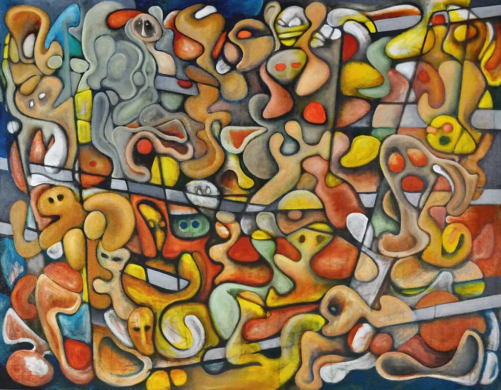
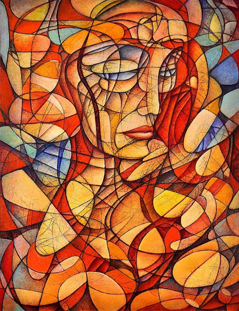
    I managed to get back to this yesterday. Again, I’ll apologize for the image quality. I’m going to have to see if I can find some retouch varnish without an outrageous gloss to it or maybe, just wait until this is dry to get a decent photo of it. (Maybe, I should bite the bullet and upgrade my 35 year old lights and order some polarizing filters for them to replace the ones that I’ve not seen since I last moved. 🙂 It’s not really been much of an issue but I rarely shoot stuff that’s this wet.)

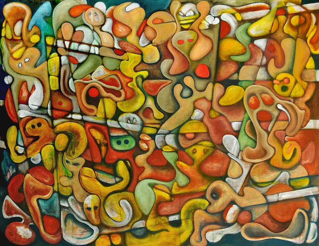
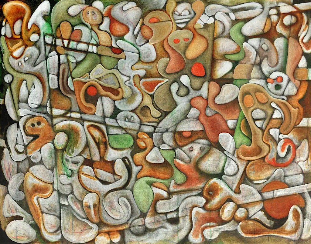
    Anyway, I went over the edges of most everything and added some shadows with Winsor Newton’s brown madder. Brown madder is a beautiful, transparent brown color that’s great for shading things. It’s a fairly intense dark that easily blends to a transparent brown. It’s similar to burnt sienna though it’s not quite as red. I fell in love with the watercolor version… a color that can do amazing things in an airbrush. The color is a little different but it’s nicely useful in both mediums.

    I brushed into that with Winsor Newton’s cadmium yellow deep and highlighted that with Rembrandt’s brilliant yellow light. I think they’ve discontinued brilliant yellow, renamed it or whatever. It’s not a color I use all that often and frankly, I’m trying to finish off the tube. It seems a little “under-powered”. 🙂 This phase of a painting always seems like a good place to do that.

    It’s occurred to me that there are no cars on this street. 🙂 I suppose that means I’ll have to do another one… a series.

    June 23, 2023
    Automatism, Oil Painting, On the Street

  • The City of the Future

    I didn’t get a chance to work on “On the Street” yesterday. Things were a little busy. I did get a bit of work done on this painting.

    This is an attempt to push the automatic drawing idea, that I typically use, a bit sideways. Normally, what I call a scribble works as a sort of grid or pattern that fills the page and that I try to fill up with something meaningful. It works pretty well. It sets up a fairly tight composition from the get-go and establishes a framework that’s woven into itself very closely.

    One of the problems with using that sort of framework is that it’s fairly inescapable. Once you’re past a point that comes pretty early in the process… you really can’t make many changes or break out of the “grid” without throwing the entire thing out of whack. I do escape that to some extent when I translate the entire thing into forms like those in “On the Street“. That can be a little restrictive as well.

    The idea, with this sort of image is to break away from the grid and define it as an object; something like Tanguy‘s done in some of his more complex paintings. I’ve done something similar by introducing negative space into the grid or, sometimes… not even using the grid at all. 🙂 I’m talking paintings that use a grid though.

    This painting is fairly basic and actually required a bit of restraint on my part. I have a few of these going; figures, faces and so on. The intent with them is to treat the entire (grid) thing as a sort of standing form made up of many simpler forms. Basically, a blob of “stuff”. This particular piece reminds me of a sort of science fiction city or spaceport. I’m going to go with that. It also feels a bit like early Modernist abstraction, like Kandinsky‘s constructions or something by Leger, to me. I’m going to push that as well. I’m a little obsessed with that period of art anyway.

    You might be asking yourself: “Why do this?”. “Why should I care?”, might occur to you as well. In response to the latter… Seriously… I don’t know. I’ll just assume that if you’ve actually read this far you have some interest in art. In response to the former… Frankly, it’s about breaking out of something of a rut I seem to have driven myself into and, as with pretty much everything… it’s a matter of exploration, experimentation and so on.

    Things started with a scribble in water soluble graphite. I blocked in a few things with colored pencil then decided that was simply wasting my time. The drawing’s sealed with a couple of coats of UV resistant clear acrylic. I went straight to oils after that: cadmium red deep, chrome green, Naples yellow light and Payne’s grey mixed with a bit of titanium white. The “background” is raw umber mixed with titanium white. The paper is Canson’s linen texture oil paper.

    June 22, 2023
    Automatism, Oil Painting, The City of the Future

  • A Bit Further Down the Street

    Yesterday was a matter of filling in the blanks, adding some color, rebuilding and modeling the forms and so on.

    Colors are Winsor Newton’s viridian blended with Rembrandt’s cadmium yellow, The blues are Winsor Newton’s French ultramarine with varying percentages of titanium white. The shadows are just ultramarine scrubbed over the greys as well as in to a few other places. I’ll be blending more greys back into that, as well as shadowing with a bit of violet. I want to see what sort of paint effects I can come up with on the “wall” areas.

    The reds are, um… “reinforced” with Winsor Newton’s cadmium red deep blended to Rembrandt’s cadmium red light.

    Frankly, I’m thinking the greens are a bit harsh and the whole thing sort of reminds me of Christmas. I’ll be toning things down and adding some paint effects throughout. I’m thinking along the lines of a summer scene… moderately bright, saturated colors… clear, sunny skies, all that.

    June 21, 2023
    Acrylic Painting, Automatism, Oil Painting, On the Street

  • Walking Down the Street

    I actually managed a fairly decent amount of time with this yesterday. Most of that time was spent shaping things with burnt sienna and a mix of raw sienna and titanium white. I followed that with Tuscan earth midtones and some Naples yellow highlights… changed the hair on the mother from the “mother and child” grouping and reworked her legs a little bit. The guy at the top center is supposed to be eating an orange. Eventually, the orange will be orange and the mouth should be a little more “mouth-like”.

    There are a few small changes yet to be made. Today, I’ll break out the greens and blues and try to get a little interplay going between the colors… maybe put in a few shadows. There’s not a lot to say about it that isn’t better said by the image.

    June 20, 2023
    Acrylic Painting, Automatism, Oil Painting, On the Street

  • On the Road

    Yesterday’s was a short session due to Father’s Day festivities. I did manage to pretty much resolve the structure of this thing. Aside from a few small changes, it’s basically ready to paint. 🙂 …Shadowing, rendering, color and so on. This is the pleasant part where I can just basically get lost in things, listen to Americana or Jazz and fiddle with colors and forms.

    Colors in yesterday’s session are: Sennelier’s raw umber, carbon black and titanium white for the greys and Naples yellow for some of the modeling. The oranges are Winsor Newton’s cadmium scarlet and Rembrandt’s cadmium orange.

    Oh, I still had the lights and camera set up from yesterday. A couple of shots and a few twists on the polarizing filter were enough to get this image. It’s still sort of weird shooting in near dark.

    June 19, 2023
    Acrylic Painting, Automatism, Oil Painting, On the Street

  • The Street Revisited

    This is the point at which things get a little frustrating. I made some changes to the overall structure of things yesterday. There will probably be a bit more of that. If this were any other time, or any other painting I’d probably just lose the linear stuff and just go with organic forms. That doesn’t really work with the way this was conceptualized though.

    I think I’ve come to terms with the architectural stuff. I’m going to simplify a few areas, add some shadowing and go for a sort of trompe l’oeil look…. Sort of dangle things in front of a grey, concrete wall. In addition to the structural lines, it should give me what I’m looking for.

    It’s probably a little unprofessional of me to apologize for the image quality… so, I’m going to do it anyway. This is image number 53. It’s taken with the lights reflecting off of the opposite wall, the window shades drawn and the polarizing filter on the camera cranked up all the way. It’s wet… It’s really difficult to make the glare go away and I need coffee yet. 🙂

    Colors are Sennelier’s Tuscan earth, titanium white and Naples yellow. Naples yellow, and specifically Sennelier’s product, may just be the most essential color in my paint box. I typically use it instead of white. It’s wonderfully dense and opaque and makes rendering and highlighting much, much easier.

    I used Grumbacher’s Mars black for the greys and the outlining. I usually use lampblack or carbon black but, I have a few old tube “ends” that I need to clear out of the paint box.

    June 18, 2023
    Acrylic Painting, Automatism, Oil Painting, On the Street

  • Back to the Street

    I spent the last week or so dragging a large Vizsla (mix) and a larger American pit bull (mix) up and down the rivers of the Ozarks in a canoe. It was pleasant if exhausting. The Ozarks are a beautiful area. I did not get any painting done.

    This fourth session… done since I’ve been back, looks like the above picture. I know it’s not really all that pretty… hopefully, that will get resolved. I’m still working out colors and forms and trying to define this as the “city”. I think I’ve got some of the hustle and bustle and the general feeling of a crowded city street down, as well as some distinct characters to define a bit more fully: the Corinthian, Hippie octopus, Lovers, Mother and Child, The Boxer, Rioters, the Toe sucker, etc. The structure of the buildings is going to require a bit more work.

    Colors this time include:

    Sennelier’s Rive Gauche copper for its metallic properties and color. By themselves, metallic colors can look a little hokey. Under a few glazes, in abstract passages or as highlights on forms they can be really useful. Rive Gauche is Sennelier’s fast drying line of oils. That can be really useful as well.

    Winsor Newton’s Terra Rosa and cobalt turquoise. Terra Rosa is an essential part of my palette… cobalt turquoise was something I picked up on a whim. It is sort of interesting but it’s definitely a color that spends more time on the shelf than it does on the palette. One tube has lasted me 30 or so years.

    Sennelier’s Modigliani ochre, Hooker’s green and Indian yellow. Indian yellow, being extremely transparent, can sort of instantly and easily colorize any form. Modigliani ochre is a nice base for fleshtones and it recalls its namesake. I see it as sort of essential.

    The medium is linseed oil and cobalt drier again.

    June 17, 2023
    Acrylic Painting, Automatism, Oil Painting, On the Street

  • Still on the Street

    This is session 3 of painting. Last night, I worked at the forms a little more with titanium white and hookers green acrylic. Today, I started with oils: Sennelier’s warm grey, sap green, sepia, burnt sienna and some stuff that was left over on the palette. I’m a little frustrated with it yet. I’ve lost some of the chaotic feel that I liked about the drawing and it’s a lot more cheery than I was going for. 🙂 I suppose that needs to be fixed in the next version.

    The medium here is straight linseed oil with some cobalt drier. I left the acrylic stuff unsanded. I like the texture. Linseed oil flows a lot easier than mediums like liquin and so on that sort of surface. 🙂 It does not make for easily photographed oil paintings.

    June 11, 2023
    Acrylic Painting, Automatism, Oil Painting, On the Street

  • On the Street Again

    I decided I needed to work a bit larger for a while and this thing has been hanging around for way too long, so… I spent some time on it a couple of days ago. This is what things look like after the first session. I shaded things in with Sennelier’s (green) sepia, then went back and scrubbed in the highlights with titanium white and topped it all of with a sap green glaze here and there. It’s acrylic on very wet raw canvas. I spent as much time with a spray bottle as I did a brush. Keeping things wet blurs the paint into the canvas and makes for some really dense colors. It’s a little easier to see where this is going than in the sketch.

    This spent the day yesterday getting sealed with a couple of coats of clear acrylic medium and drying while I worked on other stuff. Today, I’ll start figuring out the color a little better. 🙂 I can see a few changes that need to be made as well.

    June 10, 2023
    Acrylic Painting, Automatism, Oil Painting, On the Street

  • Monika’s New Red Dress

    This is the final version of Monika’s New Red Dress. I figured it was probably time to put up a piece I’ve stopped working on.

    One of the most difficult things about this sort of painting is knowing when to stop. That’s probably true of any painting though. I think I got this one to just about the right place. I do tend to overwork stuff. I think that’s part and parcel of the sort of imagery I work with. In the past, I’ve been able to do “simple”. That really just doesn’t work for me these days. I’m sure that will change.

    To quote Arshile Gorky: “When something is finished, that means it’s dead, doesn’t it? I believe in everlastingness. I never finish a painting – I just stop working on it for a while.”

    I know it took Gorky quite some time to “finish” “The Artist and His Mother“…Da Vinci carted the “Mona Lisa” around with him for a good bit of his life. I have some paintings and sketches I’ve worked at since the mid-eighties… nineties… this century, etc… I suppose that technically a painting’s “finished” when the artist defines it that way. I like the idea that things can be revisited and reworked, Um.. “everlastingly”. Modern technology does a lot to enable that. I have quite a few digitally saved sketches that show quite a bit of promise; even some stuff shot on film. Whenever I’ve made the attempt to push the ideas further… I either failed technically or just didn’t quite understand how to push past a certain point. I have several paintings that I basically stare at once in a while. I just don’t get how to resolve certain issues. That will come.

    This sketch has been filled in with some Chinese orange and Indian yellow glazes. That’s been painted over with various cadmium colors, some cobalt blue, Naples yellow and so on.

    June 9, 2023
    Acrylic Painting, Automatism, Digital Emissions, Monikas New Red Dress, Oil Painting, Portrait

Previous Page Next Page

Copyright © 2023-25. Richard Taylor. All rights reserved.

Website Built with WordPress.com.

  • Subscribe Subscribed
    • Studio Time
    • Already have a WordPress.com account? Log in now.
    • Studio Time
    • Subscribe Subscribed
    • Sign up
    • Log in
    • Report this content
    • View site in Reader
    • Manage subscriptions
    • Collapse this bar