This is 18×24… oil on canvas panel. It’s just straight, out of my head, with no references; one of those rare paintings that just worked out of the gate. I blocked it in with acrylic paint. It took, maybe, four brushstrokes to resolve the face… the rest went pretty easily. It took a bit longer to add the details and so on.
This is old… like really old… late “eighties” old.
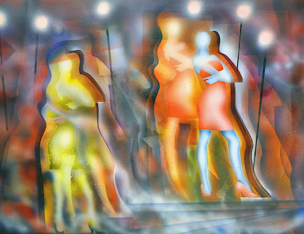
I used to be obsessed with the airbrush. (I no longer have a Badger 100 (sg)… That is what this was done with though. These days I have an Iwata Eclipse (gravity feed) and a special edition Paasche VSR90 (which they no longer make) which still works very nicely 35 years later.)
It was one of the most productive periods of my life. You can turn out images in just a few minutes with one. The prep may take some time. Cutting stencils out of acetate can be really time consuming. Once you have the stencils cut… it’s fairly simple to build images with them though. Once you have a library of stencils, things go pretty fast. Even without stencils you can do some incredible things pretty easily.
This was a simple line drawing that I traced on to acetate and cut out with a number 11 X-acto blade. One stencil for the shoulders, arms and neck, one for the legs, the dress and the shoes. The straight lines that build the staircase are just the edge of the acetate sheet. The lights at the top are simply dots sprayed with opaque white ink. I just moved the stencils around and sprayed until I’d built up the image. Some of the splatters are intentional… some not. I like the way they accent the image, add random elements and make things a bit less sterile than airbrush can be capable of.
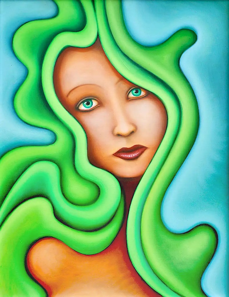
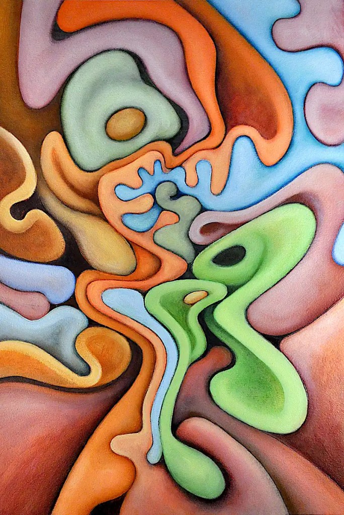
This painting is about as close as I get to fantasy art these days. It asks the age old question; “Whatever happened to that kid? Did he freeze to death? Did he get his rabbit skin? Did Dad ever come home from his hunting trip?”
This started out with an automatic drawing. Strangely, the nursery rhyme kept occurring to me as I drew things out. I began to see elements in the painting that reminded me of elements in the poem… the wild hunt for the rabbit skin and so on. I started pushing things in that direction. Aside from the baby and, maybe, the hunter up in the corner, the color is probably the most influenced.
It’s altogether possible that you may not actually see Baby Bunting, the child’s father or anything to do with the poem in this. I suppose we could call it “playful, cartoony, greenish painting” or something then.
This is 22×30 inches… oil on canvas that’s been adhered to a hardboard panel.
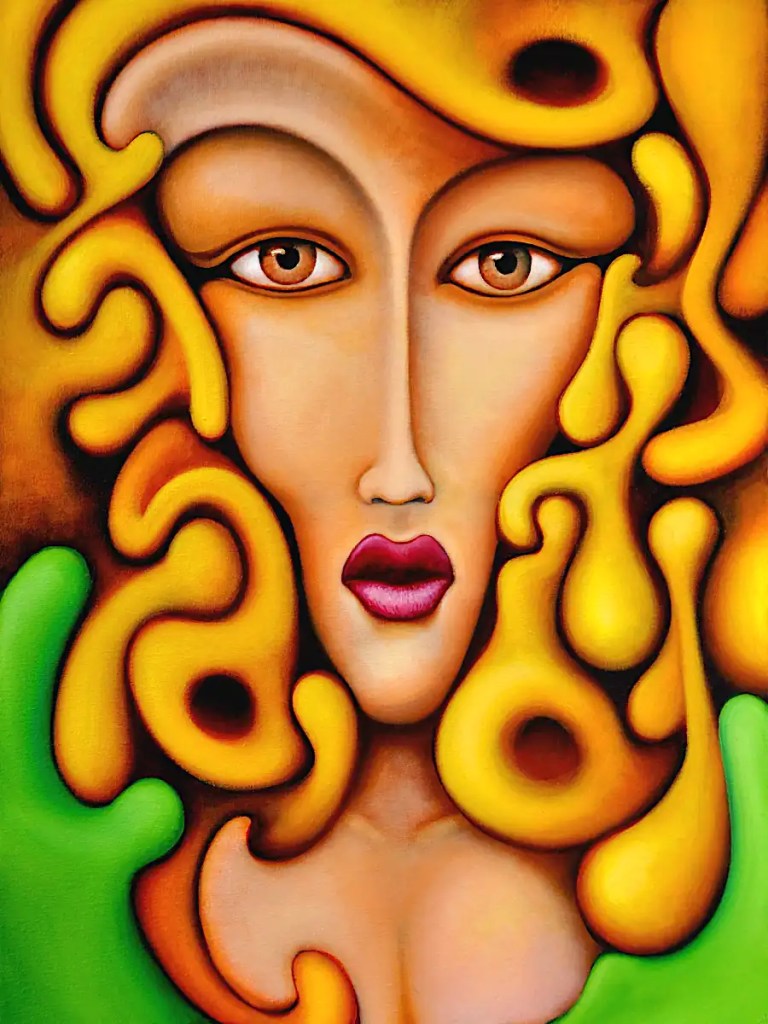
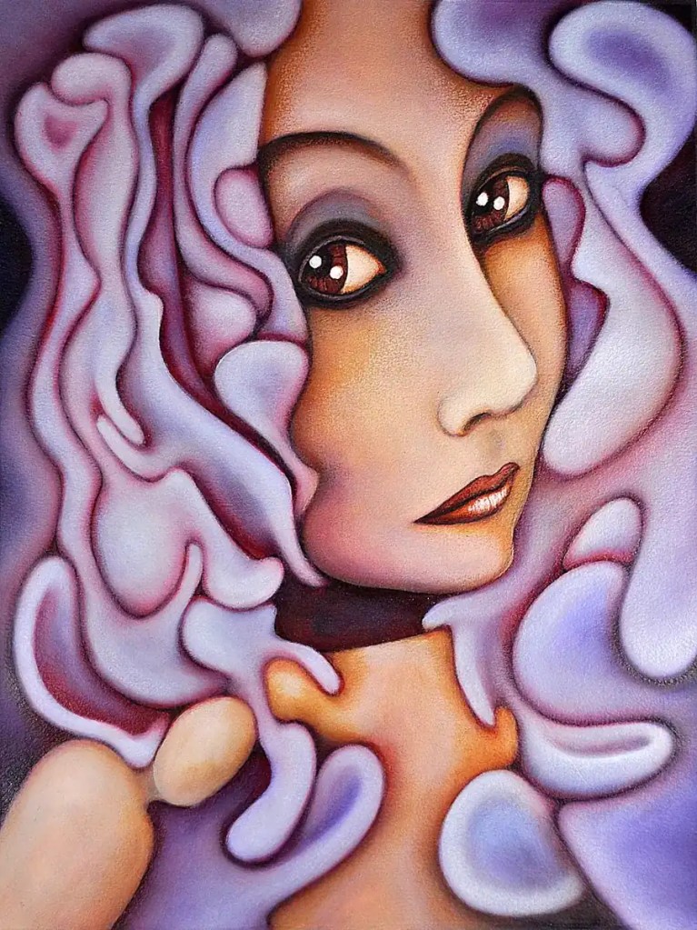
This painting is the second in a fairly long running series of “glamour” portraits. There’s nothing digital about this one. I just drew an inverted triangle for the head, blocked in the rest of it then did an automatic drawing on top of it. I’ve done these sorts of things for as long as I can remember. They go fairly easily and give me a break from the more complex stuff.
I love mid-twentieth century glamour photography: George Hurrell and Milton Greene and so on… pictures Of Dietrich, Garbo, Gene Tierney, Hedy Lamarr, Lauren Bacall, etc… Those pictures offer a sort of break from the glut of images on the internet today. Not that today’s photography is bad… some of it’s amazing. There’s so much of it that it loses a lot of its impact. There’s a sort of magic to those old film photos, anyway… the greyscales, the lighting, the clarity… the subjects…
(I just realized… I sound a bit like Norma Desmond. 🙂 )
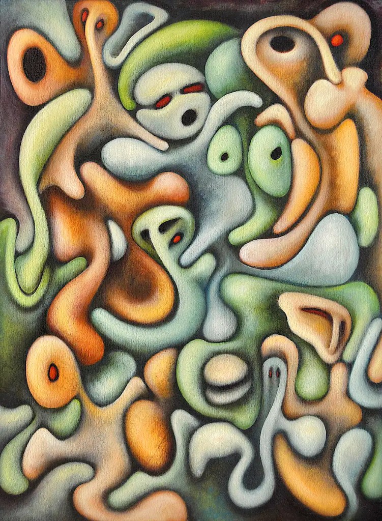
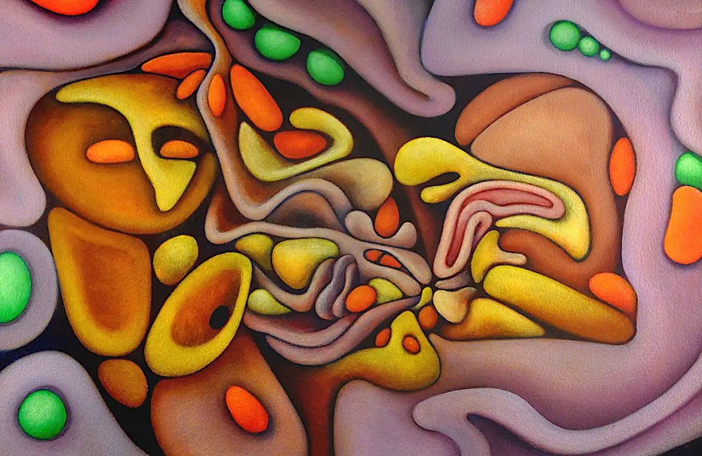
When I originally got in to making artwork… Well, high school, anyway… I wanted to be an underground cartoonist like Robert Crumb or Vaughn Bodē. (I might have been inspired a bit by artists like Roger Dean, Frank Frazetta and Gage Taylor as well. 🙂 ) It was the early seventies… a reflection of the times. I still love those guys work though.
I did page after page of cartoons on typing paper and eventually had a fairly huge stack of them. College… introduced me to folk like Paul Wunderlich, Hans Bellmer, the Surrealists and so on. I lost much of my interest in cartooning in pursuit of other styles and forms. My stack of cartoons got lost or destroyed along the way but that influence still shows up in my artwork these days. This painting is a pretty good example.
This is oil on canvas that’s adhered to a hardboard panel. It’s generated with an automatic drawing that I’ve run a few straight lines through. Colors are typical for me… cadmiums, cobalts (gotta’ love poisonous stuff, no?), Naples yellow and so on.
This is another image that’s been digitally altered in gimp. The original was a figurative piece that I sold a while back. The subject; babies with dogs… is something I’ve dealt with for a long time now. The medium is oil on Arches oil paper.
I really have no idea what colors I used in this. White is a pigment I refused to use for many years. At least, unless it was truly necessary. It tends to suck the life out of colors. This is an attempt to come to terms with it.
This image began life as a photograph of Mera; another extremely pretty woman I met in the Chicagogoth scene back in the ’90s. She was wearing a velvet (I think) collar during the shoot. The title of the painting refers more to the idea that I removed it than any actual collar.
This is the “finished” piece. There’s actually 2 sessions here… an hour or so with Sennelier’sNaples yellow and titanium white as well as Rembrandt’s cadmium yellow light to add some definition to the forms and a bit of Sennelier’s alizarin crimson and and cobalt blue to clean up the edges. The final session was 10 minutes or so to add a few highlights with Naples yellow, clean up a few edges I’d missed and so on.
This got framed and carted off to the gallery downtown on Saturday afternoon.
This was a fairly long session. I modeled the “seeds” with Rembrandt green (Which I don’t see in their listings. I’ll assume it’s been discontinued. Basically, it’s a proprietary name for phthalocyanine green.) and cadmium yellow light and basically finalized most of the forms with the colors that were left on the palette. 🙂 One of the best things about oils is that your paint can stay usable for days.
I painted in the background and a few of the outlines with Sennelier’scobalt blue and added a few shadows here and there with it. I blended some of Winsor Newton’s cobalt violet into the purple forms to give things a bit more saturation and define them a little more.
Cobalt blue over dark passages gives you a bizarre sort of dusty blue and a glow that can probably best be defined as “mysterious”. 🙂 It also make things look like there is a glare over them.