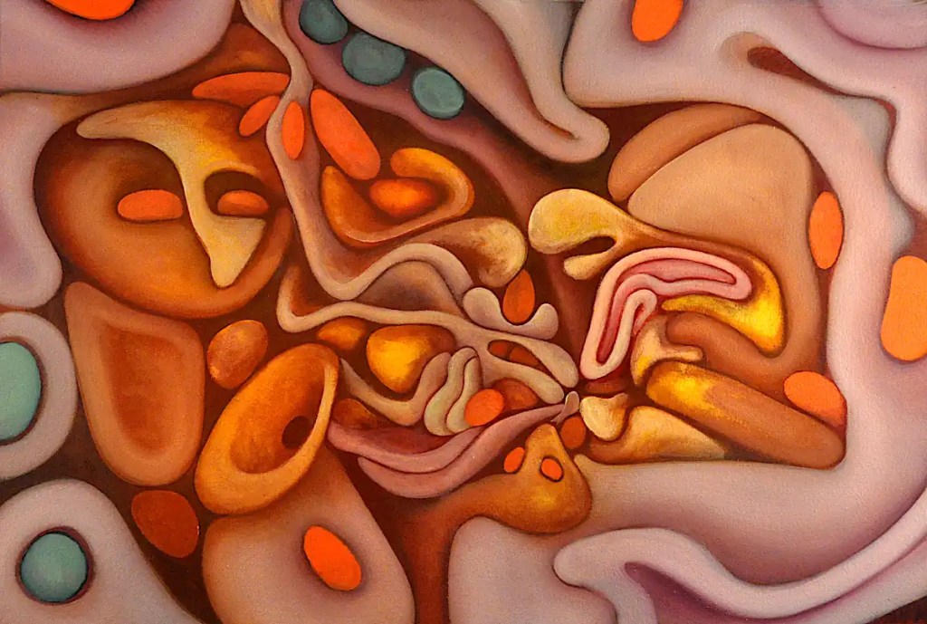
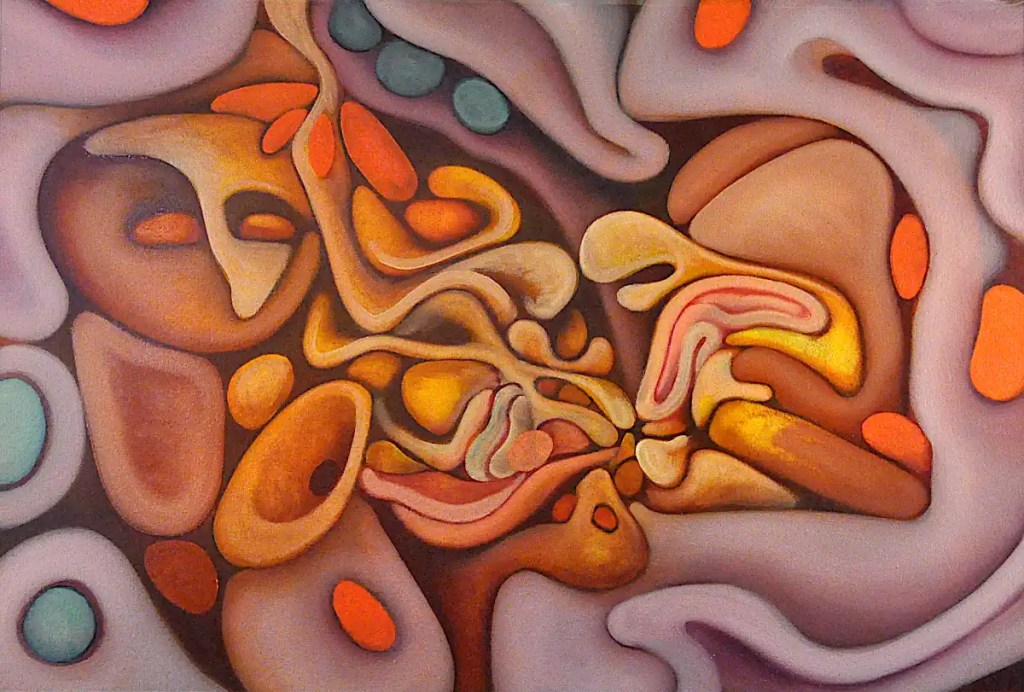
This is the “finished” piece. There’s actually 2 sessions here… an hour or so with Sennelier’sNaples yellow and titanium white as well as Rembrandt’s cadmium yellow light to add some definition to the forms and a bit of Sennelier’s alizarin crimson and and cobalt blue to clean up the edges. The final session was 10 minutes or so to add a few highlights with Naples yellow, clean up a few edges I’d missed and so on.
This got framed and carted off to the gallery downtown on Saturday afternoon.
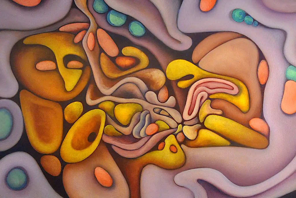
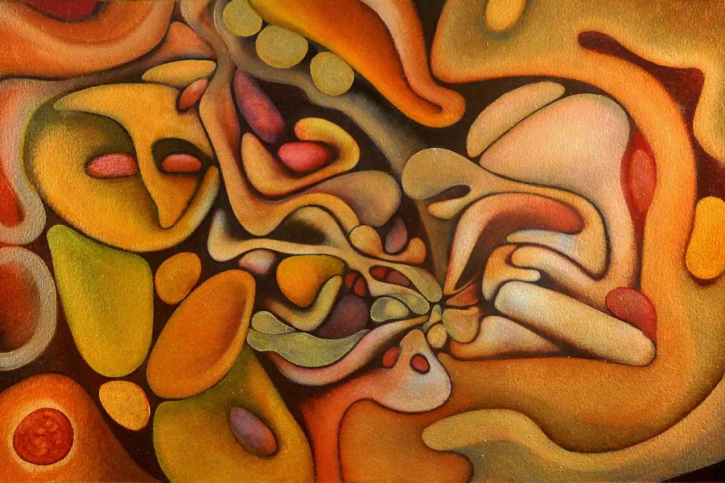
This was a fairly long session. I modeled the “seeds” with Rembrandt green (Which I don’t see in their listings. I’ll assume it’s been discontinued. Basically, it’s a proprietary name for phthalocyanine green.) and cadmium yellow light and basically finalized most of the forms with the colors that were left on the palette. 🙂 One of the best things about oils is that your paint can stay usable for days.
I painted in the background and a few of the outlines with Sennelier’scobalt blue and added a few shadows here and there with it. I blended some of Winsor Newton’s cobalt violet into the purple forms to give things a bit more saturation and define them a little more.
Cobalt blue over dark passages gives you a bizarre sort of dusty blue and a glow that can probably best be defined as “mysterious”. 🙂 It also make things look like there is a glare over them.
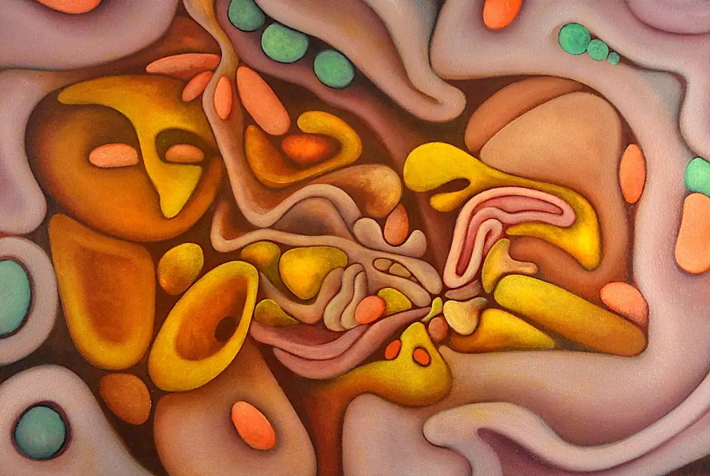
Still clarifying things… In keeping with the “yellow to violet blend” idea, I covered a few things with Sennelier’sIndian yellow orange and worked into that with Sennelier’s Naples yellow and some of Sennelier’s burnt sienna. I added the three green “seeds” in the corner with Senneliers viridian and Naples yellow and clarified a few of the red forms with a mix of Winsor Newton’s scarlet vermilion and Naples yellow.
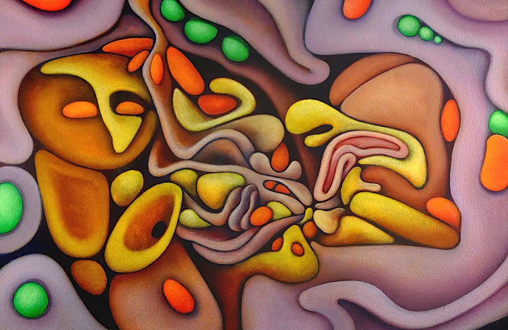
I figured that for this session, it would probably be a good idea to resolve a few of the essential elements of the thing. I put in many of the shadows and darks with Sennelier’salizarin crimson, worked in the wishbone, rib cage and whatever those other bones are with Sennelier’s Naples yellow, worked out the intestines a little further with alizarin and naples yellow and clarified a few elements with Winsor Newton’s scarlet vermilion.
Despite the weather, I have managed a bit of time to paint. Our internet is finally up and running. I’ve just been writing this as I go so I’m going to put the entire thing up at once.
I started this session with a glaze of Sennilier’sburnt sienna over the outside of the yellow forms and blocked in some of the elements like the “hair” and so on with Winsor Newton’s scarlet vermilion. I glazed over the “intestines” (what’s an evisceration without intestines?) with Sennelier’s alizarin crimson and added some shadows and darker passages with Sennelier’s caput mortuum. Some of the yellow objects got modeled a bit with Sennelier’s Naples yellow. I added a few highlights with it as well. The greenish “seeds” were painted in with Sennelier’s viridian and naples yellow. Some of the mid-tones are painted in with Winsor Newton’s terra rosa.
I seriously considered changing the name of “Self Evisceration” to the above title. That is what most of this last week or so has been.
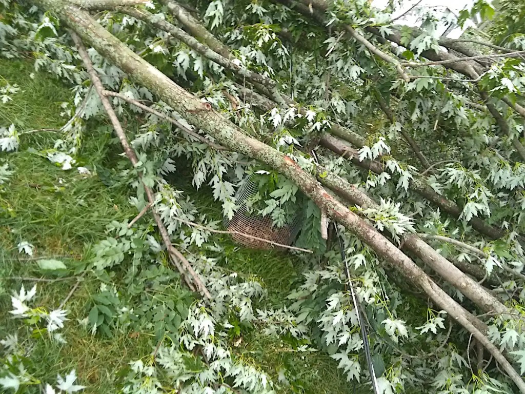
We had a tornado wander down the alley behind our house the other day. That marks the second time in my life I’ve been scared shitless by the weather. The first was a few years back when lightning hit the porch I was standing on in the middle of a thunderstorm. Usually, I love thunderstorms. I frequently go outside to watch them. Watching the world explode around you is like turning the thrill knob up to eleven though.
This last time; my son and I were standing near the door that leads to our deck watching the back yard and discussing whether it might be a good idea to go downstairs and actually pay attention to the tornado warnings that kept popping up on our phones. The kids were already downstairs but my son had come back up to try to convince me it wasn’t safe. True to form, I sort of discounted the idea. Being much wiser than I, my son started to walk back downstairs anyway. As he did, I turned back to the window, just in time to see half of the trees in our yard simply… disappear. I followed fairly quickly. If the wind had come fifty feet closer to the house I doubt that I’d be writing this today.
I’ve spent the better part of the past several days out back, with a chainsaw, trying to uncover what used to be our yard. The picture above is a pretty good representation of what the entire yard looked like last week. There’s a Japanese maple in the cage there… It’s 4 feet tall. The cage is 3 feet tall… just for scale. It was meant to protect the little tree from rabbits.
A couple of things occurred to me yesterday while I was working on this. One was that it would be be cool to grade from purple to yellow… sort of like a flower with a yellow center and violet petals. The other was that James Gurley is definitely one of the greatest guitarists ever to walk the earth… and one of the most underrated.
The above link is my small effort to resolve Mr. Gurley’s ratings problem. As to the issue of developing a gradient on this painting… I started with a thin glaze of Winsor Newton’s Griffin brand Indian yellow. “Griffin” is Winsor Newton’s line of alkyd colors. Alkyds are, for all intents and purposes, fast drying oils.
Next step was to brush Sennelier’sultramarine violet into the outer part of that and to follow it with Winsor Newton’s cobalt violet. I spent some time manipulating the actual gradient then brushed titanium white into it. From a distance you can see the actual violet/yellow vignette/gradient. It’s not so apparent up close.
I went ahead and blocked in some of the forms on the outside with Winsor Newton’s scarlet vermilion to give things a kick and to establish a sort of reference to start building color from… to begin to develop relationships and so on. The colors in this photo are pretty accurate. Things will get “kickier”, more saturated, etc… White tends to “bleach” stuff out but it’s a fast way to define forms.
The medium is Liquin. Liquin is an alkyd based substitute for traditional mediums like linseed oil.
I decided I needed a break from the street yesterday. I spent a few hours cutting panels in the reflective air fryer that is my driveway, and did a bit of work on the painting you see here. This actually has a sort of deadline. It does have a bit of time and it’s pretty far along anyway. I figured it might be a good time to spend some time with it though.
( 🙂 I actually have a version of this photo with even lighting by the way. For some reason, I decided I like this one better. The painting’s got a ways to go anyway. This does show the texture of Arches oil paper pretty nicely.)
This is a version of a painting I did a while back called “Three Aging Musicians”. The title of that one is sort of self explanatory.
This is printed in greyscale on Arches oil paper and reworked in oil. I did have to make a few changes to things to get it to work the way I wanted. I’m sure it will go through quite a few changes before it goes to the gallery.
…
A couple of the things that I really like about gimp (aside from the fact that the developers make every effort imaginable to provide as many options as possible for carrying out a given task: the gradient tool offers a choice of eleven shapes, a choice of color spaces, etc…) are the warp tool, the cartoon filter and the “Little Planet” filter. There are a lot of other things that are great about the program but those are some of my favorite toys. I used them all on a photo of the original to come up with this.
I’m not a big fan of filters that distort things in general but The Little Planet filter, in particular, seems to work with my style of painting. I’m not sure what other uses it might have (aside from making little planets) seeing that it does some pretty severe stuff to an image, but it works nicely for me. I went through a few hundred photos of my paintings recently and came up with a fair number of “re-mixes”: