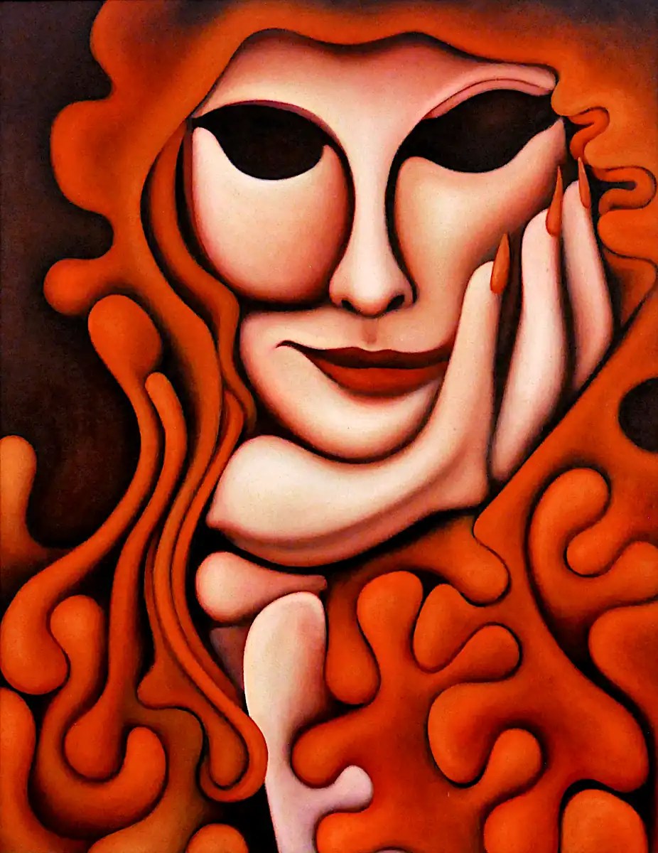
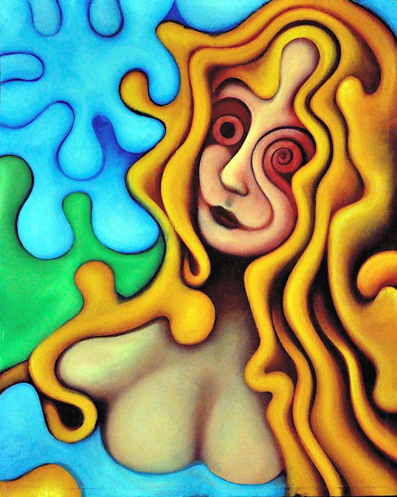
This is Marian (a version). A painting I did for the first time back in 1989. It’s based on the song by the Sisters of Mercy. Originally, Marian was floating above an airbrushy ocean… as per the song lyrics. Version 2 was sometime in the ’90s. I changed the background to a sort of greyish, drippy, abstract thing. I did this version a few years back. It’s 28×22 inches, oil on muslin that’s adhered to a hardboard panel. I’ve been forbidden to sell it. 🙂 It is one of several paintings that I’ve done with the same “figure”.
Somehow, this is just crying out for another version…
I think I’m managing to lose some of the “restroom wall” look and I’m actually starting to like parts of it. I have some ideas as to how this can go (and maybe not end up being totally hokey… It will be weird.). I probably like the “frilly, lace top” more than anything else in the painting. I’m going to have to reproduce some of those holes in the rest of the painting.
This is really just a start. I’ve just blocked in the colors. It should start to take shape when I start using oils.
This is the sketch of “A Sunny Day on the South 40” It’s been transferred to a panel and drawn in a bit. It’s unprimed canvas that’s adhered to hardboard with acrylic medium. Basically, it’s going to go straight to paint. This is just to give me an idea of the way things need to work.
I decided that our heroine here… a farm girl caught mid-frolic out in a pasture, wasn’t really likely to be prancing about in the nude. So, in an effort to alleviate a bit of that “drawn on the wall in a service station bathroom” look and make things a little more realistic; I decided she needed a frilly, lace top. I’ve never actually painted a frilly, lace top so we’ll see how that goes. I doubt it will end up being much more than the suggestion of a frilly, lace top.
My graphite paper has given up the ghost after many years of faithful service, so… I transferred this by rubbing pastels on to the back of the print. That always leaves things a little messy. The lines are darkened with watercolor pencil. I’ve shaded things a bit just to get them started… I sprayed it with water to set the drawing, further start the shading process and give me a few random drips. This is wet in the photo.
I’ll give this a coat of clear acrylic a bit later just so it doesn’t soak up huge amounts of paint, sand it and go straight to acrylic for the under-painting. I have some ideas as to how this will go. As usual, we’ll see what happens.
This is another painting based on a photo of Mera. It was featured in a series of “bus stop” benches that the Collective gallery did around the city as a promotion. If you live here, you’ve probably seen it.
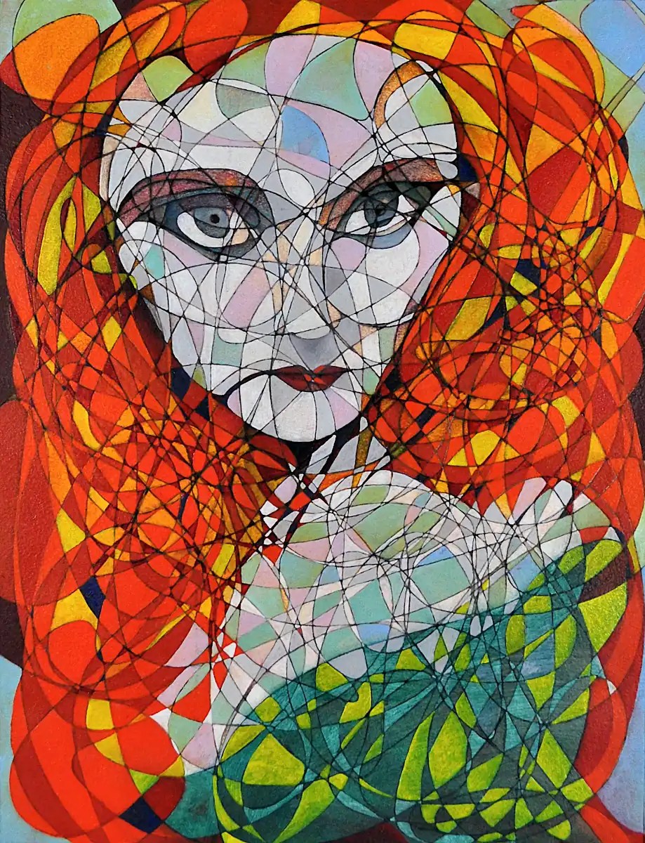
As you can probably tell, the “automatic drawing” here wasn’t quite so automatic. It’s closer to a Cubist technique to break things into forms and planes than anything generative.
I finished the Green Nude. ….Mostly. It’s still going to need a few minutes to get cleaned up and highlighted. I’ll put the final image up in a day or two.
In the meantime… I’ve got a couple of new things in mind: one that I’ve defined a fairly complex process for and will start when I’ve got a consistent few hours to work on it… And one that’s been sitting around the studio for ten years or so:
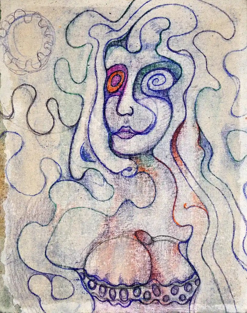
I know… it’s a little rough.
I’ve used a wide format printer that’s capable of 13×19 prints for quite some time now… a couple of HP’s… Nowadays, an Epson. At one time, I did a lot of 18×24 paintings, from digital sketches, by cutting them into two 13×19 images and printing those on decent paper: Rives BFK or Canson Edition… Arches watercolor and so on. Those prints got trimmed, then adhered to a hardboard panel with acrylic medium. You’ve still got the seam in the middle to deal with but it’s not terrible. A few coats of acrylic will usually fill it in.
When I did this particular image, I decided I’d get “artsy” with it and cut the paper into shapes and glue those to the panel.
I did not deal with this very well. I just could not handle the edges of the paper showing. If it had been a collage or the paper had been thinner or it was simply a different image, I might have been able to handle it. …Not here.
Originally, I thought that maybe I could just sand the edges down and cover the thing with acrylic and make it all go away. This did not work. I ended up with the edges still standing and a surface that was so smooth that it was impossible to paint on. I figured that the alternatives to this were to add some sort of texturing agent to the acrylic and try to fix things or let it sit in the corner of the studio for 10 years until I figured out something to do with it. I chose the latter course.
Ten years later, it’s possible that I’m a little wiser and more capable of dealing with this whole thing. So… I shot a photo of the painting, made some of the changes that it wanted digitally and printed that to tiles. I’ll transfer that to the panel that I have waiting in the studio, paint over the offending, paper-edged thing that’s been taking up space in my studio for all this time and cover the back of the panel with canvas. No one will be any the wiser and I’ll have 2 panels and a start on a “new” painting.
I like this idea, for some reason. I think that I can push it to something interesting. This is what’s getting transferred to a 16×20 panel:
I did a fashion shoot for a friend of mine… um… many years back. Mostly goth/industrial clothing… lots of PVC, latex, metal things and so on. This painting is based on one of the photos from that shoot. I like to clothe figures in stripes; either as contours or, like I’ve done here, as a sort of construction or lattice to twine the hair through.
This is 18×24… oil on canvas panel. It’s just straight, out of my head, with no references; one of those rare paintings that just worked out of the gate. I blocked it in with acrylic paint. It took, maybe, four brushstrokes to resolve the face… the rest went pretty easily. It took a bit longer to add the details and so on.
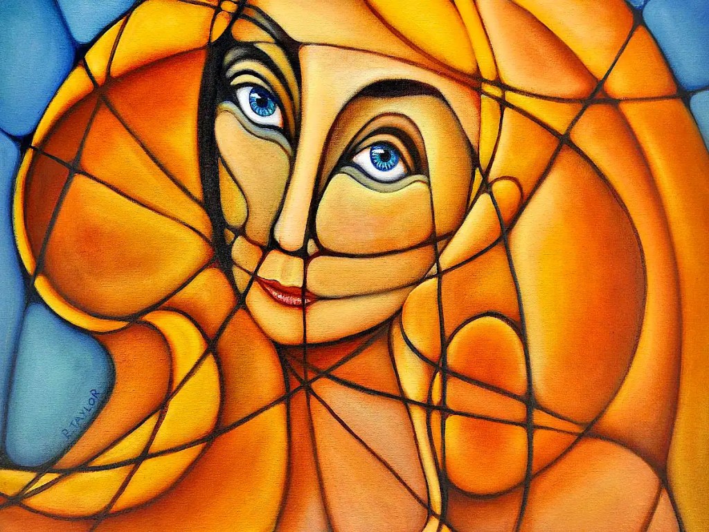
This painting is the second in a fairly long running series of “glamour” portraits. There’s nothing digital about this one. I just drew an inverted triangle for the head, blocked in the rest of it then did an automatic drawing on top of it. I’ve done these sorts of things for as long as I can remember. They go fairly easily and give me a break from the more complex stuff.
I love mid-twentieth century glamour photography: George Hurrell and Milton Greene and so on… pictures Of Dietrich, Garbo, Gene Tierney, Hedy Lamarr, Lauren Bacall, etc… Those pictures offer a sort of break from the glut of images on the internet today. Not that today’s photography is bad… some of it’s amazing. There’s so much of it that it loses a lot of its impact. There’s a sort of magic to those old film photos, anyway… the greyscales, the lighting, the clarity… the subjects…
(I just realized… I sound a bit like Norma Desmond. 🙂 )
This image began life as a photograph of Mera; another extremely pretty woman I met in the Chicagogoth scene back in the ’90s. She was wearing a velvet (I think) collar during the shoot. The title of the painting refers more to the idea that I removed it than any actual collar.