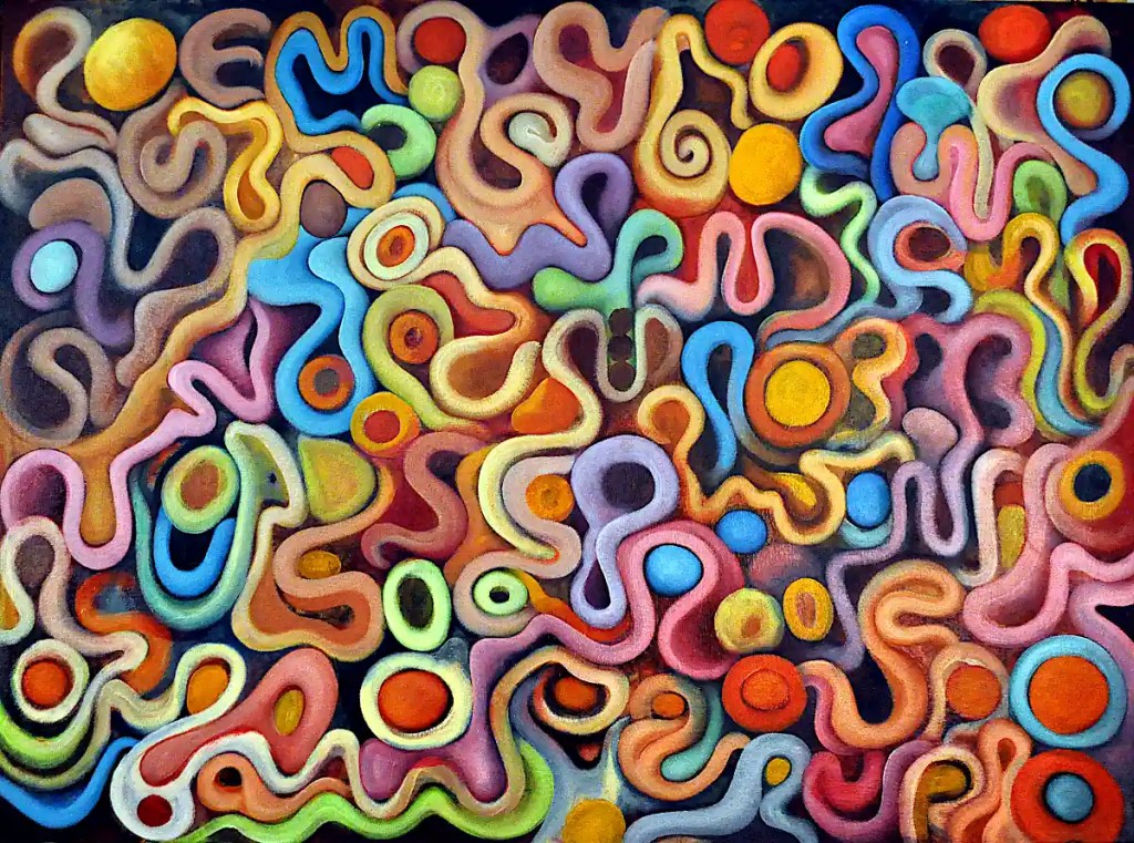
This is the result of a couple of sessions. The colors are pretty much the same. I did add some of Sennelier’sAlizarin Crimson. I had an insatiable desire to put pink things in this. I also feel a need to add many spheres and rings so that I can build some sort of “Vasarelly meets Miro and Gorky in alphabet soup candy land” world.
It won’t stay that way very long but, for now, I like the idea.
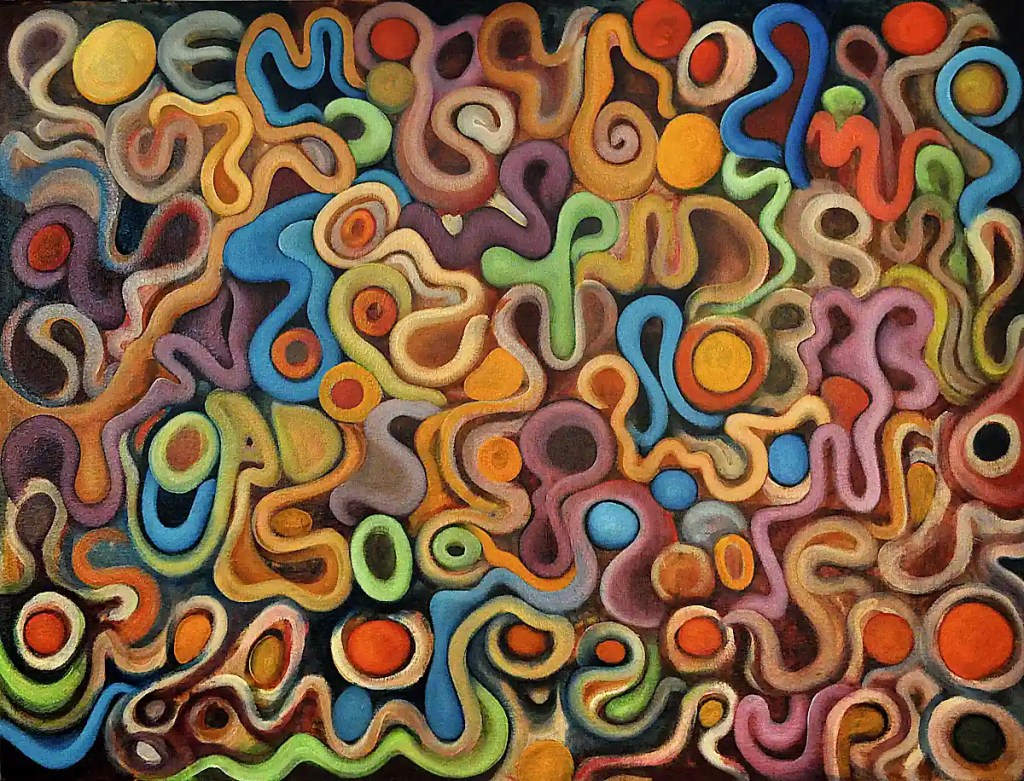
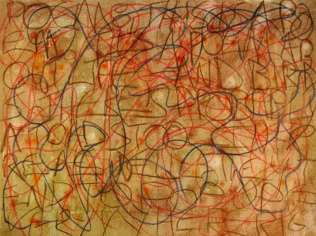
🙂 A glare-free shot of this just isn’t happening. This is a little more “contrasty” than it is in real life.
I got some colors and forms blocked in. Despite what you see here… some of the underpainting’s still there. It’s covered with glazes in spots… still shows the same texture. Most of this is still pretty rough. It needs much modeling and many shadows. Some of the colors are a bit brighter than I’d like so there will be many glazes as well.
Overall, I’m happy with the layout and the sort of “alphabet soup” look of the whole thing. I still have some forms to figure out. Some of them are a little too “simple”. 🙂 I need to add some complexity to the thing. I want to play with the colors as well. It really needs some depth but that will come.
I spent several hours listening to “space rock“, adding colors, developing forms and making things work together. I’m much more energized by this than I have been by a painting in quite some time. The only reason I put up the brushes was that the paint started to get a bit thick and “gloppy“.
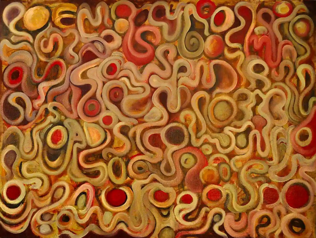
I’m not a “wet on wet” painter by any stretch of the imagination. I don’t deal well with gooey paint that slides all over the canvas. It’s really rare that I’ll do something alla prima. One of my professors at S.I.U. taught traditional technique… underpaintings, glazes and so on and so forth. I may not adhere to those practices all that faithfully but I do implement aspects of them.
Anyway… this is coming together fairly quickly. I doubt you can see it in this image (A lot of it’s just subtle differences in color… brushstrokes. (“gloppy” 🙂 )) but I do have most of the forms defined. Next… color interactions… refinements and so on…
I was gifted a dozen or so pound tubes of Miameri paint when a friend of mine finished her degree at Ray Vogue. They’re student colors (not what I’ve linked to above… It’s just a nice chart of their colors.) and they apparently don’t make them any more. They’re beautiful, just don’t have a huge pigment load. I tend to use them to start largish paintings like this one.
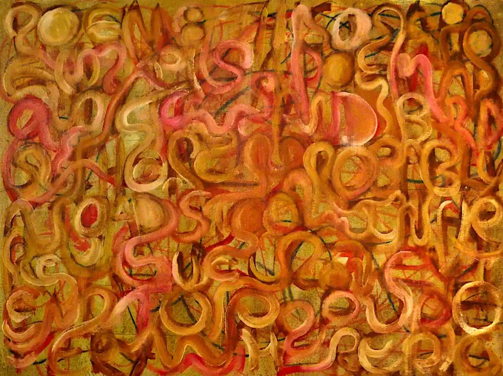
I used a large blob of Permanent Red, Titanium White, Yellow Ochre and Burnt Sienna to do this. I’d intended to stick a little closer to the letter forms and pool “turpentine” (mineral spirits) on top of them so that things blurred and blended and so on. I got carried away as usual. I went ahead and started building some stuff.
I did pool a small amount of linseed oil mixed with mineral spirits and cobalt drier on things… not really as much as I’d originally intended but enough to flatten out the paint film and cause a little blending. I went back an hour or so later and leaned this against the wall (I painted this on the worktable in the garage. I’m fond of breathing.) so that the paint would run down the front. 🙂 I didn’t get as much of that as I wanted either, but… I’m not really wanting to wait a month for this to dry and I want to get started on it, so… I’m going to leave it at that.
You can see some of the “drippage” and bleeding in the detail. Usually, white drips as a sort of veil. You can see a little of that under the “S” form on the upper left.
I’m sort of anxious to see what I can do with this. I like the way the letter forms are working. I may not make as much of an effort to hide them as I’d intended. I rather like the idea of letting them pop out of the painting.
I sprayed this with clear acrylic to fix the pastels. I do tend to wonder how this would have worked out if I hadn’t.
I wanted a sort of general “mid” tone to this canvas, so… I mixed up three small tubs of acrylic medium, water and Sennelier’sSepia, Burnt Umber and Mars Yellow paints, soaked the canvas panel with water and used a 4 inch house painters brush and a rag to give things a “not really all that even” tone.
Even wetted, the raw canvas tends to suck up paint. I salted this, which can give you some really nice effects with watercolor. Here, it just adds a sort of grainy look to the paint. You can see it better in the detail below. Salt does tend to give your underpainting a sort of “sparkle”. Some of the light spots come from spraying up close with a water bottle… The spatters are from bottles of Chinese Orange and Alizarin Crimson watercolors, mixed with water, that I keep to use with an airbrush. The acrylic tends to seal the watercolor. I’m still pretty sure they’re going to bleed when I seal this.
(I did a series of canvases a while back that I covered with acrylic and sprayed with a garden hose. It gave me some very nice, subtly blended colors. You can get stuff that looks like batik or tie-dye with raw canvas as well. 🙂 I’m not sure a wax resist has a place in an underpainting.)
A couple of days ago, I mentioned that I had an idea for a new image. This is it. At least, this is the beginning.
I know, the first thought that probably comes to mind is “Why the hell would anyone do something like that to a poor, defenseless canvas?”
I intend to generate this image from paint. I wanted consistently sized forms on the canvas. I suppose I could have drawn a grid or filled this thing with row after row of circles. That would have been horribly restrictive and this seemed like a more expressive way of defining things. The forms are roughly the same size and the letter shapes will probably inform the final forms. I have no intention of doing typography here but I’m sure a few elements of the letters will make their way into the final image.
The scribble? It’s to hold things together and begin relationships between the letters. Some of that will probably make its way into the final image as well.
This is done with pastels on unprimed canvas, mounted on a 30×40 inch piece of hardboard. Pastels work wonderfully on raw canvas. You can go through an entire stick in no time though. Raw canvas holds a lot of pigment.