I know… it’s been quite some time. I’ve been buried in the studio finishing things and really haven’t had the time to shoot paintings, type, etc, etc.
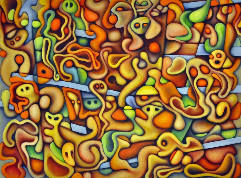
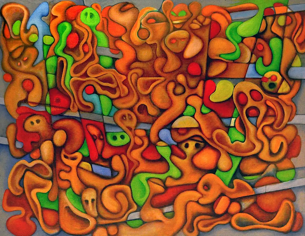
Anyway, this is the final version of On the Street. You can see it in person at the S.A.A. Collective Gallery for this next couple of months or so. You can see the final version of much of the work on this page as well as several paintings that I’ve not put up here yet. I’m doing a featured show with Mario Clarke… Mario does some very nice glass work.
Stop by if you’re in the area. The opening’s this Friday night (April 12). You can drink wine, look at artwork and even listen to me talk about my work. How that will go is anyone’s guess.
Much of the “noise” you see in these images is actually from the texture of this panel. As I mentioned elsewhere, I didn’t sand this after I sealed it with acrylic medium. I find that the texture makes blending the way I do it; scrubbing very thin passages of paint into things, much easier. I like the feel of it as well. It does leave things a little noisy and manages to play hell with very expensive brushes. I like the noise… the effect on my brushes, not so much. 🙂 It does give me an easy way to grind down older brushes. I usually end up applying the color with something new then scrubbing with something that’s been around a while.
I imagine that’s one of the things that’s making this so hard to photograph. The light hits every little protrusion and the camera picks it up as noise. For the sake of my sanity as well as my brushes… I’ll sand the next panel… a bit.
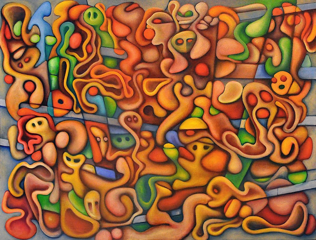
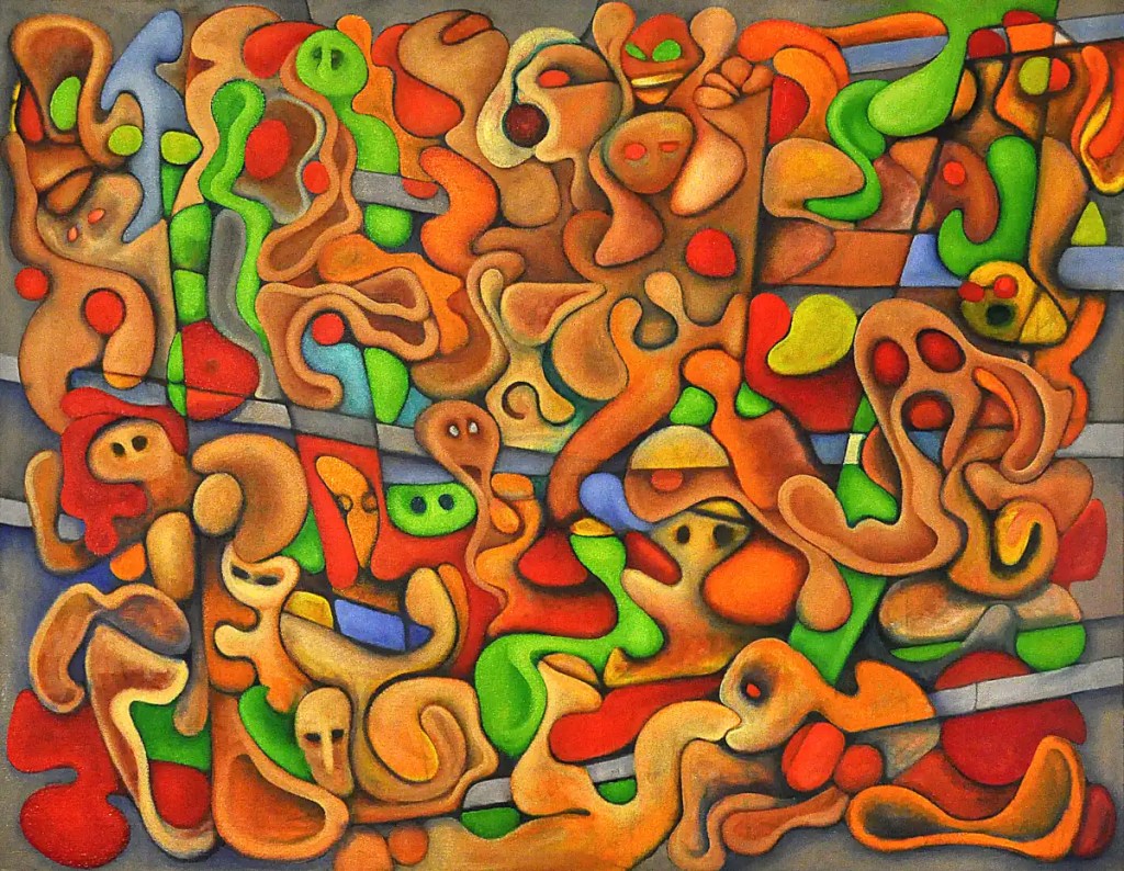
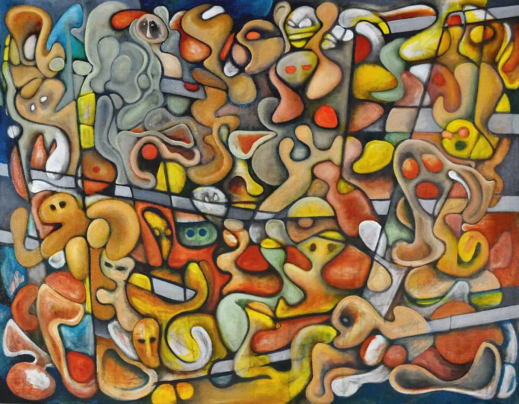
This session involved using Sennelier’sNaples yellow, titanium white and Modiglianiochre to build up the lights. I refined that with Sennelier’s burnt sienna and sap green… used it to smooth out the rough edges and so on. I managed to tone down some of the orange and to implement a bit of Modigliani’s idea of what a fleshtone should be.
…
An update on the photo issue: I don’t really mean to harp on it, whine, complain or whatever. I am still building this studio… I’d like to set up a permanent photo system that lets me simply shoot this sort of thing without moving half of the furniture in the room, playing acrobat, re-shooting 20 times with different lighting or spending an hour with graded masks in a photo editor; something that will let me simply “shoot and go” so to speak. Much of this will resolve when the painting’s dry. As I’ve said otherwheres… It’s not usually an issue. I’d like to have things optimized, regardless. I want the best prints possible.
I built a sort of make-shift soft box this morning. (Basically hung a sheet of plastic a few feet from fluorescent fixture that I use to light the easel.) It helped a bit. 🙂 This probably means I’m going to have to make a trip to the local home improvement store eventually.
After reading half of the stuff about photographing artwork on the internet; most of the stuff that deals with this sort of thing suggests doing exactly what I’m doing. 🙂 It’s not working. The most commonly suggested upgrades to the process are polarizing filters, softboxes and umbrellas. The polarizing film will happen, regardless. I don’t really have the room for umbrellas. I can build a permanent softbox on the ceiling and a portable one for the floor… or maybe built into the easel. That would make life considerably easier. Eventually, I’d like to hang a few fixtures from the ceiling as well. 🙂 Maybe take a hacksaw to my old lights?
Yesterday, I put in some more shadows and darks with Winsor Newton’s cobalt violet and Sennelier’sultramarine rose and cobalt blue. Transparent and semi-transparent colors like these add a bit of color to the darks so that you’re not stuck with something drab and boring. You can play them against compliments and create a subtle interplay between the lights and darks… It’s not immediately apparent but it does perk things up considerably.
(There are a lot of good books on color theory. It’s a subject that can get insanely complex and touches on everything from psychology to electronics. There are many different color models… some of them have very specific uses. Basically, in the subtractive model that we use in painting… compliments are directly across from each other on the color wheel… red/green, yellow/violet, blue/orange, etc. Combining them will typically give you some sort of neutral color… a brown or grey of some sort.)
I’m thinking I’ve let things get a little too orange. It makes for a nice base color to play with though. I’ll try to get a little creative with the colors today and start cleaning things up and winding them down. I’m seeing a stopping point within the next few days.
I am serious about the “series” idea I mentioned yesterday. I’ll build a panel for the next piece next week. I like the car idea. I’m thinking a night scene might be cool as well. It would give me an opportunity to play with lighting.
I managed to get back to this yesterday. Again, I’ll apologize for the image quality. I’m going to have to see if I can find some retouch varnish without an outrageous gloss to it or maybe, just wait until this is dry to get a decent photo of it. (Maybe, I should bite the bullet and upgrade my 35 year old lights and order some polarizing filters for them to replace the ones that I’ve not seen since I last moved. 🙂 It’s not really been much of an issue but I rarely shoot stuff that’s this wet.)
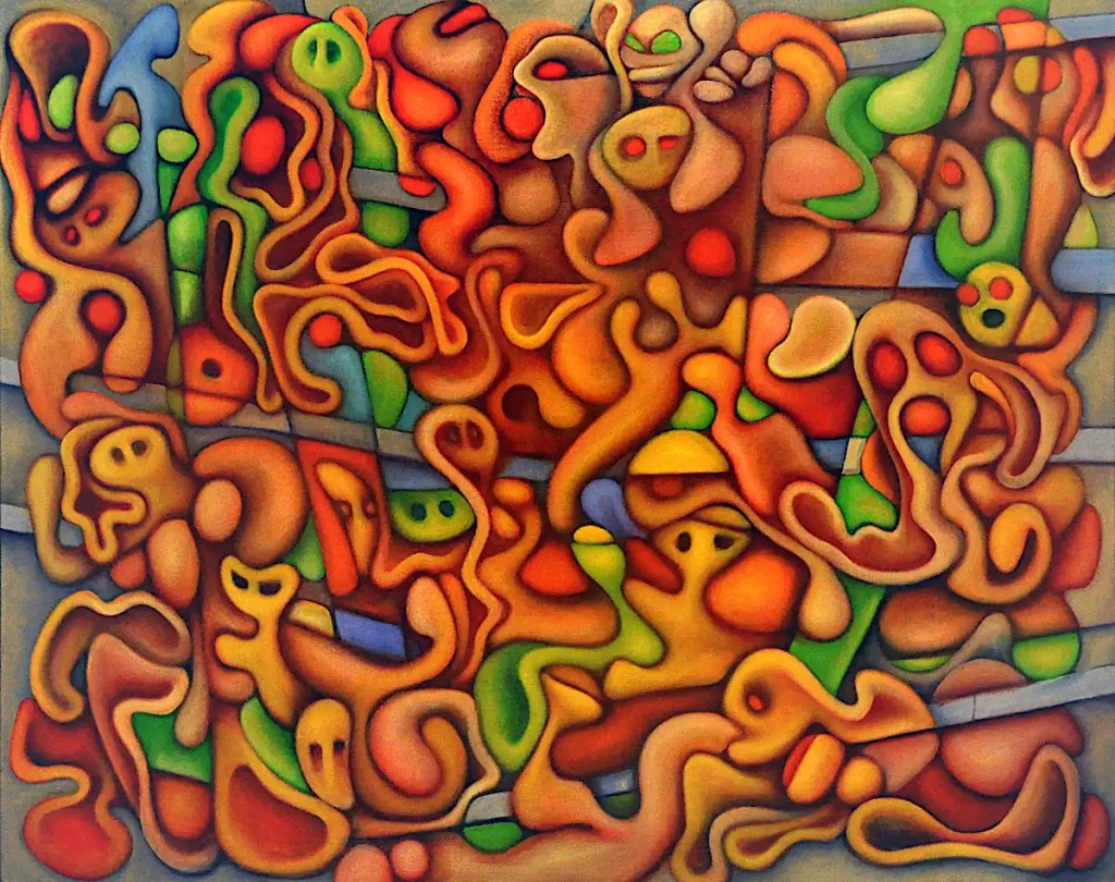
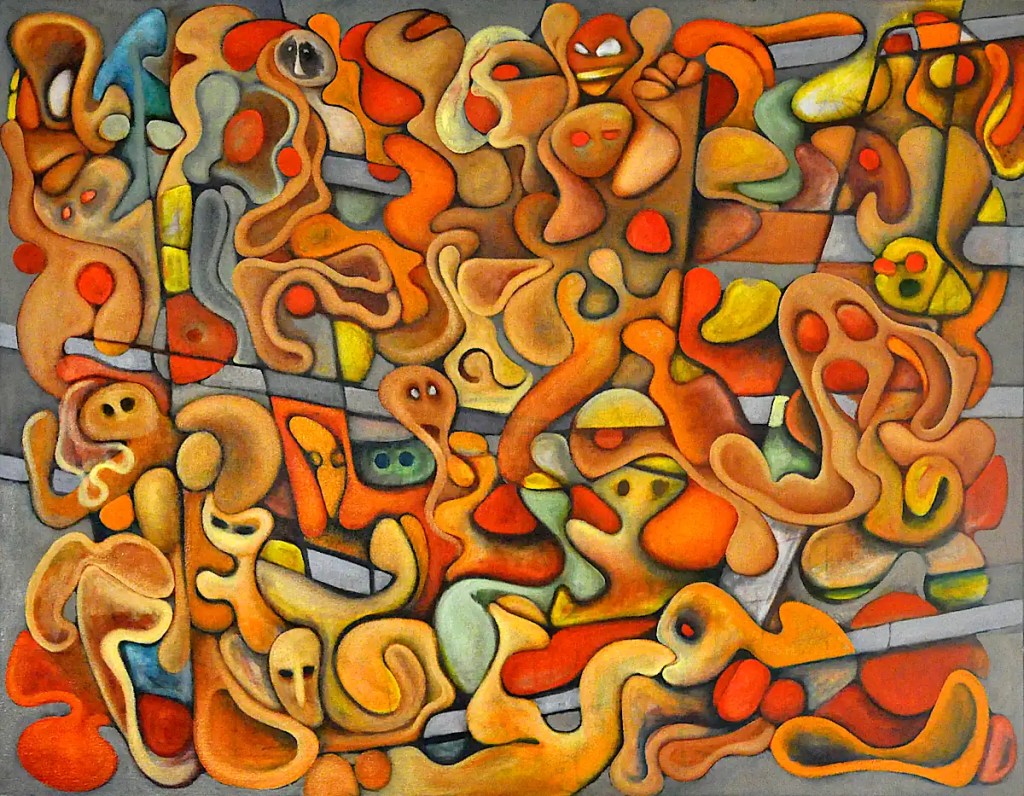
Anyway, I went over the edges of most everything and added some shadows with Winsor Newton’s brown madder. Brown madder is a beautiful, transparent brown color that’s great for shading things. It’s a fairly intense dark that easily blends to a transparent brown. It’s similar to burnt sienna though it’s not quite as red. I fell in love with the watercolor version… a color that can do amazing things in an airbrush. The color is a little different but it’s nicely useful in both mediums.
I brushed into that with Winsor Newton’s cadmium yellow deep and highlighted that with Rembrandt’s brilliant yellow light. I think they’ve discontinued brilliant yellow, renamed it or whatever. It’s not a color I use all that often and frankly, I’m trying to finish off the tube. It seems a little “under-powered”. 🙂 This phase of a painting always seems like a good place to do that.
It’s occurred to me that there are no cars on this street. 🙂 I suppose that means I’ll have to do another one… a series.
Yesterday was a matter of filling in the blanks, adding some color, rebuilding and modeling the forms and so on.
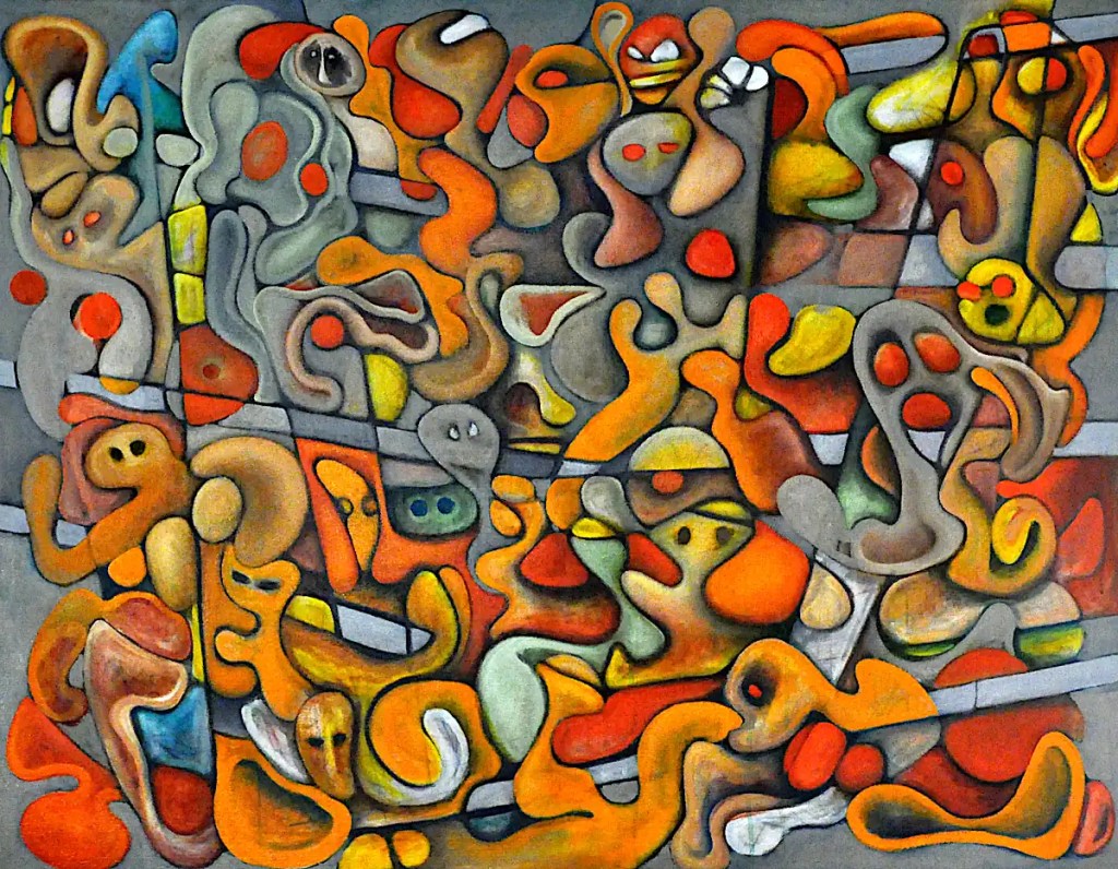
Colors are Winsor Newton’sviridian blended with Rembrandt’s cadmium yellow, The blues are Winsor Newton’s French ultramarine with varying percentages of titanium white. The shadows are just ultramarine scrubbed over the greys as well as in to a few other places. I’ll be blending more greys back into that, as well as shadowing with a bit of violet. I want to see what sort of paint effects I can come up with on the “wall” areas.
Frankly, I’m thinking the greens are a bit harsh and the whole thing sort of reminds me of Christmas. I’ll be toning things down and adding some paint effects throughout. I’m thinking along the lines of a summer scene… moderately bright, saturated colors… clear, sunny skies, all that.
I actually managed a fairly decent amount of time with this yesterday. Most of that time was spent shaping things with burnt sienna and a mix of raw sienna and titanium white. I followed that with Tuscan earth midtones and some Naples yellow highlights… changed the hair on the mother from the “mother and child” grouping and reworked her legs a little bit. The guy at the top center is supposed to be eating an orange. Eventually, the orange will be orange and the mouth should be a little more “mouth-like”.
There are a few small changes yet to be made. Today, I’ll break out the greens and blues and try to get a little interplay going between the colors… maybe put in a few shadows. There’s not a lot to say about it that isn’t better said by the image.
Yesterday’s was a short session due to Father’s Day festivities. I did manage to pretty much resolve the structure of this thing. Aside from a few small changes, it’s basically ready to paint. 🙂 …Shadowing, rendering, color and so on. This is the pleasant part where I can just basically get lost in things, listen to Americana or Jazz and fiddle with colors and forms.
Oh, I still had the lights and camera set up from yesterday. A couple of shots and a few twists on the polarizing filter were enough to get this image. It’s still sort of weird shooting in near dark.
This is the point at which things get a little frustrating. I made some changes to the overall structure of things yesterday. There will probably be a bit more of that. If this were any other time, or any other painting I’d probably just lose the linear stuff and just go with organic forms. That doesn’t really work with the way this was conceptualized though.
I think I’ve come to terms with the architectural stuff. I’m going to simplify a few areas, add some shadowing and go for a sort of trompe l’oeil look…. Sort of dangle things in front of a grey, concrete wall. In addition to the structural lines, it should give me what I’m looking for.
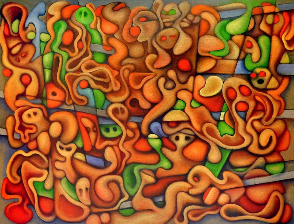
It’s probably a little unprofessional of me to apologize for the image quality… so, I’m going to do it anyway. This is image number 53. It’s taken with the lights reflecting off of the opposite wall, the window shades drawn and the polarizing filter on the camera cranked up all the way. It’s wet… It’s really difficult to make the glare go away and I need coffee yet. 🙂
Colors are Sennelier’sTuscan earth, titanium white and Naples yellow. Naples yellow, and specifically Sennelier’s product, may just be the most essential color in my paint box. I typically use it instead of white. It’s wonderfully dense and opaque and makes rendering and highlighting much, much easier.
I used Grumbacher’sMars black for the greys and the outlining. I usually use lampblack or carbon black but, I have a few old tube “ends” that I need to clear out of the paint box.