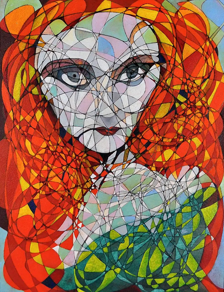
This is a portrait, in process, of my friend Joann. Joann is the very embodiment of the word “beautiful” (grace… poise…).
🙂 I will finish this eventually.
Usually, when you sand down a painting, it removes the high spots and doesn’t really mess with the painting a whole lot. Imagine my surprise when the image just sort of disappeared the moment the sander hit it this time. It was a pain but I just repainted what I had there following whatever traces were left and the photo I had on the studio computer.
This is an absolute mess but I think I finally got it to work. The way I see it in my head works anyway. 🙂 The composition doesn’t seem quite as “off” as it did previously. I can see some potential in the forms as well.
Colors: Sennelier’s Prussian Blue, Titanium White, Naples Yellow and Sepia as well as Winsor Newton’s Cadmium Red Deep, and Purple Madder.
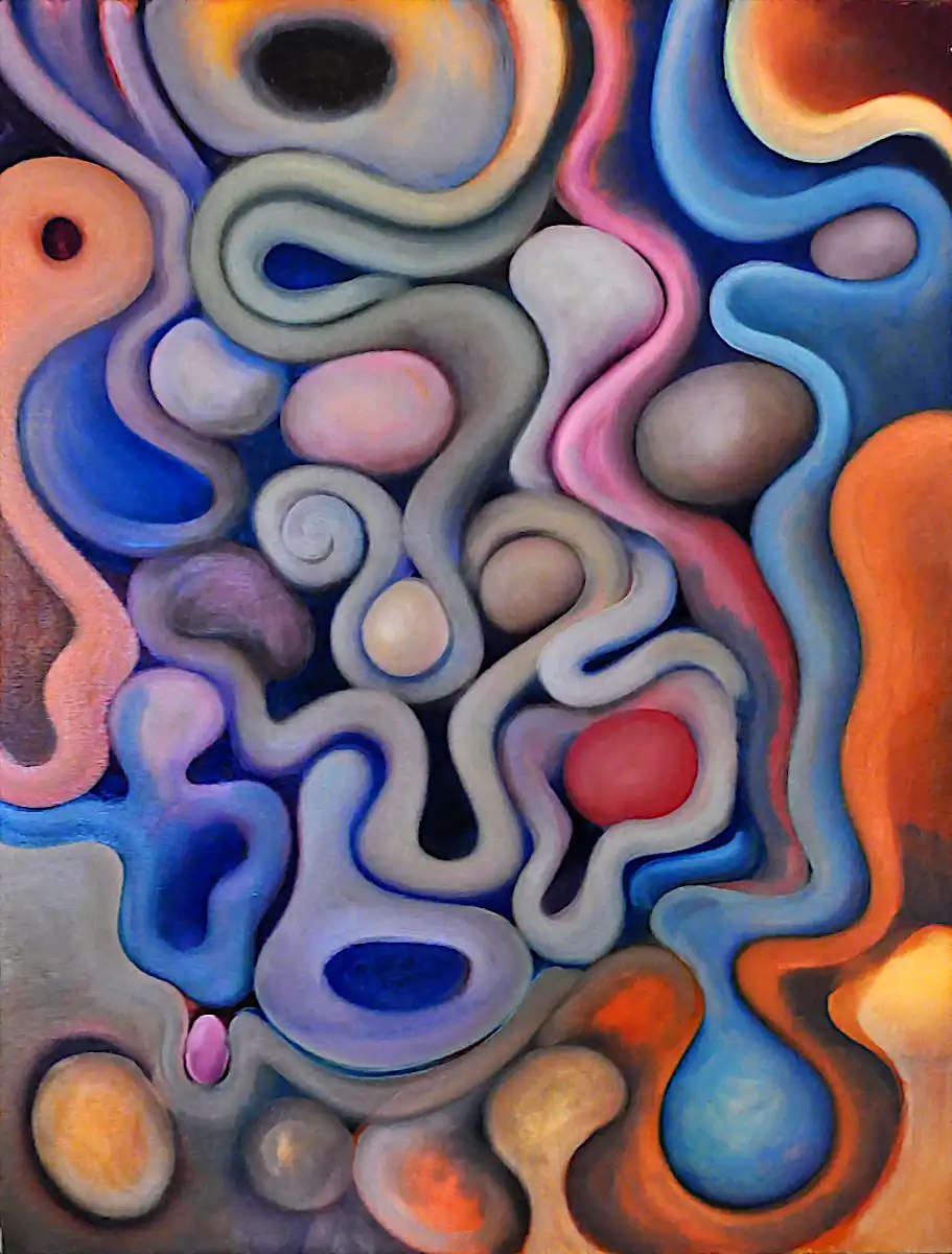
I was digging through the paintings on my paint shelves and ran across a couple of paintings that I made last year. Essentially, they were finished but I wasn’t really all that fond of the results. So… I decided to rework them.
This is the first painting. I sort of like it but it strikes me as overly simple and I’m not really fond of the horizontal forms. I think that they throw off the flow of the whole thing.
This second image is after a couple of hours (Two sessions, actually.) with Sennelier’s Alizarin Crimson and Titanium White as well as Miameri’s Yellow Ochre and some Phthalocyanine Blue that I had left on my pallet. I’m not sure that this will stay this way. The composition is a little wonky. I still need to spend some time sanding out the lines from the previous version of this as well. That will change things a bit. I do think this works a bit better. I like it a lot more anyway. We’ll see how it goes…
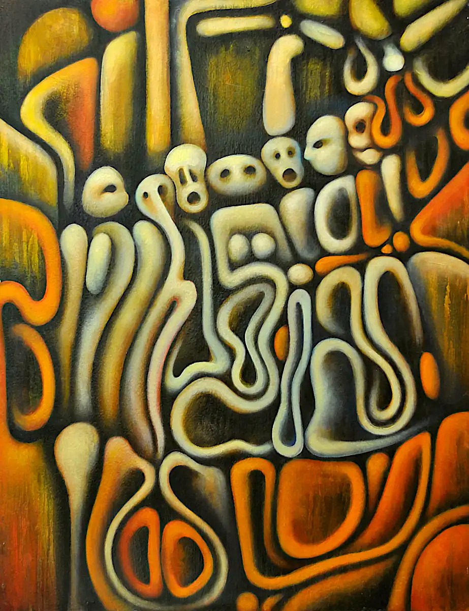
The idea behind this one is probably obvious. It’s basically meant to illustrate “Judgement”… the feeling you get when you see that look in someone’s eyes that says they’ve already made up their mind about you. Any guy that had long hair in the ’60s or wore a mohawk in the ’70s knows the feeling all too well. If you’re too old, if you’re too young… if you’re from the country or “another” country… any woman that’s had to enter “that” workplace… any person of color that’s had to walk down the street. Many of us have had the experience to some degree or another. I figured that a jury or tribunal pretty well illustrated the concept.
Technically… I covered this with paint and mineral spirits and let the paint run down the face of it. I built a grid on top of that, blocked in the basic forms and added the figures. It’s oil on paper mounted on a 28×22 inch panel.
I decided that I was going to wait until this was finished to post about it again.
For now… it’s finished. It could stand a little cleanup but I’m going to wait until it’s cured for a bit before I do that. For one thing, it’s a bit easier… for another… I’m at the point where every time I look at this thing I see something else that needs to be “fixed”. I need to leave it alone for a while. 🙂
This is scheduled for a show I have coming up in March. I’ve got plenty of time to pull it off of the wall and completely re-work it. 🙂
Colors are the same.
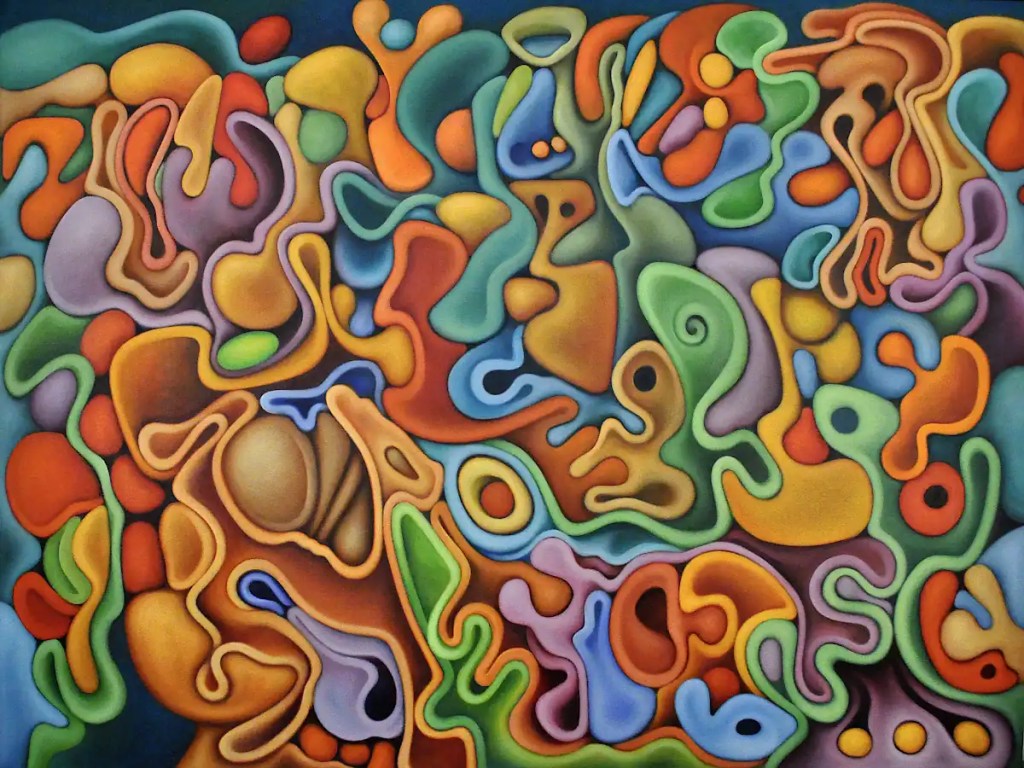
It finally “clicked”. 🙂 That’s technical, artsy talk for “the forms all work, everything fits, the composition is fairly tight and the motion flows unimpeded across the face of the image.” Nearly time to stop, in other words.
I realized this afternoon that this painting channels, pretty well, the psychedelic, stoner music that I’ve been listening to for the entire time I’ve been working on it. I did listen to Renaissance for most of this last session. 🙂 I suppose that’s appropriate for refining things. It will still probably take another session or two.
Colors are the same.
I’m somewhere in the middle of the “stand back and stare at the thing, work on something, wipe it off and re-do it, stand back and tell yourself it works then re-do it again phase.
I’m happy with the way things are going… I do wish they would go a little faster.
Colors are the same with the addition of Sennelier’s Indian Yellow.

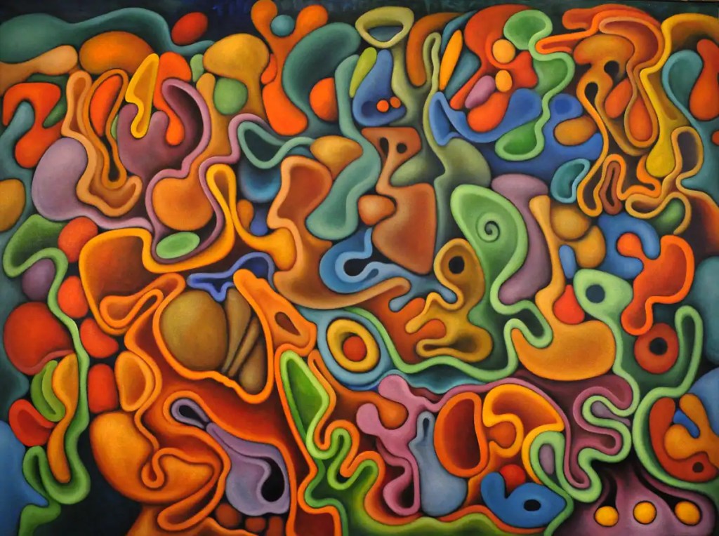
Strangely, I’ve felt a real need to listen to psychedelic stoner stuff for the entire time I’ve worked on this.
Looks like my previous estimates were a little overly optimistic. Still… this is fun and is turning out pretty well. I’ve spent a lot of time just playing with stuff and seeing what I can do with it.
I did spend some time yesterday trying not to scream in frustration at that bottom, center area but I’m pretty sure I can get it to work. It does look a lot better in this shot than it seems to in real life.
Colors are the same with the addition of Sennelier’s Alizarin Crimson.
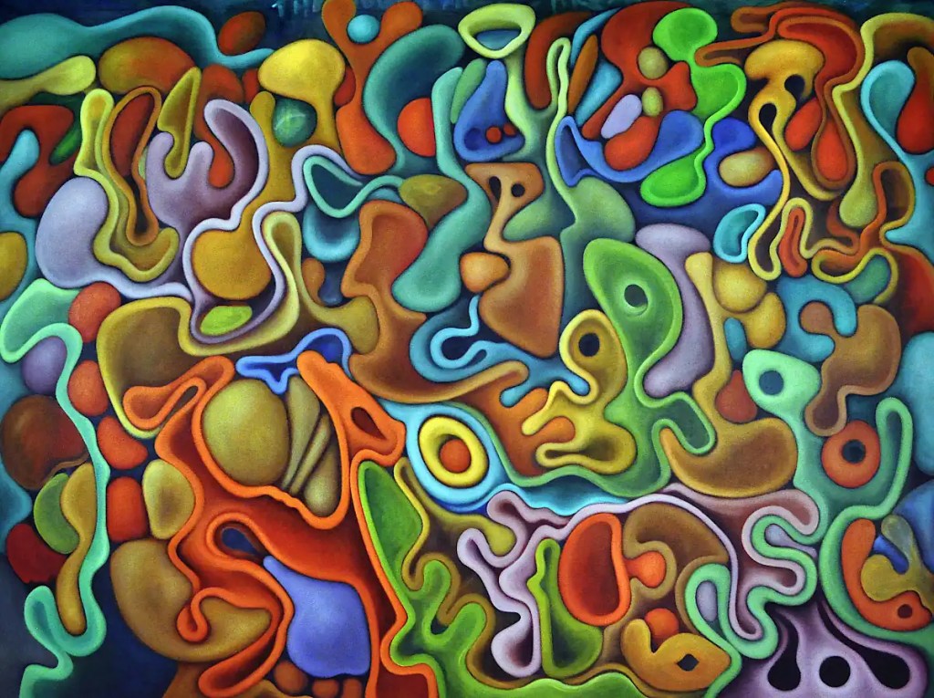
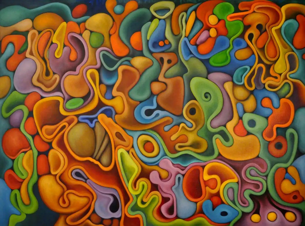
I’m actually seeing the finish line on this one. A few more sessions and I’ll let it dry for a bit then brush in the highlights. Many bits of this are finished, again… aside from fitting them into the rest of the painting.
Tomorrow will probably be spent making prints.
Colors are the same with the addition of Winsor Newton’s Cobalt Turquoise, Sennelier’s Naples Yellow and Rembrandt’s Cadmium Orange.

I got back to this today. It’s hard to forget about. It sort of fills the studio. I think the forms are pretty much resolved. It’s a matter of colors and shading and molding and modeling from here on out. It is going to get a lot brighter. 🙂 Hopefully, that will make it easier to photograph.
Colors are the same. Oils stay usable on the palette for a long time.
