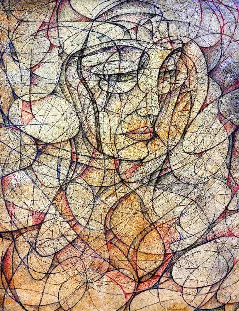
This is based on a photograph that I took of Monika; a strikingly pretty woman that I met somewhere in the Chicagogoth scene in the late ’90s. She’s the kind of person who turns heads just about everywhere.
I made a stylized sketch from the photo, photographed that and optimized it in gimp… some warping, the cartoon filter and so on. I printed this back out and, just naturally, had to scribble on it. There’s some watercolor and acrylic washes here as well. They give a sort of vague idea of where to take the drawing and introduce a few more random elements to things. The drawing itself is worked in with watercolor pencils and water-soluble graphite.
This is today’s intended victim. It’s oil on Arches oil paper. It began life as an automatic drawing. Since its birth, it’s gone through several digital changes, been re-printed in grayscale and “colorized” with oil paint.
Given that I do work with several images every day… it’s a little difficult to know exactly how far I’ll get on a given piece. These are fairly complex and do become a little difficult to work with after a bit. The idea here (one of them anyway.) is to show the process on these things. Posting an “after” without a “before” wouldn’t exactly do that. This is the before. The after will come after.
I have added categories to this page so that the progress of individual pieces is a little easier to follow. Please bear with me. This page is still, very much, a work in progress.
I’ve been working on this sketch for quite some time now. I finished it yesterday. At least it’s finished enough to serve it’s purpose as a sketch. It gives me enough information to move on to color. I’m still going to need to come to some sort of understanding with a few of the linear elements.
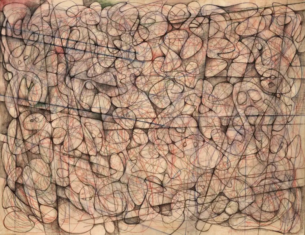
This is fairly large… 36×48 inches. It’s canvas adhered to a hardboard panel with acrylic medium. The canvas isn’t primed. I prefer drawing on raw canvas… It’s an amazing surface for pastels, charcoal, graphite and so on. This is done with watercolor pencils and water-soluble graphite. I’ve misted it with a spray bottle so that the pigment soaks into the canvas… a bit like a dye.
Next step is to seal the whole thing with gloss acrylic medium. I’ll probably block in a few forms with acrylic paint then move on to oils.
This began life as an automatic drawing. The forms and so forth come about through interpretation of it. Dali did something similar with his Paranoiac-critical method, Ernst built his grattage and frottage stuff by interpreting rubbings and blobs of paint. You’ve probably done it when you looked for faces, elephants, demons, wizards and so on in clouds or wood grain.
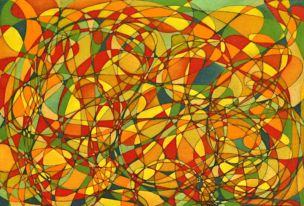
This actually had some intent behind it. I wanted to represent chaos in a sort of street scene. The straight lines allow me to work in some sort of architectural elements. 🙂 Whether that will come across in the final painting or not remains to be seen.
This is pretty typical of the work I’ve been doing lately. (My son calls them “chaotic”.) I have twenty five or thirty of them going. They tend to get to be unworkable when I’ve painted in a lot of shapes and force me to spend half my time cleaning paint off of my hand and wiping smeared paint off of things. If I work on a bunch of them at once, it saves me remixing paint, leaving excess on the palette to dry up and go to waste, and… it keeps me from getting bored.
This is basically an automatic drawing done in watercolor pencil, sealed with clear acrylic and blocked in with oils. …A detail of it anyway. It’s stretched on a stretcher that’s a bit larger than the final image will be. The actual painting is a couple of inches larger. It’s a little (lot) more work but it allows me to stretch it on an appropriately sized stretcher and wrap the image around the edges. It saves framing and looks a lot better than the raw edges.
I glazed this with Indian yellow this morning. It may look overly “yellow” at the moment but the glaze evens out the paint film and gives things some consistency. When I go back into it and add the final colors, blend stuff, shade it and so on, it will take the paint a little easier. Of course the yellows are pretty much finished. 🙂
This sad, little guy is named “Ditty”. In 2012, when Ditty was born, he was a proud, colorful, little painting with his entire life and a bright, happy future ahead of him.
This was before Ditty came down with “Sharpie”.
The ravages of Ditty’s disease are pretty obvious. Those black marks weren’t in the painting when I finished it. By the time this came back from it’s first show, they’d already started to bleed up from the sketch. Thankfully, it didn’t sell.
Most everything I do involves some degree of experimentation. This one seemed like a no brainer… lay the thing out with a permanent marker, build the actual painting and just finish it up. Not even an experiment really. This is one of the few times I’ve not been able to salvage something. I don’t even want to try to paint over what’s there. I’m pretty sure I’ll just end up with the same results.
People ask on social media whether Sharpies are appropriate for fine art. My comment is usually something like “no… they bleed”. This is what that means.
…
Ditty is so named because it’s supposed to represent a short snippet of a song. I usually view my work as something analogous to experimental jazz… where musicians take a phrase and expand on it. It’s all improvisation though I don’t really do things in real time. This was just a simple phrase.
Drippy spent yesterday with its third coat of medium drying. Today, it got a wash of sepia followed by another wash of Paynes grey then another of terra verte. Once it had dried, I scumbled across it with Indian yellow and followed that with some titanium white. Indian yellow is fairly transparent. It does work very well as a dye though. The purpose of it was basically to tint the white. Once that was all dry, I brushed a very dilute glaze of sepia across it, stuck it on an easel and let the paint run down the painting.
I use mostly Senellier colors. Their sepia has a greenish tone despite what the Wikipedia link above says about the color. I do use Utrecht’s titanium white. It’s very heavily pigmented, dense and covers very well. It’s great for mixing as well.
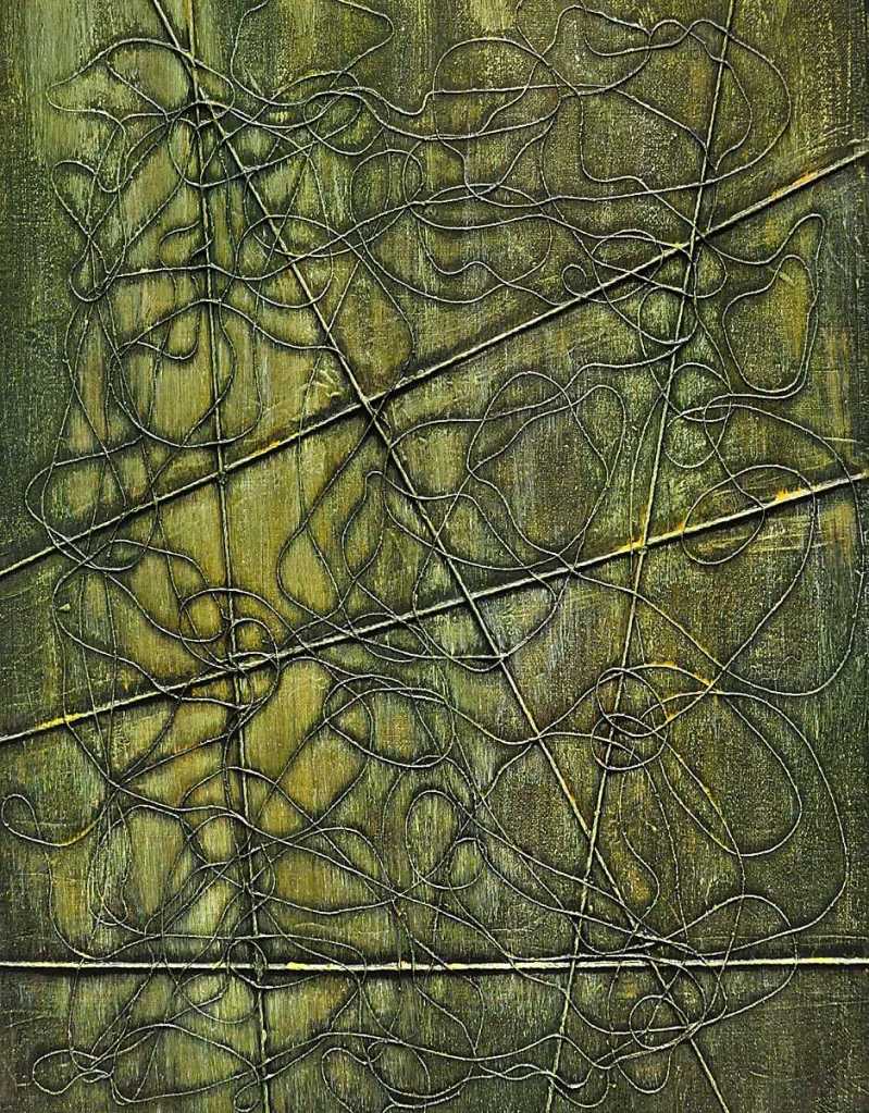
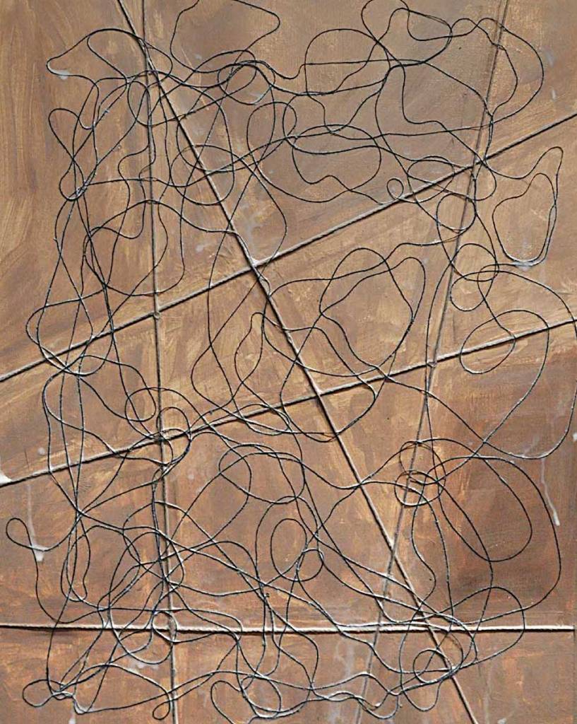
This is on Canson acrylic/oil paper by the way. It’s much different from the Arches product. This has a “linen” texture and is considerably less absorbent. They both have their uses. I do prefer the Arches stuff for drawing. I’m really just trying both to see which I prefer for the “thread” stuff.
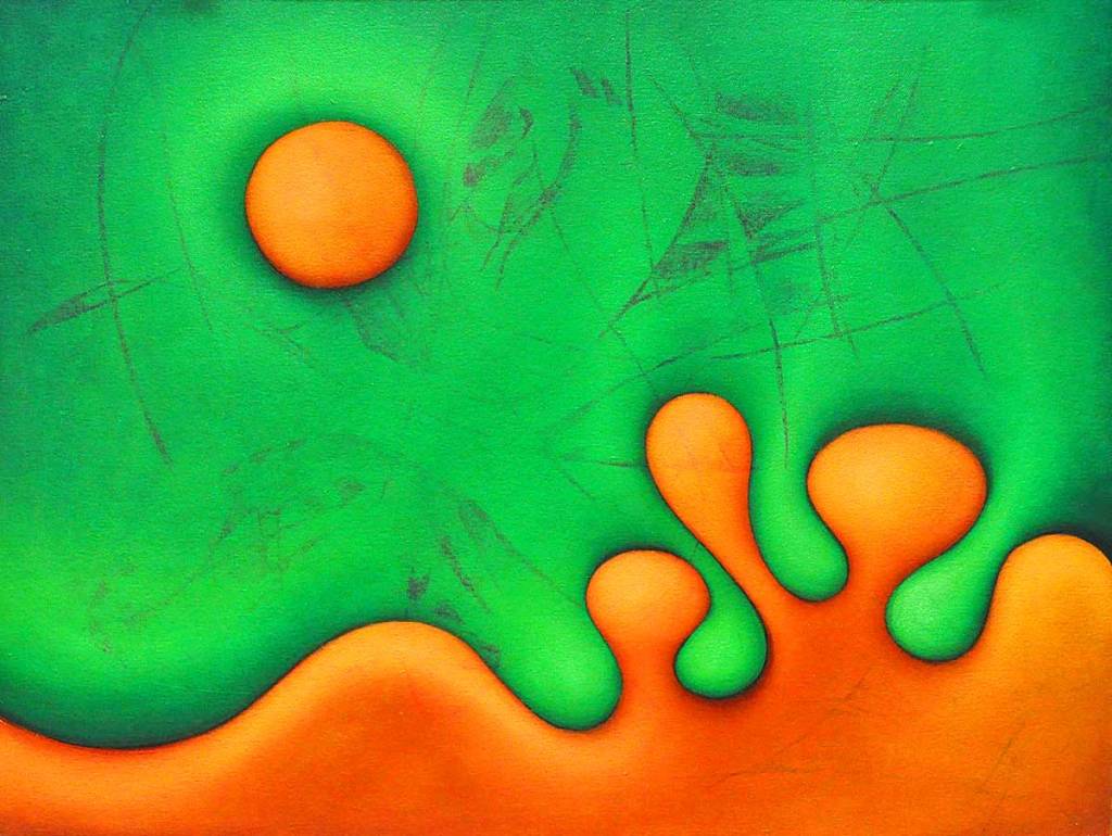
I’m going for a sort of “evil garden” feel with this painting. That is where I spent a good portion of the day yesterday. Between the beetles eating my viburnums, the dogs trampling my ostrich ferns and the Central Illinois mid-afternoon sun… that sort of describes the way I feel about them at the moment. Seriously though, it’s a theme I’ve spent a lot of time with over the years. I love working with organic forms. The idea that some of them may have some sort of malevolent intent doesn’t seem like all that much of a stretch.
This is another of the string experiments I started recently. I’ve washed over the thing with Phthalocyanine blue and some Venetian red then scumbled over that with titanium white. This is acrylic paint. It dries faster than oils and works fairly well as an adhesive. It makes for a tough paint film that pulls the whole thing together. I’m not really fond of the look of acrylic though. I don’t really like painting with it either. I’ll probably block in a little of this with it then switch to oils.
Basically, I’m just trying to get some color started. Some of what’s there will serve as a background. The white is to accent the texture of the paper and make the thread stand out a bit more… I’m trying to push the idea of “line” rather than “thread” as well.
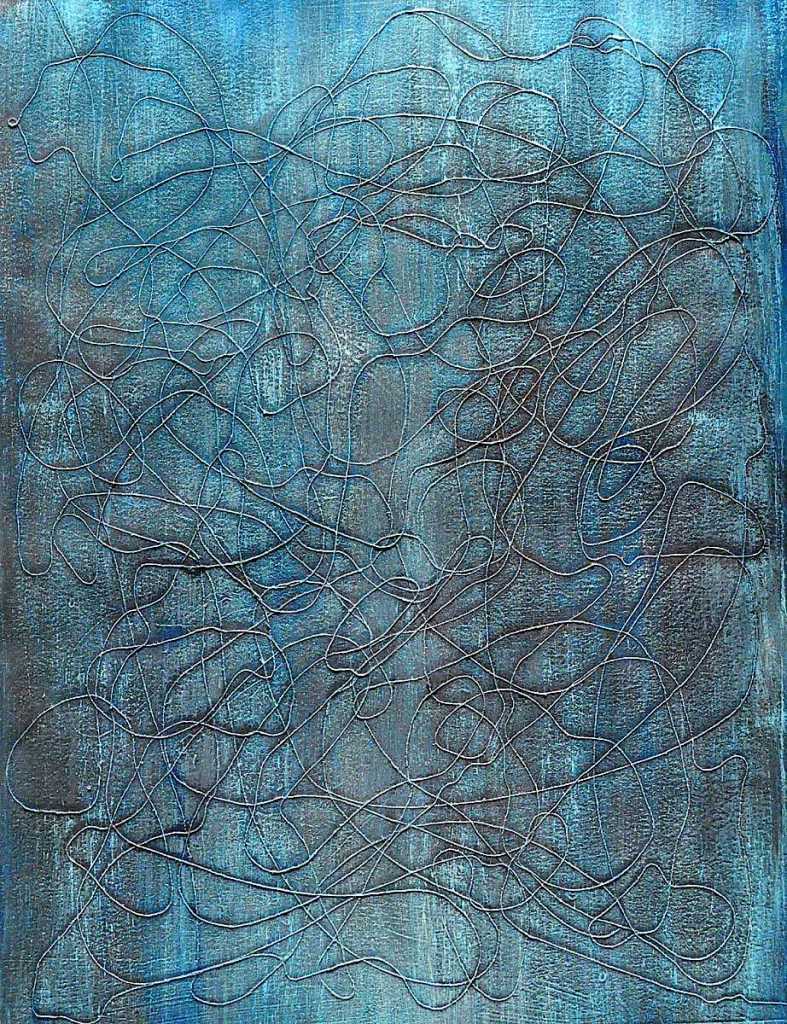
This is a current experiment that attempts to combine the aesthetic of some of the string/rope/wood/etc collages I’ve done in the past with that of the automatic (scribble) drawings I use to generate nearly everything I do.
The heavier, straight lines on this are made from heavy cord. The squiggly lines are made from thread. The drips are acrylic medium that will eventually run off of the paper or dry transparent. This is the second coat. If you look closely, you can see that some of the thread is still “floating” a bit. It will probably require at least one more coat.
Drawing with thread is “different”. It’s definitely a technique that requires some practice. Hopefully, I’ll improve if this turns out to be something worth pursuing. I do have a few of these going. Practice makes “perfect”, no?
Anyway… I’ll see how this goes and post the occasional update. It is one of quite a few experiments I have going. I’m sure they’ll all appear here as well.