I went ahead and scrubbed the highlights into this painting… extremely thin applications of Sennelier’s Naples Yellow and Titanium White.
This goes to the Collective Gallery this weekend…
I went ahead and scrubbed the highlights into this painting… extremely thin applications of Sennelier’s Naples Yellow and Titanium White.
This goes to the Collective Gallery this weekend…
I finished the Green Nude. ….Mostly. It’s still going to need a few minutes to get cleaned up and highlighted. I’ll put the final image up in a day or two.
In the meantime… I’ve got a couple of new things in mind: one that I’ve defined a fairly complex process for and will start when I’ve got a consistent few hours to work on it… And one that’s been sitting around the studio for ten years or so:
I know… it’s a little rough.
I’ve used a wide format printer that’s capable of 13×19 prints for quite some time now… a couple of HP’s… Nowadays, an Epson. At one time, I did a lot of 18×24 paintings, from digital sketches, by cutting them into two 13×19 images and printing those on decent paper: Rives BFK or Canson Edition… Arches watercolor and so on. Those prints got trimmed, then adhered to a hardboard panel with acrylic medium. You’ve still got the seam in the middle to deal with but it’s not terrible. A few coats of acrylic will usually fill it in.
When I did this particular image, I decided I’d get “artsy” with it and cut the paper into shapes and glue those to the panel.
I did not deal with this very well. I just could not handle the edges of the paper showing. If it had been a collage or the paper had been thinner or it was simply a different image, I might have been able to handle it. …Not here.
Originally, I thought that maybe I could just sand the edges down and cover the thing with acrylic and make it all go away. This did not work. I ended up with the edges still standing and a surface that was so smooth that it was impossible to paint on. I figured that the alternatives to this were to add some sort of texturing agent to the acrylic and try to fix things or let it sit in the corner of the studio for 10 years until I figured out something to do with it. I chose the latter course.
Ten years later, it’s possible that I’m a little wiser and more capable of dealing with this whole thing. So… I shot a photo of the painting, made some of the changes that it wanted digitally and printed that to tiles. I’ll transfer that to the panel that I have waiting in the studio, paint over the offending, paper-edged thing that’s been taking up space in my studio for all this time and cover the back of the panel with canvas. No one will be any the wiser and I’ll have 2 panels and a start on a “new” painting.
I like this idea, for some reason. I think that I can push it to something interesting. This is what’s getting transferred to a 16×20 panel:

We’ll see how it goes.
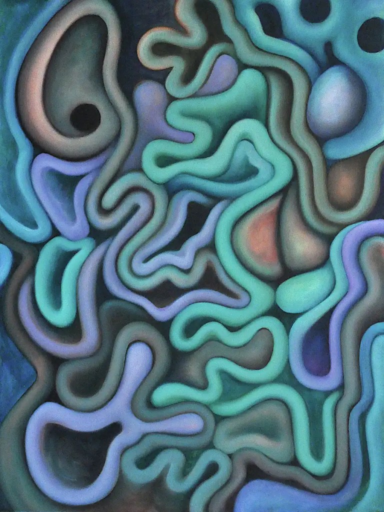
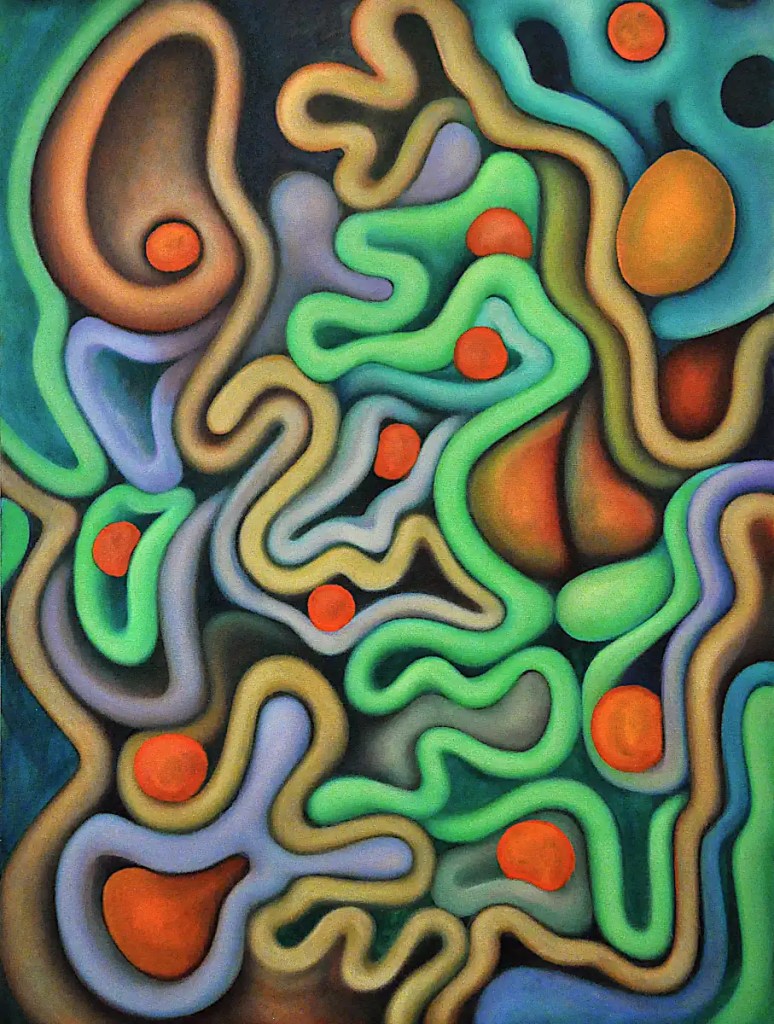
I spent some time yesterday listening to somewhat newer “psychedelic“, cleaning things up and getting some of the final colors in place. I think I managed to fix the upper right and reflecting it below is just going to be a matter of making the existing forms a bit brighter. The blues and violets are next.
(…Still cleaning up the image libraries. I’ve decided I need a consistent, well organized copy of everything on the server. I’ll probably delete everything on the other drives and set up some form of incremental backup. One thing about writing a blog… It’s forced me to get organized. I think I’ve managed to resolve the issues with photographing things as well. Ambient light was most of the issue. I’m going to have to find some decent “blackout” style window shades so I can pull the cardboard off of the studio windows. 🙂 )
Colors: Sennelier’s Cadmium Yellow Light, Burnt Sienna, Naples Yellow Light and Deep, Alizarin Crimson and Titanium White as well as Rembrandt’s Cadmium Orange.
I got a bit obsessed with this yesterday and spent a while calmly modeling forms, making changes to the colors, adding shadows and highlights and generally enjoying myself. All the while, I had the nagging thought in the back of my mind that I just couldn’t allow that orange form in the upper right get away with running out of the composition. So… I imprisoned it in a small blue cage. This, of course, screwed up the way everything else in that corner worked and I spent a bit of time reworking things up there. …Over and over again.
Finally, I had it exactly the way I wanted it… stood back and thought it over, then wiped everything off, smeared in the sketch for the revision with my finger and calmly put the brushes away. Despite my frustration, I did not injure the painting. Now, I think I need to figure out a way to reflect that change in the lower left corner. 🙂 That shouldn’t be a big deal…
Colors: Liquitex Manganese Blue (A truly old tube… probably untouched since the early ’80s. I actually had to break the cap off with a pair of pliers.), Sennelier’s Titanium White and Naples Yellow Light, Rembrandt’s Cadmium Red Light and Winsor Newton’s Prussian Blue.
Just in case you thought I’d forgotten about this… I haven’t. It has been back-burnered a bit over the past few days while I try to make sense of the files on my backup drive.
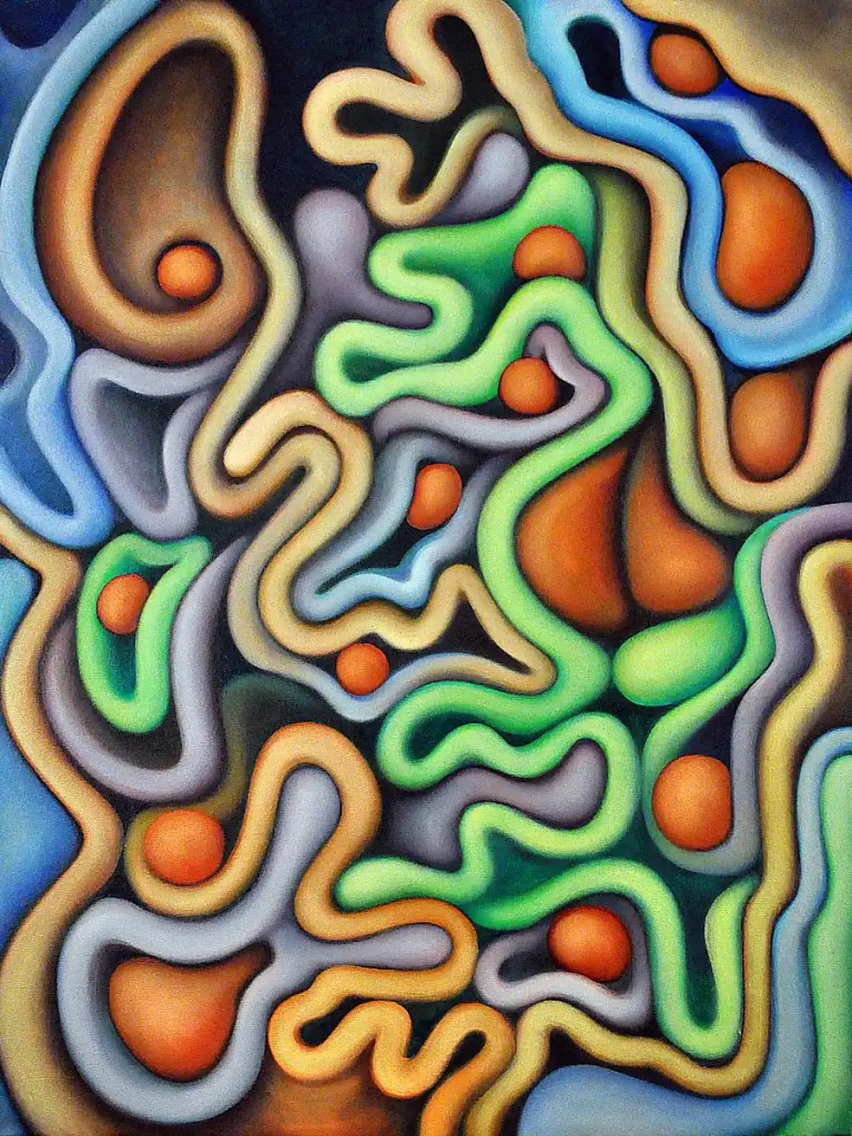
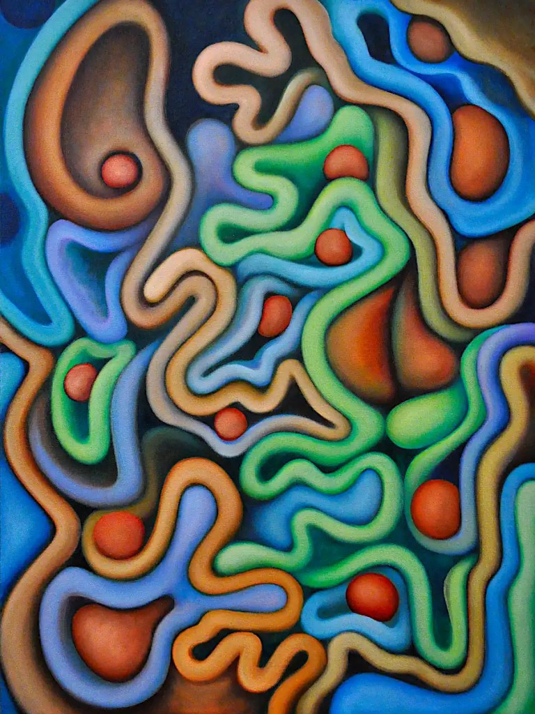
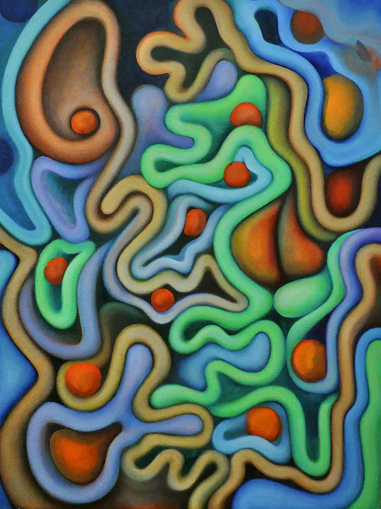
As you can tell, I put the spheres in. I like the sort of “stair-step” effect that gives. …Painted the white form on the upper left orange and spent some time modeling stuff with Naples Yellow Light. …Toned down the “psychedelic” greens…
I liked the orange form before it was orange. Right now, I’m a little irritated with it. I think it throws things out of the composition. I should be able to fix that with lighting though. The color definitely needs some work as well.
I think that a few of the elements in this are starting to work pretty well… the mottled look of the large form on the upper right, the form that fades into the distance below it, etc. I have a pretty good idea of the way things need to go… some blueish forms, shadows, rendering and so on…
🙂 We’ll see what happens.
Colors: Sennelier’s Naples Yellow Light and Rembrandt’s Cadmium Red Light and Cadmium Orange.
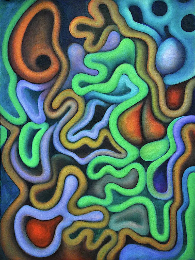
This is just about working out some basic color relationships and developing the forms. I’m going fairly slow with the colors… scrubbing in layers of different colors rather than simply filling in the forms. That way, I get color relationships working in the forms themselves as well as more chances for what Bob Ross calls “happy accidents”. …Something that’s part and parcel of Surrealist technique as well as most abstract painting; exploring or experimenting with just about anything for that matter. …Of course, there’s always those “unhappy accidents” as well. Thankfully, you can “erase” with oils.
I really feel the need to fill this with spheres. To add complexity for one thing… to play with pattern and color as well. And, because they’re fun. I think I’ll do that after breakfast.
Colors: Sennelier’s Mars Yellow, Alizarin Crimson, Lemon Yellow and Titanium White, Winsor Newton’s Phthalocyanine Green and Rembrandt’s Cadmium Red Light.
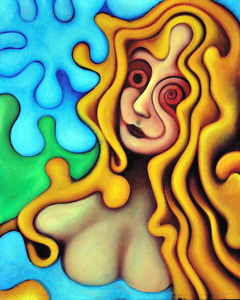
I decided that the Queen needed to dry for a day or two. I paint with a lot of glazes. “Dry to the touch” is generally good enough. Occasionally, something needs to get a little more solid.
This has been hanging around waiting for me to finish it for a while now. (I may have mentioned somewhere that I usually work on 20-30 images at a time.) This first image is what it looked like prior to yesterday’s session. I probably could have just cleaned it up and called it finished. I rather like what’s going on in the image.
I decided that it needed to be green and a bit more contrasty before I could truly love it. After the past few days with the Dark Queen, I’m liking the “psychedelic” idea as well. This seems like the sort of image that would support that and I think I can push it a little bit further.
This second image is the painting after I outlined the forms in Winsor Newton’s phthalocyanine green and blended that back in to things. I rendered things a bit with Sennelier’s Naples yellow light and scrubbed in the purples with a mix of their dioxazine purple and titanium white.
This is destined for the next group show at the Collective Gallery. I should probably pay it some attention.
One of the benefits of having a digital copy is that I can quickly try out changes on the computer and get an idea of what things will look like if I make a specific change. I can always click undo or work on a copy or something. I have some ideas I want to try out. 🙂