This has gone a little slower than I expected. The simple stuff, that I’d normally paint in without thinking about it, has decided to be difficult. I didn’t think it showed enough progress yesterday to warrant a post.
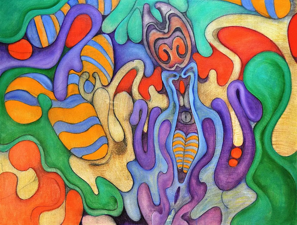
Black is a color that I typically use for outlines and details. It struck me as necessary in order to convey a “Dark Queen”. It may have been a bad decision. 🙂 It will get glazed over anyway. I think I’ve got things figured out now. At least, I’m pretty sure I know the way they’re going to go.
This is all worked in with acrylic paint. I’m working out some of the details. Seeing that the sketch was fairly well finalized when I transferred it… I don’t really need to do a lot of that.
Golden’s open acrylics are formulated so as to emulate oil paints. They are convenient and they do “emulate” pretty well. They don’t quite get it, but they are much nicer than traditional acrylics; they keep longer and work easier.
I am phasing out acrylics aside from a set of basic colors. I don’t actually use them for anything other than underpaintings or “utility” paints. It doesn’t make sense to pay for an additional tube of expensive colors like cobalts or cadmiums. This is something of an attempt to use up some half empty tubes. I’m a little short onearth tones, so I’m skipping a few of the elements in the underpainting. I’ll just go straight to oil. I’ll probably just buy basic sets of Utrecht, Sennelier Abstracts or Blick brand acrylics in the future.
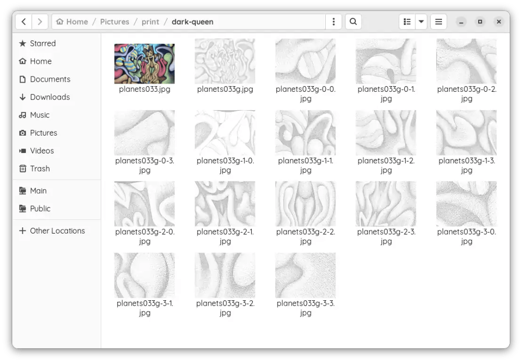
This is the result of going through that whole rigamarole yesterday. I trimmed all of the prints with a paper cutter… Alternately, you can use an X-acto knife and a straight-edge.
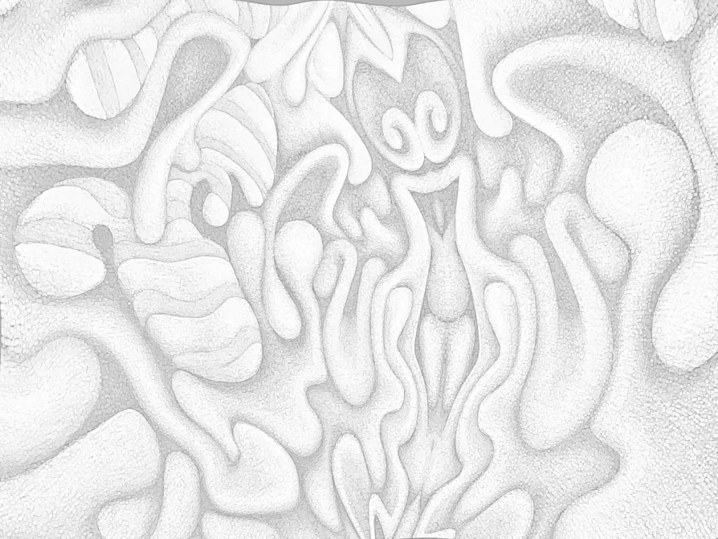
After taping all of the prints together with transparent tape, I transferred the drawing using graphite paper (Carbon paper made with graphite.) and a ballpoint. (Ballpoints don’t tear the paper as often when you bear down on them and they give you a lot better reference regarding what you have and haven’t traced.) I re-drew it with water-soluble graphite, sealed that with a light coat of (mostly) water mixed with acrylic medium, sanded it and drew a bit more…
I gave our queen a bit of cleavage (Seemed necessary… she’s “dark”.), a pair of velvet hot pants and striped stockings that reflect a few of the other forms in the painting. I stylized the rest of it and made a few changes here and there, then made an attempt to map out some of the colors with watercolor pencils. It got 2 more coats of acrylic medium. That blended the colors into fairly continuous fields as well as fixing the drawing into the canvas. This dried overnight and got sanded again. (rotary sander… it makes things go much faster. You need to be careful on stretched canvas though.)
I just realized that her robe/hair is going to have to be dark or she’s going to come off as some sort of bouncy, Pollyanna type. I’ll make some color changes this morning… I’m pretty sure how they need to go.
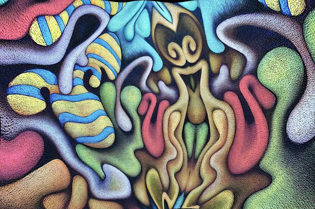
This began life as a photo of “Nefarious Doings Down on the Farm“. As I’ve said elsewhere, I like subjecting my images to the “Little Planet” filter in gimp. This particular image has been mirrored, “planeted”, warped and variously distorted to a fairly high degree. I have a few hundred of these that I fiddle with once in a while. While I was fiddling with this image, I decided that the figure in the center really resembles an evil queen (Probably the source of all of those nefarious doings.) and deserves to be painted as such. I’ve set about doing just that:
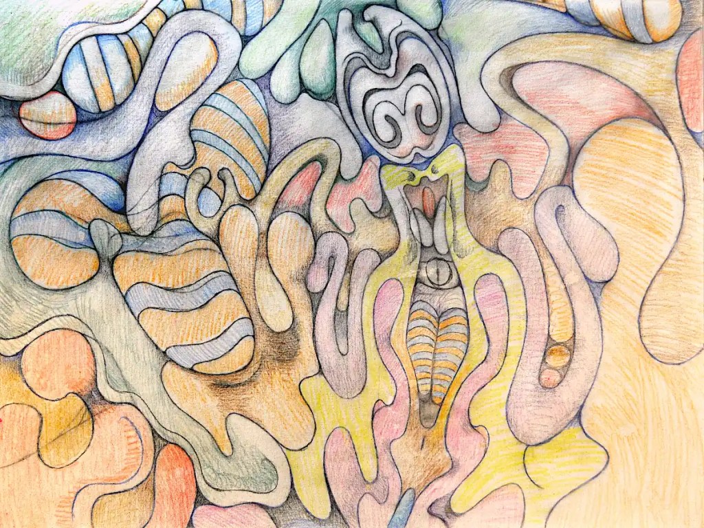
I’d previously run the cartoon filter on this; which looks really cool but imparts a texture that I really didn’t want in the print that I intended to work from. So… I ran gimp’s dilate filter across it… several times. That removed most of it. I ran the cartoon filter again, because it does a nice job of defining the edges of things, then desaturated the image and raised the output levels so that it’s fairly light. I don’t want to waste a huge amount of ink on this and I want to be able to draw on it when I transfer it to the panel and actually be able to see what I’m drawing.
I decided that this needs to be 30×40 inches 🙂 seeing that I just happen to have a couple of 30×40 panels cut. I don’t have a 30×40 printer and the idea of driving downtown to get this printed doesn’t really appeal to me. Optionally, I suppose I could connect the computer to the television and use that as a light table (Hold a piece of paper to your monitor… You’ll see what I mean.). That’s sort of a pain though. Using a projector is just as much of a pain and the “grid method” just isn’t happening. I suppose I could simply re-draw it, seeing that I’ll be making changes to it anyway, but I think I’d probably lose some of what makes it appealing to me. I want a hard copy, so the best option I have is to print this out as tiles, tape them all together, transfer that and so on…
I could use the tiling function in some printing program that does it automatically. That just strikes me as horribly inaccurate though. That leaves me with slicing the thing up and printing pages individually. Many graphic programs offer some sort of “slicing” function. Gimp will let you set guides and slice things that way. So… I scaled this to 30×40 inches at a print resolution of 72. I’m not really looking for high resolution and… ink…
I set the guides, sliced the images and saved them out individually; 16 10×7.5 images. It’s really not as much work as it might seem. The entire process of making the prints took me about twenty minutes. Gimp is nice enough to number them all so you don’t have to play jigsaw puzzle with them when you put them together.
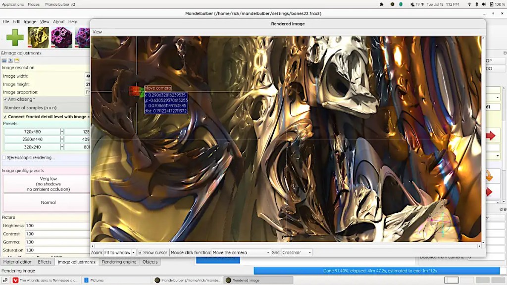
If you’re one of those folk that might be willing or even eager to visit the deepest, darkest depths of graphical insanity… Mandelbulber is for you! On a psychedelic scale from marijuana to L.S.D. (pot being a one and acid being a ten)… this rates somewhere around mescaline.
The program does 3d fractals, and is addictive as hell. It requires a fairly hardcore machine to get any real use out of. A good gaming machine should do you, though… whilst you’re in the throes of your addiction, you might opt to set up network rendering. Mandelbulber will allow you to use a system called “Netrender” to take full advantage of your local LAN or maybe that blade server that you’ve got set up in the basement, but just really haven’t figured out what you’re going to use it for, to create images.
This is not a simple program and it does have an incredibly high learning curve. Thankfully, the developers have done a great job of making the thing as user friendly as possible. Mandelbulber comes with many different fractal types and will let you combine them as hybrid fractals to develop even more. It provides a materials editor similar to those in 3d programs. You can build really complex surfaces with options like specularity, luminosity, transparency, reflection and so on and so on. The program will build fractal animations and will even allow you to animate parameters using an audio file. You can export 3d meshes and voxels to use in 3d programs and printers.
On linux, you can probably install this from your local repository. There is an AppImage available as well. The program’s also available for Windows and OSX. You can download it here. It’s open source; if you feel like contributing to the actual program, you can.
The image here is fairly simple. It’s a fairly short dive into one of the default types. I’ve used a photo of one of my paintings as a texture and fiddled with the specularity, luminosity and so on.
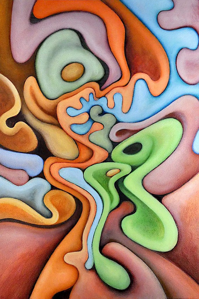
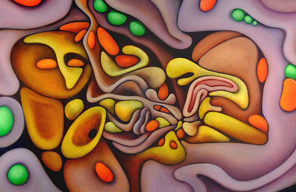
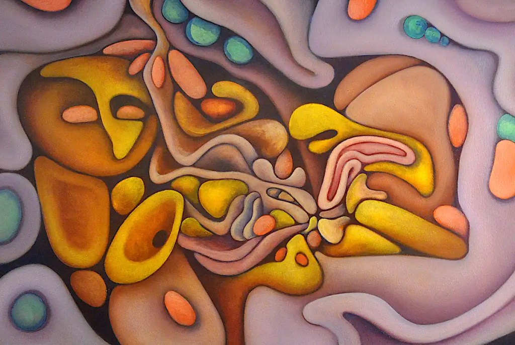
This is another image that’s been digitally altered in gimp. The original was a figurative piece that I sold a while back. The subject; babies with dogs… is something I’ve dealt with for a long time now. The medium is oil on Arches oil paper.
I really have no idea what colors I used in this. White is a pigment I refused to use for many years. At least, unless it was truly necessary. It tends to suck the life out of colors. This is an attempt to come to terms with it.
This is the “finished” piece. There’s actually 2 sessions here… an hour or so with Sennelier’sNaples yellow and titanium white as well as Rembrandt’s cadmium yellow light to add some definition to the forms and a bit of Sennelier’s alizarin crimson and and cobalt blue to clean up the edges. The final session was 10 minutes or so to add a few highlights with Naples yellow, clean up a few edges I’d missed and so on.
This got framed and carted off to the gallery downtown on Saturday afternoon.
This was a fairly long session. I modeled the “seeds” with Rembrandt green (Which I don’t see in their listings. I’ll assume it’s been discontinued. Basically, it’s a proprietary name for phthalocyanine green.) and cadmium yellow light and basically finalized most of the forms with the colors that were left on the palette. 🙂 One of the best things about oils is that your paint can stay usable for days.
I painted in the background and a few of the outlines with Sennelier’scobalt blue and added a few shadows here and there with it. I blended some of Winsor Newton’s cobalt violet into the purple forms to give things a bit more saturation and define them a little more.
Cobalt blue over dark passages gives you a bizarre sort of dusty blue and a glow that can probably best be defined as “mysterious”. 🙂 It also make things look like there is a glare over them.