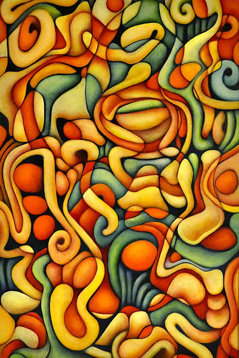
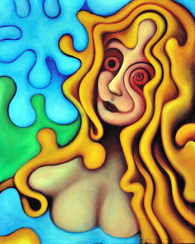
Another painting from my show at S.A.A. This is two older paintings (I’m not quite sure which. 🙂 I tend to do these in very large batches and pick the best half dozen or so.) that I composited together in gimp using the difference layer mode. I flattened and equalized that, converted it to greyscale and printed it on oil paper. Next, I spent an inordinate amount of time painting things in. This is 18×12 inches… oil on paper.
It’s been a busy month. Finalizing a dozen paintings is, um… time consuming.
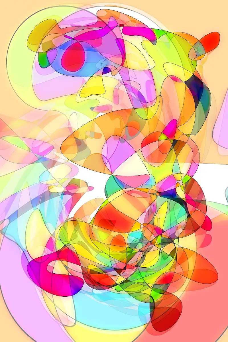
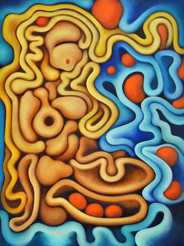
Anyway… this goes to the gallery this weekend. It’s a digital print that’s 12×18 inches. I’m amazed at how much nicer the colors are in prints than they are on the computer screen.
These things take forever. Mainly because I just work on them a little bit at a time. It doesn’t take long before there’s no place to rest my hand and I really don’t like using mahl sticks. I have a dozen of them or so going at the moment so I can just move on to the next one when one gets “full”. I have two more that are probably a session away from being finished. I’ll probably post them in the next day or so.
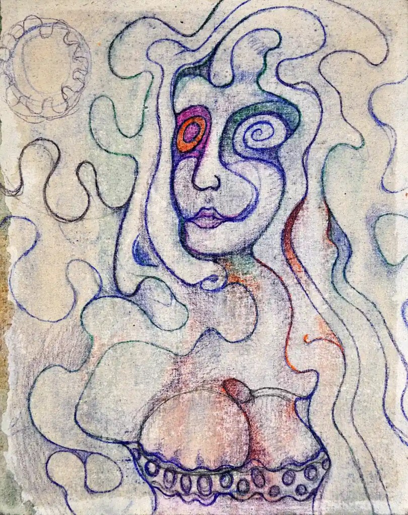
These are basically automatic drawings that I decided to treat as abstracts rather than using them to create figures and so on. The drawing for this one was digitally manipulated and re-printed on Arches oil paper. It’s 12×18 inches.
By the way… I’m now massively impressed with what my Epson printer is capable of. The colors on these are just plain gorgeous. Guess I’m going to have to come up with the cash for their new large format model.
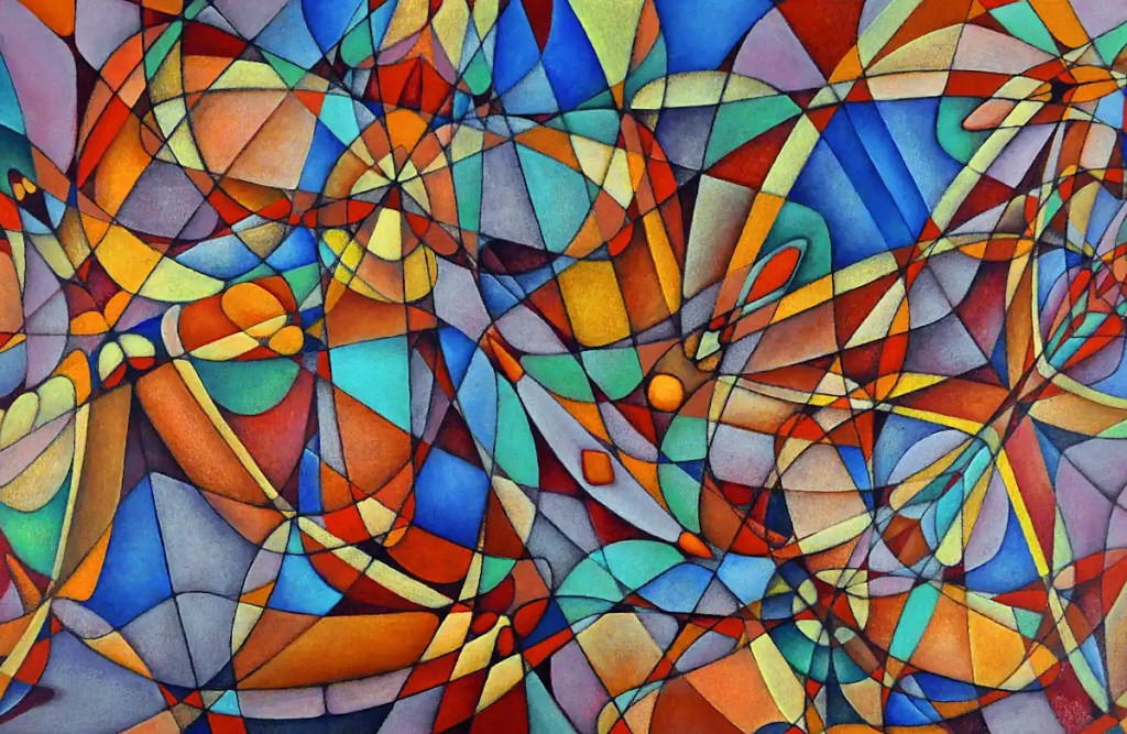
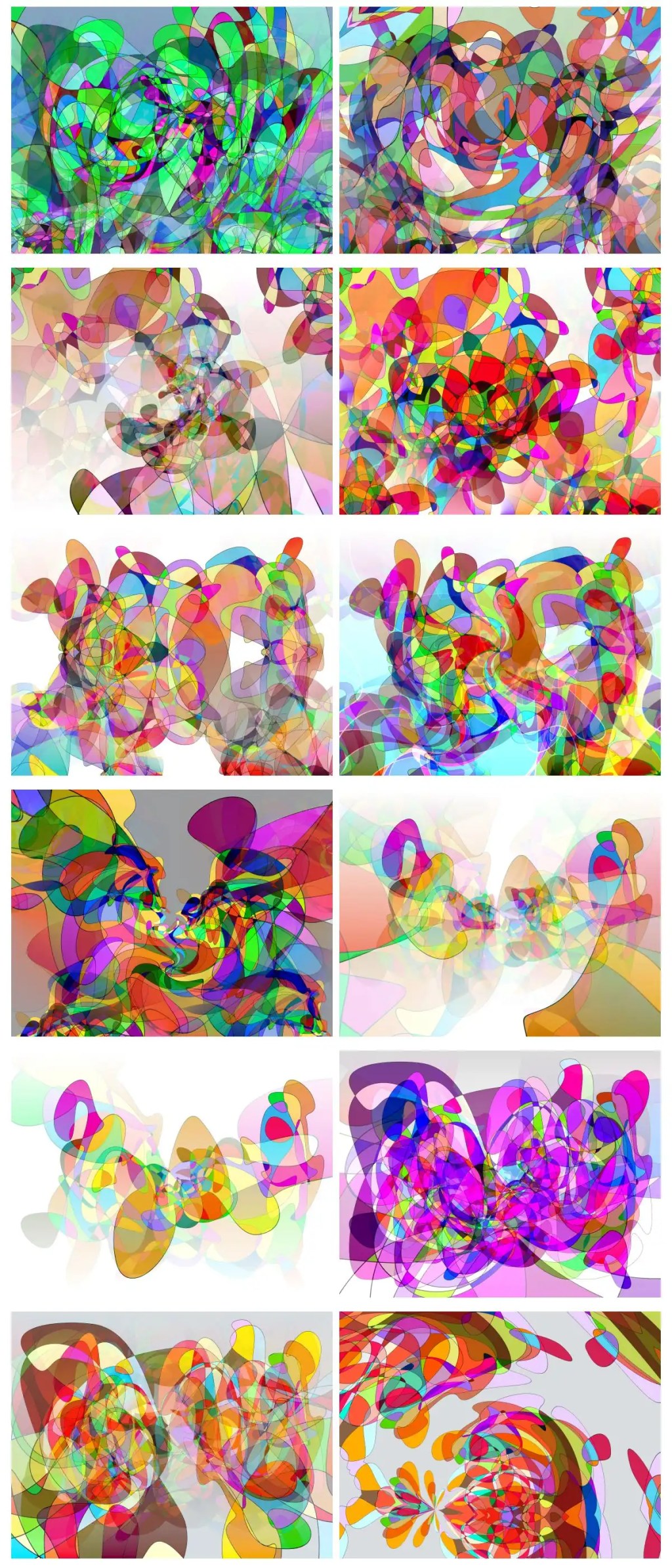
I needed some prints for the Springfield Art Association’s Art Fair that’s coming up this month. I’m a little bored with making prints of the stuff I have, so… I spent a few days doing “scribbles” in Inkscape, editing them, converting them to raster graphics and coloring them with the paint bucket in gimp.
I spent a bit more time manipulating them in gimp and eventually came up with about a hundred or so candidates for the honor of being put onto paper. I picked my twelve favorites of those. I learned a bit about gimp in the process and managed to come up with what I think are some pretty nice images. We’ll see what the folk at the fair think of them.
I’m going to have to see if I can get them printed at 30×40 inches somewhere. I think some of them would make some nice starts for oil paintings and I don’t see them working very well with tiles.
This is the sketch of “A Sunny Day on the South 40” It’s been transferred to a panel and drawn in a bit. It’s unprimed canvas that’s adhered to hardboard with acrylic medium. Basically, it’s going to go straight to paint. This is just to give me an idea of the way things need to work.
I decided that our heroine here… a farm girl caught mid-frolic out in a pasture, wasn’t really likely to be prancing about in the nude. So, in an effort to alleviate a bit of that “drawn on the wall in a service station bathroom” look and make things a little more realistic; I decided she needed a frilly, lace top. I’ve never actually painted a frilly, lace top so we’ll see how that goes. I doubt it will end up being much more than the suggestion of a frilly, lace top.
My graphite paper has given up the ghost after many years of faithful service, so… I transferred this by rubbing pastels on to the back of the print. That always leaves things a little messy. The lines are darkened with watercolor pencil. I’ve shaded things a bit just to get them started… I sprayed it with water to set the drawing, further start the shading process and give me a few random drips. This is wet in the photo.
I’ll give this a coat of clear acrylic a bit later just so it doesn’t soak up huge amounts of paint, sand it and go straight to acrylic for the under-painting. I have some ideas as to how this will go. As usual, we’ll see what happens.
I finished the Green Nude. ….Mostly. It’s still going to need a few minutes to get cleaned up and highlighted. I’ll put the final image up in a day or two.
In the meantime… I’ve got a couple of new things in mind: one that I’ve defined a fairly complex process for and will start when I’ve got a consistent few hours to work on it… And one that’s been sitting around the studio for ten years or so:
I know… it’s a little rough.
I’ve used a wide format printer that’s capable of 13×19 prints for quite some time now… a couple of HP’s… Nowadays, an Epson. At one time, I did a lot of 18×24 paintings, from digital sketches, by cutting them into two 13×19 images and printing those on decent paper: Rives BFK or Canson Edition… Arches watercolor and so on. Those prints got trimmed, then adhered to a hardboard panel with acrylic medium. You’ve still got the seam in the middle to deal with but it’s not terrible. A few coats of acrylic will usually fill it in.
When I did this particular image, I decided I’d get “artsy” with it and cut the paper into shapes and glue those to the panel.
I did not deal with this very well. I just could not handle the edges of the paper showing. If it had been a collage or the paper had been thinner or it was simply a different image, I might have been able to handle it. …Not here.
Originally, I thought that maybe I could just sand the edges down and cover the thing with acrylic and make it all go away. This did not work. I ended up with the edges still standing and a surface that was so smooth that it was impossible to paint on. I figured that the alternatives to this were to add some sort of texturing agent to the acrylic and try to fix things or let it sit in the corner of the studio for 10 years until I figured out something to do with it. I chose the latter course.
Ten years later, it’s possible that I’m a little wiser and more capable of dealing with this whole thing. So… I shot a photo of the painting, made some of the changes that it wanted digitally and printed that to tiles. I’ll transfer that to the panel that I have waiting in the studio, paint over the offending, paper-edged thing that’s been taking up space in my studio for all this time and cover the back of the panel with canvas. No one will be any the wiser and I’ll have 2 panels and a start on a “new” painting.
I like this idea, for some reason. I think that I can push it to something interesting. This is what’s getting transferred to a 16×20 panel:
This is one of several images that are based on the same reference image. It originally started as a 3D render of a model done in Daz 3d with a slightly altered version of one of their stock poses. The other images are done with a bit higher degree of, um… “realism”… fidelity to the source, whatever…
If you’ve not used Daz 3D; It’s an extremely capable system for rendering 3d figures, scenes and so on. Probably one of the best methods of developing a reference images that exists. You can alter just about every aspect of your model; create expressions and poses, change the size of just about every body part, add your own textures and so on. The basic program and a few very nice starter models are free. You can buy things like accessories and a variety of figures; cartoon, realistic etc.
It’s not Blender… You’re not going to be making full-length films in it. It is fairly easy to use and really extensive. It makes for a pretty perfect program for artists that are looking for reference material, that don’t want to shoot things themselves or limit themselves to what’s available in the public domain. You can do some very nice finished artwork in it as well.
Anyway… 🙂 This only vaguely resembles the reference. I had a large print of one my renders tacked to the wall and decide to use it for proportions and so on.
This is basically a figure on the beach with waves washing up around them. It’s something of a study in complimentary colors. It’s 18×24… oil on commercial canvas panel.
I figured that I may as well put in the red forms… I added the orange form on the right… That empty green space was just throwing things off and I want another largish orange form on that side. I’m thinking it will balance the striped objects, pull things forward a bit and set the queen herself back a little in space. I’m a little frustrated with that dark space on the lower right as well but I think that may work in the final image. I need to make it a little more interesting though.
I scrubbed purple madder into the robe/hair form. The color there is actually pretty accurate (The greens in this image… not so much.) I scrubbed the left side back nearly to black. The texture there is the texture of the canvas. That entire form will have a narrow highlight across it and the color will change a bit. It’s actually somewhat close to what I was looking for. I blocked in the wing/arm forms with purple madder and titanium white as well. I’ve decided that purple madder is the true color of evil. Black doesn’t hold a candle to it. 🙂 (Caput mortuum, on the other hand…)
The next real decision, for me, is what to do with those forms inside the robe. I can go with a bright blue that will add contrast and blend with the colors in that space or go with something jarring like an orange or yellow. Blue wouldn’t be my typical decision… I should probably go with that. I’m going to do the bones in the wings a bright yellow. It might make for an interesting interplay between the two colors.
Most of these colors will get more intense. 🙂 I’ll eventually clean up her lipstick.
I decided that I needed a few more striped objects to balance things out, repainted all of the greens with a combination of phthalocyanine green and lemon yellow, glazed over the black form with phthalocyanine blue and scrubbed phthalocyanine blue into the shadows here and there; again, for balance. I started on the yellowish form and tried to balance that as well.
The colors are actually a lot more intense in the painting. Seeing that I’m still shooting in near dark to counter the glare… the photo doesn’t show them all that well and turning up the saturation just makes things noisy.