That blue strip across the lower half of this was pretty much the concept I started with. I wanted to introduce negative space into the image…. a sort of window. The dragon’s at the top, of course.
This actually began life the other way round. What was the top is now the bottom. I just liked it better this way and changed the lighting and so on.
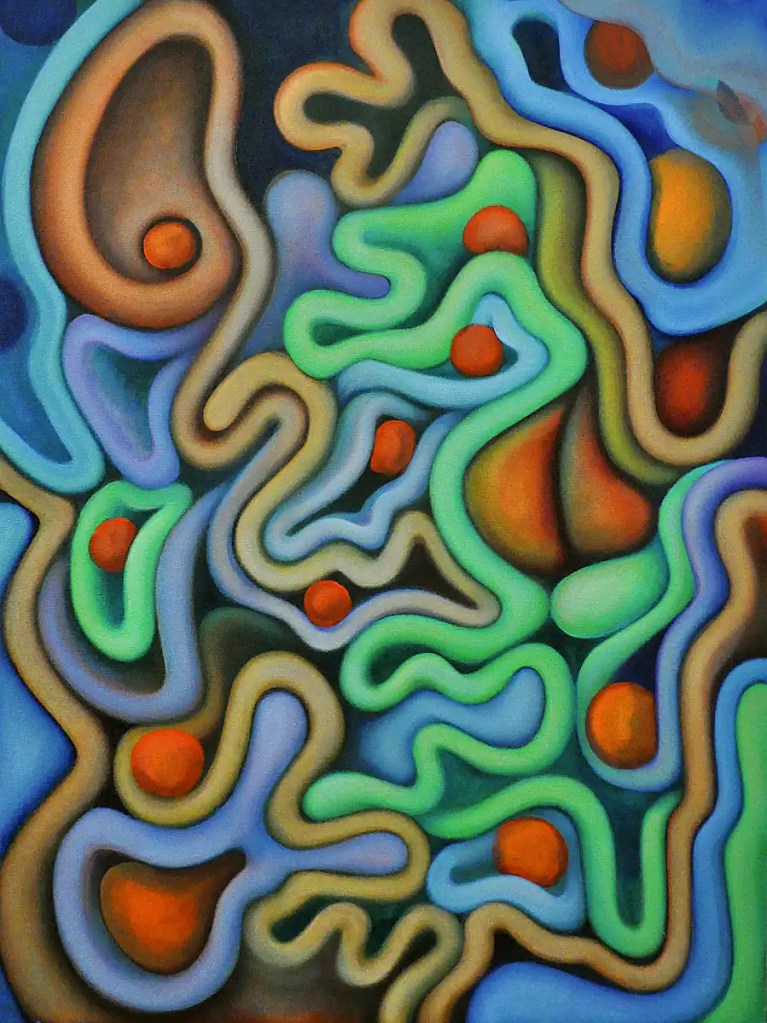
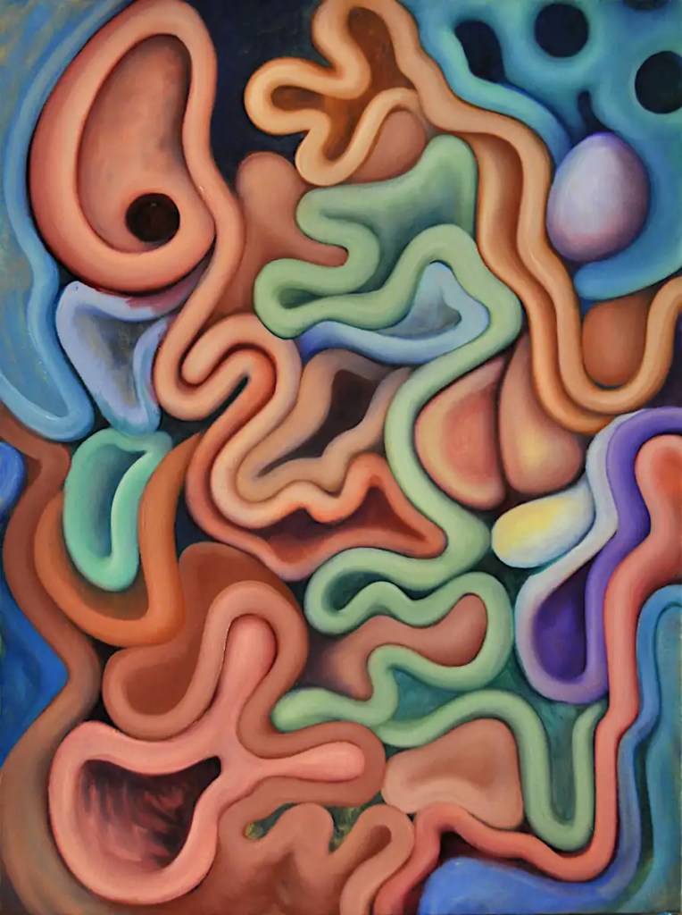
I got a bit obsessed with this yesterday and spent a while calmly modeling forms, making changes to the colors, adding shadows and highlights and generally enjoying myself. All the while, I had the nagging thought in the back of my mind that I just couldn’t allow that orange form in the upper right get away with running out of the composition. So… I imprisoned it in a small blue cage. This, of course, screwed up the way everything else in that corner worked and I spent a bit of time reworking things up there. …Over and over again.
Finally, I had it exactly the way I wanted it… stood back and thought it over, then wiped everything off, smeared in the sketch for the revision with my finger and calmly put the brushes away. Despite my frustration, I did not injure the painting. Now, I think I need to figure out a way to reflect that change in the lower left corner. 🙂 That shouldn’t be a big deal…
Just in case you thought I’d forgotten about this… I haven’t. It has been back-burnered a bit over the past few days while I try to make sense of the files on my backup drive.
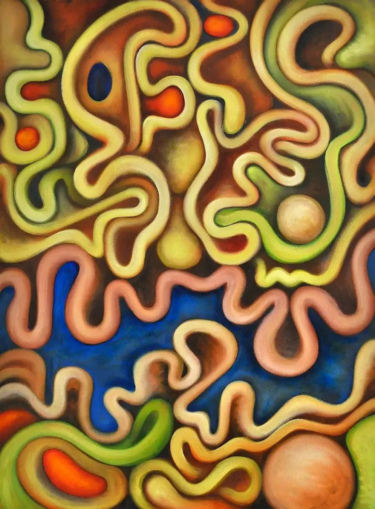
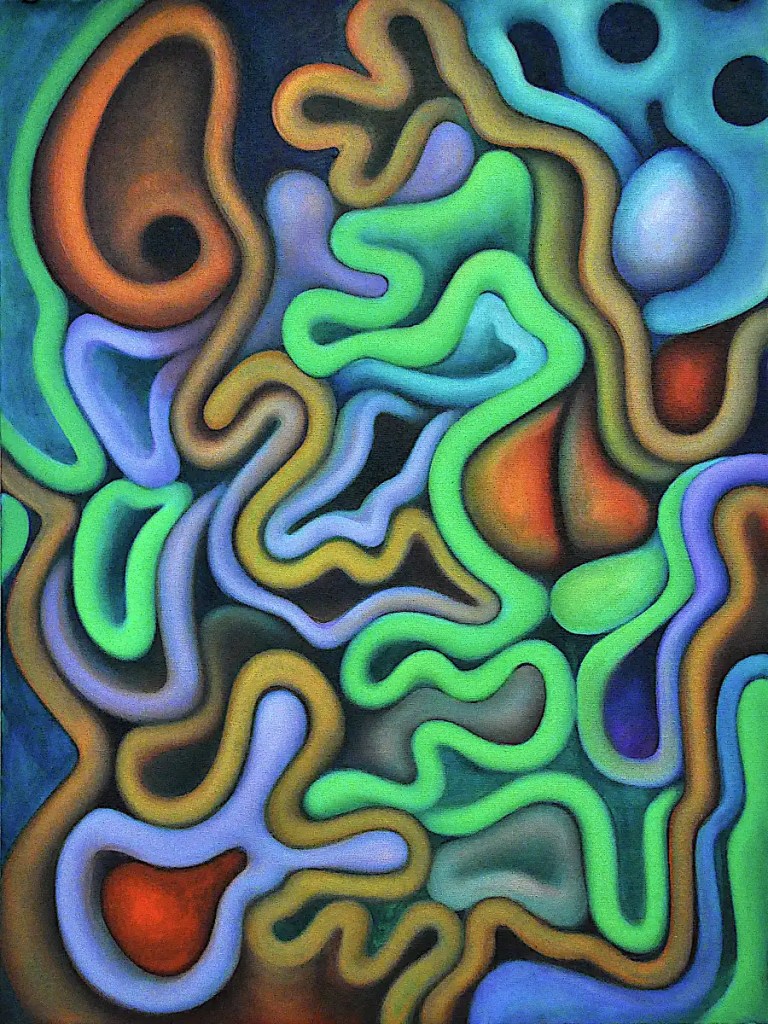
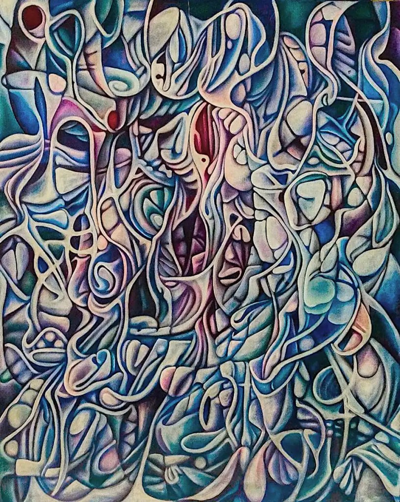
As you can tell, I put the spheres in. I like the sort of “stair-step” effect that gives. …Painted the white form on the upper left orange and spent some time modeling stuff with Naples Yellow Light. …Toned down the “psychedelic” greens…
I liked the orange form before it was orange. Right now, I’m a little irritated with it. I think it throws things out of the composition. I should be able to fix that with lighting though. The color definitely needs some work as well.
I think that a few of the elements in this are starting to work pretty well… the mottled look of the large form on the upper right, the form that fades into the distance below it, etc. I have a pretty good idea of the way things need to go… some blueish forms, shadows, rendering and so on…
This is one of several images that are based on the same reference image. It originally started as a 3D render of a model done in Daz 3d with a slightly altered version of one of their stock poses. The other images are done with a bit higher degree of, um… “realism”… fidelity to the source, whatever…
If you’ve not used Daz 3D; It’s an extremely capable system for rendering 3d figures, scenes and so on. Probably one of the best methods of developing a reference images that exists. You can alter just about every aspect of your model; create expressions and poses, change the size of just about every body part, add your own textures and so on. The basic program and a few very nice starter models are free. You can buy things like accessories and a variety of figures; cartoon, realistic etc.
It’s not Blender… You’re not going to be making full-length films in it. It is fairly easy to use and really extensive. It makes for a pretty perfect program for artists that are looking for reference material, that don’t want to shoot things themselves or limit themselves to what’s available in the public domain. You can do some very nice finished artwork in it as well.
Anyway… 🙂 This only vaguely resembles the reference. I had a large print of one my renders tacked to the wall and decide to use it for proportions and so on.
This is basically a figure on the beach with waves washing up around them. It’s something of a study in complimentary colors. It’s 18×24… oil on commercial canvas panel.
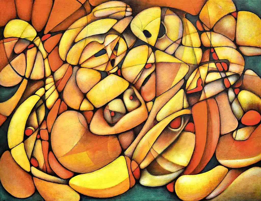
This is just about working out some basic color relationships and developing the forms. I’m going fairly slow with the colors… scrubbing in layers of different colors rather than simply filling in the forms. That way, I get color relationships working in the forms themselves as well as more chances for what Bob Ross calls “happy accidents”. …Something that’s part and parcel of Surrealist technique as well as most abstract painting; exploring or experimenting with just about anything for that matter. …Of course, there’s always those “unhappy accidents” as well. Thankfully, you can “erase” with oils.
I really feel the need to fill this with spheres. To add complexity for one thing… to play with pattern and color as well. And, because they’re fun. I think I’ll do that after breakfast.
I decided that the Queen needed to dry for a day or two. I paint with a lot of glazes. “Dry to the touch” is generally good enough. Occasionally, something needs to get a little more solid.
This has been hanging around waiting for me to finish it for a while now. (I may have mentioned somewhere that I usually work on 20-30 images at a time.) This first image is what it looked like prior to yesterday’s session. I probably could have just cleaned it up and called it finished. I rather like what’s going on in the image.
I decided that it needed to be green and a bit more contrasty before I could truly love it. After the past few days with the Dark Queen, I’m liking the “psychedelic” idea as well. This seems like the sort of image that would support that and I think I can push it a little bit further.
This is destined for the next group show at the Collective Gallery. I should probably pay it some attention.
One of the benefits of having a digital copy is that I can quickly try out changes on the computer and get an idea of what things will look like if I make a specific change. I can always click undo or work on a copy or something. I have some ideas I want to try out. 🙂
Tammy is that woman that believes that money is the root of all happiness. You probably know her. She’s a combination of Norma Desmond and Donna Reed. She was probably happy once.
Like most everything I do, this is primarily about color and form.. technique and experimentation; It started as a sort of vague portrait of Tammy… the figure’s probably obvious, the green form is a mirror and the pearls are just sort of suggested here and there. It was generated from an automatic drawing that I tweaked just a bit.
Tammy’s preparing for a night on the town. This was meant to be a sort of comment on aging, misplaced priorities and so on… Nothing I do is really that specific though. I’d love to be able to express what Kathe Kollwitz could. It’s not really a priority though. 🙂
I found Tammy, and the idea of a woman crying into her mirror as she prepares for one more pointless evening, to be far too depressing to actually paint. On the other hand, I couldn’t get her out of my head for the entire time I did work on this. The brightish colors are probably a sort of reaction to that… my escape.
This is a photograph sent to me by this painting’s current owner. I believe she shot it with her cell phone. It is considerably better quality than the images I shot with 35mm film way back when.
The painting is 60×48 inches… Oil on linen. It’s the result of 3 weeks of long days; back when I still had the energy (and economy (or lack thereof)) to work 20 hours and sleep 4 every day. There was no sketch for this… I went straight to paint with it. It’s painted entirely with a one inch bristle brush, that I bought for fifty cents, at the little hardware store down the street. ( 🙂 It was a phase.)
This may have actually had a title at some point. If it did, it’s long forgotten.
This is 20×41… Oil on canvas. It started out as an automatic drawing that ended up as more of a framework for the figures than anything else. Most of them are consciously developed. The focus here is on the figures themselves, color interactions and using the stripes to define the contours.
I occasionally do fantasy style images that derive from a hypothetical farm. It has a small cast of recurring characters and gives me a sort of base construct to place things in to as well as a place to develop narratives and so on. This draws from that a bit… hence the title. The “Nefarious Doings”? 🙂 They’re in there.
The title kind of says it all; though that particular Friday was a while ago. This is an automatic drawing that I’ve added a few straight lines to for compositional purposes and pulled a few cartoon-like figures out of.
My focus at the time was on tempering my tendency to overwork stuff… showing process in the painting and leaving some evidence of how it came about. I think the “rough edges” are as important to the painting as the “polish”. I’ve always had an issue with leaving them.