I decided I needed to work a bit larger for a while and this thing has been hanging around for way too long, so… I spent some time on it a couple of days ago. This is what things look like after the first session. I shaded things in with Sennelier’s (green) sepia, then went back and scrubbed in the highlights with titanium white and topped it all of with a sap green glaze here and there. It’s acrylic on very wet raw canvas. I spent as much time with a spray bottle as I did a brush. Keeping things wet blurs the paint into the canvas and makes for some really dense colors. It’s a little easier to see where this is going than in the sketch.
This spent the day yesterday getting sealed with a couple of coats of clear acrylic medium and drying while I worked on other stuff. Today, I’ll start figuring out the color a little better. 🙂 I can see a few changes that need to be made as well.
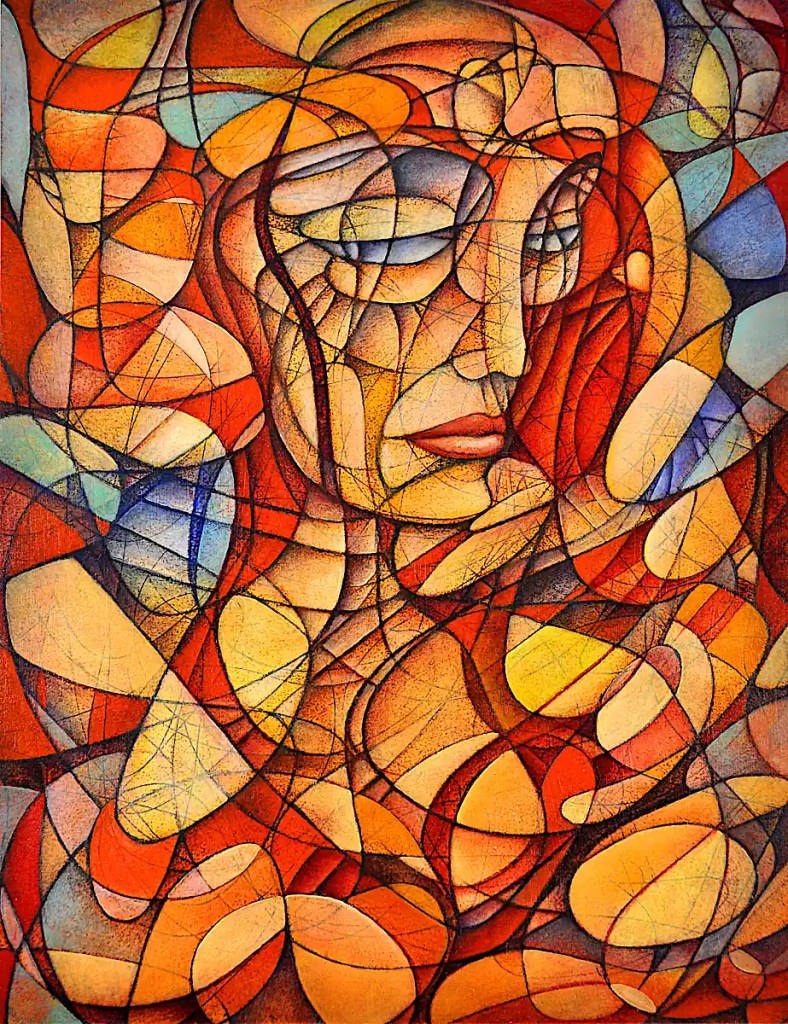
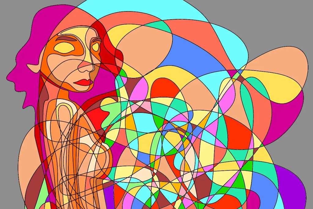
This is the final version of Monika’s New Red Dress. I figured it was probably time to put up a piece I’ve stopped working on.
One of the most difficult things about this sort of painting is knowing when to stop. That’s probably true of any painting though. I think I got this one to just about the right place. I do tend to overwork stuff. I think that’s part and parcel of the sort of imagery I work with. In the past, I’ve been able to do “simple”. That really just doesn’t work for me these days. I’m sure that will change.
To quote Arshile Gorky: “When something is finished, that means it’s dead, doesn’t it? I believe in everlastingness. I never finish a painting – I just stop working on it for a while.”
I know it took Gorky quite some time to “finish” “The Artist and His Mother“…Da Vinci carted the “Mona Lisa” around with him for a good bit of his life. I have some paintings and sketches I’ve worked at since the mid-eighties… nineties… this century, etc… I suppose that technically a painting’s “finished” when the artist defines it that way. I like the idea that things can be revisited and reworked, Um.. “everlastingly”. Modern technology does a lot to enable that. I have quite a few digitally saved sketches that show quite a bit of promise; even some stuff shot on film. Whenever I’ve made the attempt to push the ideas further… I either failed technically or just didn’t quite understand how to push past a certain point. I have several paintings that I basically stare at once in a while. I just don’t get how to resolve certain issues. That will come.
This is based on a photograph that I took of Monika; a strikingly pretty woman that I met somewhere in the Chicagogoth scene in the late ’90s. She’s the kind of person who turns heads just about everywhere.
I made a stylized sketch from the photo, photographed that and optimized it in gimp… some warping, the cartoon filter and so on. I printed this back out and, just naturally, had to scribble on it. There’s some watercolor and acrylic washes here as well. They give a sort of vague idea of where to take the drawing and introduce a few more random elements to things. The drawing itself is worked in with watercolor pencils and water-soluble graphite.
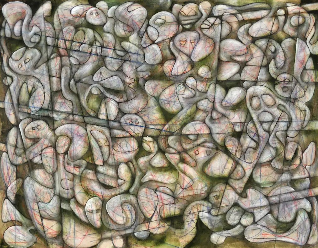
This is today’s intended victim. It’s oil on Arches oil paper. It began life as an automatic drawing. Since its birth, it’s gone through several digital changes, been re-printed in grayscale and “colorized” with oil paint.
Given that I do work with several images every day… it’s a little difficult to know exactly how far I’ll get on a given piece. These are fairly complex and do become a little difficult to work with after a bit. The idea here (one of them anyway.) is to show the process on these things. Posting an “after” without a “before” wouldn’t exactly do that. This is the before. The after will come after.
I have added categories to this page so that the progress of individual pieces is a little easier to follow. Please bear with me. This page is still, very much, a work in progress.
I know the whole “automatism/scribble” idea may sound a little ridiculous. It’s something I’m entirely serious about. I don’t do everything that way. I still do portraits and figure drawings and so on. I do have a lot more interest in it than I do most anything else. I’m not quite sure that I buy the idea of channeling your unconscious mind and so on that the Surrealists were so fond of. I do like the idea that it helped create a real break with traditional representative art and helped lead us to Abstract Expressionism and so on. I think there’s still something vital and important to be found there.
I started this sort of thing during what was probably the last artist’s block I’ve ever experienced. Late ’80s, I was suffering from fairly severe depression due to a few failed relationships and the culmination of a fairly long battle with “substances“. To this point, I’d simply drawn the stuff that I saw in my head. It occurred to me one night that I might actually be able to express something of what I was feeling through automatic writing or drawing. I decided I’d write a suicide note. Not that I actually intended to commit suicide; though it was a fairly frequent consideration back then. I just figured that it was a fairly intense idea to put down on paper. I started writing on a fairly large sheet of paper and by the time I’d finished… I was shaking. The whole thing was nicely cathartic but did leave me with a large sheet of paper covered with unreadable scrawl. I decided I’d try to turn this mess into something that meant something… started drawing into it, picking out shapes, adding elements and so on. The painting actually worked. It sold a long time ago… way back before the age of digital photography. Otherwise, I’d have an image of it here.
Amusingly enough, I included the painting in a show at one of the Illinois government offices. It was around Christmas. I got a call one afternoon to come down and move it seeing that the workers there didn’t feel that a painting titled “Suicide Note” was all that appropriate in the same room as the Christmas tree.
Since then, I’ve incorporated some form of automatism in most everything I do. At the very least, it can offer a way to develop a composition. I frequently develop forms from the spaces and shapes it creates. As of late, I’ve dealt more with abstraction and the sort of emotional/expressive qualities of the whole thing. I do keep some sort of intent in mind while I’m doing this. It’s not entirely automatic. Occasionally, I’ll put in a portrait or figure or try to build a landscape from things.
Working this way does offer a sort of catharsis. Working large can actually be physically exhausting. I have stretched rolls of canvas across the wall and simply attacked them with a handful of pastels or charcoal. It’s actually a pretty good workout both emotionally and physically.
(Oh… I no longer mess with “substances”, I’m happily married and suicide’s about the furthest thing from my mind these days.)
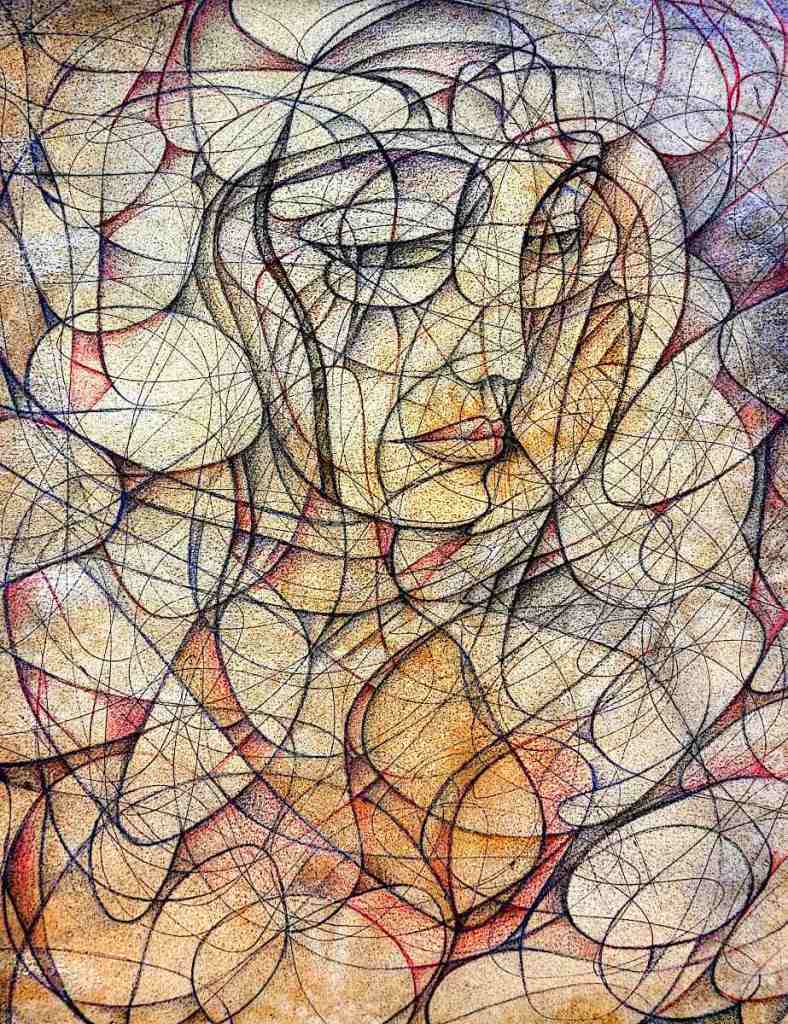
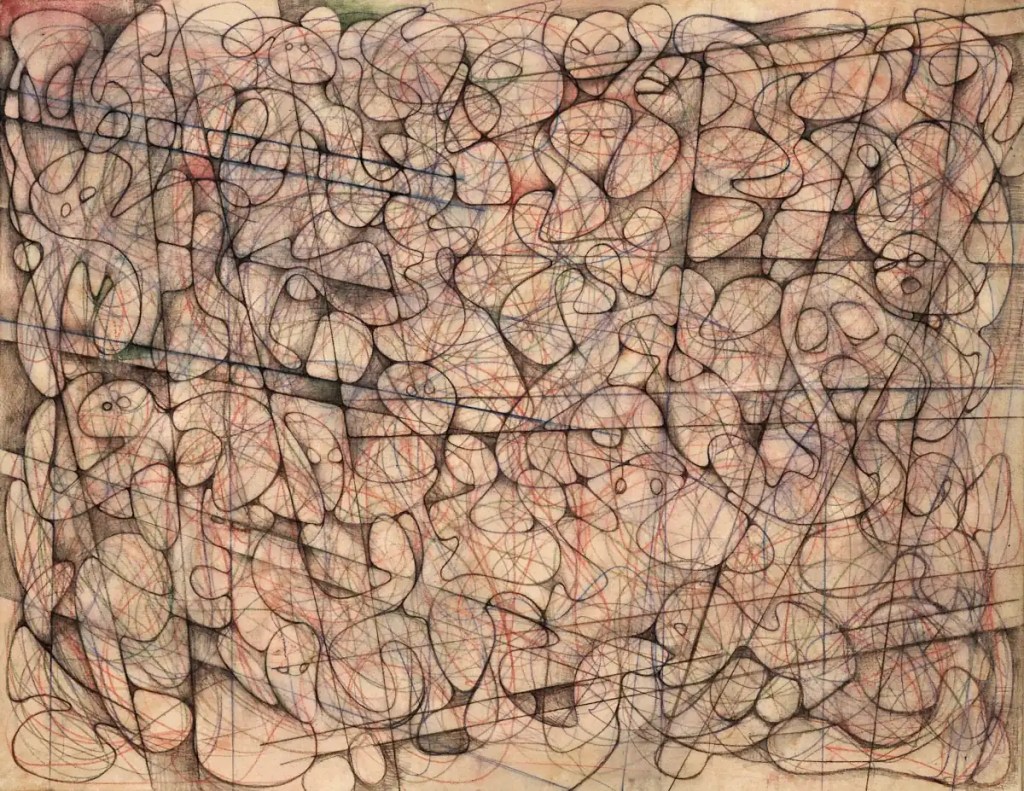
I’ve been working on this sketch for quite some time now. I finished it yesterday. At least it’s finished enough to serve it’s purpose as a sketch. It gives me enough information to move on to color. I’m still going to need to come to some sort of understanding with a few of the linear elements.
This is fairly large… 36×48 inches. It’s canvas adhered to a hardboard panel with acrylic medium. The canvas isn’t primed. I prefer drawing on raw canvas… It’s an amazing surface for pastels, charcoal, graphite and so on. This is done with watercolor pencils and water-soluble graphite. I’ve misted it with a spray bottle so that the pigment soaks into the canvas… a bit like a dye.
Next step is to seal the whole thing with gloss acrylic medium. I’ll probably block in a few forms with acrylic paint then move on to oils.
This began life as an automatic drawing. The forms and so forth come about through interpretation of it. Dali did something similar with his Paranoiac-critical method, Ernst built his grattage and frottage stuff by interpreting rubbings and blobs of paint. You’ve probably done it when you looked for faces, elephants, demons, wizards and so on in clouds or wood grain.
This actually had some intent behind it. I wanted to represent chaos in a sort of street scene. The straight lines allow me to work in some sort of architectural elements. 🙂 Whether that will come across in the final painting or not remains to be seen.
I did digital art exclusively for many years. Quite a few years back (2010 or so), I got fed up with it, tossed the computers and went back to doing art with traditional media. A couple of years ago, I decided that the decision to erase computers from my life entirely might have been overly hasty and started to integrate them back into my artistic workflow.
Inkscape is a vector editing program. It’s open source, very capable and “free“.
I sort of wonder if the idea of automatism and that of digital drawing are all that compatible. I suppose that’s an artistic, philosophical quandary that I’ll deal with at some point but, for the time being, the program does offer a way of creating “scribbles” that are infinitely editable and that print cleanly and precisely. It’s an experiment that I’m having some good results with.
Doing things digitally gives me results that are strangely modernist. I get the feeling that some of the work would fit into the mid 1950s very well. It doesn’t provide the same sort of release that working with traditional media does. It’s cerebral with nothing really physical involved. There is no “random” to speak of. I’m sort of tempering that by using the drawings as sketches and adding “random”, paint effects and so on with actual paint.
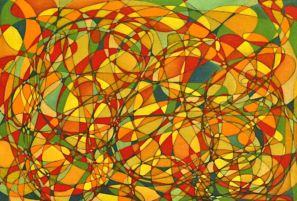
This is pretty typical of the work I’ve been doing lately. (My son calls them “chaotic”.) I have twenty five or thirty of them going. They tend to get to be unworkable when I’ve painted in a lot of shapes and force me to spend half my time cleaning paint off of my hand and wiping smeared paint off of things. If I work on a bunch of them at once, it saves me remixing paint, leaving excess on the palette to dry up and go to waste, and… it keeps me from getting bored.
This is basically an automatic drawing done in watercolor pencil, sealed with clear acrylic and blocked in with oils. …A detail of it anyway. It’s stretched on a stretcher that’s a bit larger than the final image will be. The actual painting is a couple of inches larger. It’s a little (lot) more work but it allows me to stretch it on an appropriately sized stretcher and wrap the image around the edges. It saves framing and looks a lot better than the raw edges.
I glazed this with Indian yellow this morning. It may look overly “yellow” at the moment but the glaze evens out the paint film and gives things some consistency. When I go back into it and add the final colors, blend stuff, shade it and so on, it will take the paint a little easier. Of course the yellows are pretty much finished. 🙂
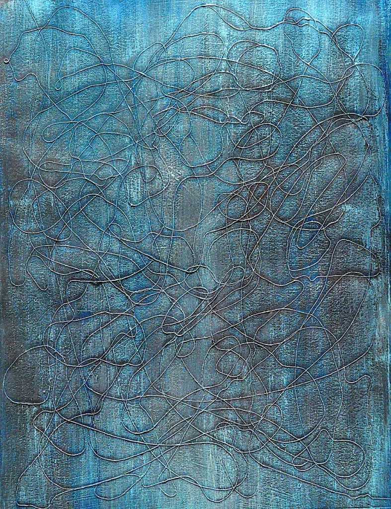
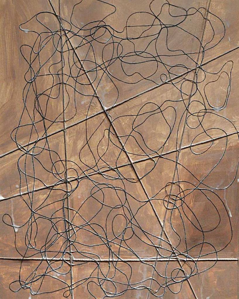
This is another of the string experiments I started recently. I’ve washed over the thing with Phthalocyanine blue and some Venetian red then scumbled over that with titanium white. This is acrylic paint. It dries faster than oils and works fairly well as an adhesive. It makes for a tough paint film that pulls the whole thing together. I’m not really fond of the look of acrylic though. I don’t really like painting with it either. I’ll probably block in a little of this with it then switch to oils.
Basically, I’m just trying to get some color started. Some of what’s there will serve as a background. The white is to accent the texture of the paper and make the thread stand out a bit more… I’m trying to push the idea of “line” rather than “thread” as well.
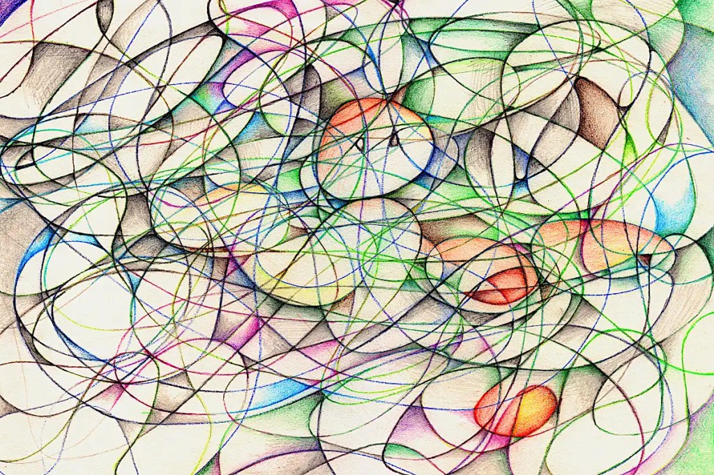
This is a current experiment that attempts to combine the aesthetic of some of the string/rope/wood/etc collages I’ve done in the past with that of the automatic (scribble) drawings I use to generate nearly everything I do.
The heavier, straight lines on this are made from heavy cord. The squiggly lines are made from thread. The drips are acrylic medium that will eventually run off of the paper or dry transparent. This is the second coat. If you look closely, you can see that some of the thread is still “floating” a bit. It will probably require at least one more coat.
Drawing with thread is “different”. It’s definitely a technique that requires some practice. Hopefully, I’ll improve if this turns out to be something worth pursuing. I do have a few of these going. Practice makes “perfect”, no?
Anyway… I’ll see how this goes and post the occasional update. It is one of quite a few experiments I have going. I’m sure they’ll all appear here as well.