🙂 A glare-free shot of this just isn’t happening. This is a little more “contrasty” than it is in real life.
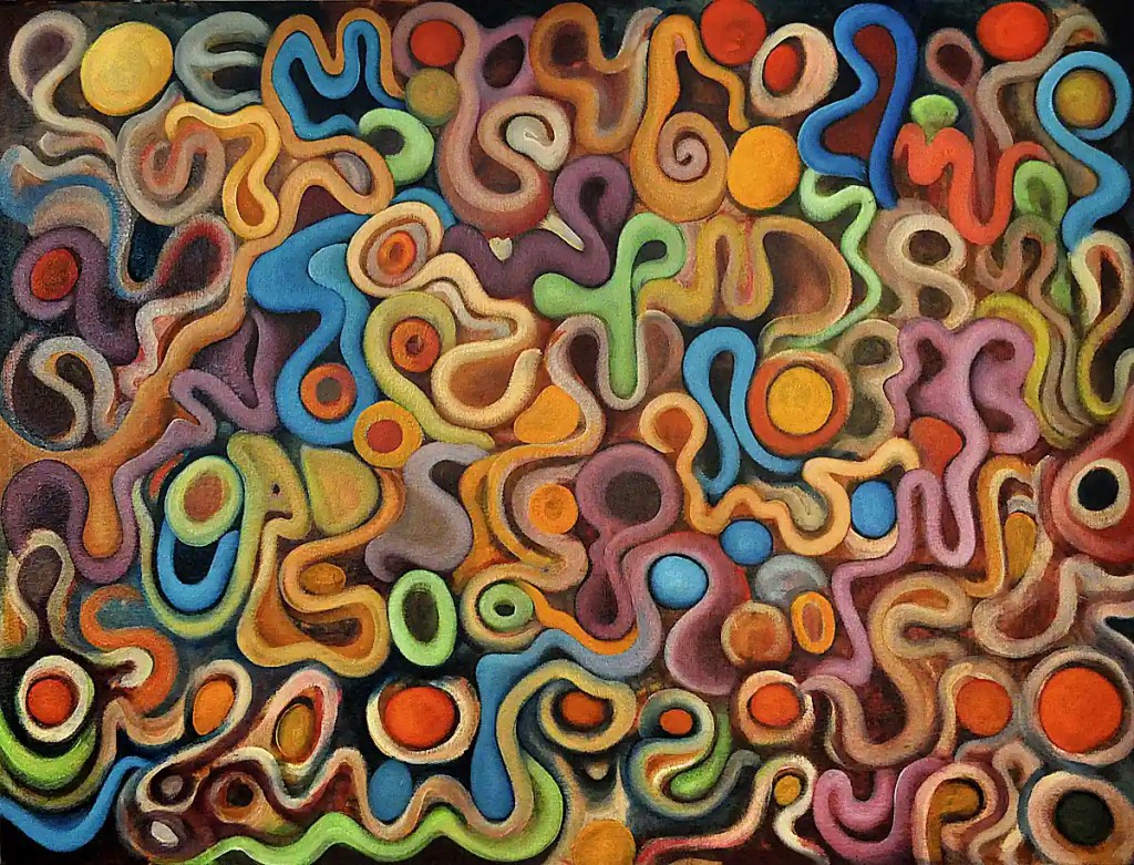
I got some colors and forms blocked in. Despite what you see here… some of the underpainting’s still there. It’s covered with glazes in spots… still shows the same texture. Most of this is still pretty rough. It needs much modeling and many shadows. Some of the colors are a bit brighter than I’d like so there will be many glazes as well.
Overall, I’m happy with the layout and the sort of “alphabet soup” look of the whole thing. I still have some forms to figure out. Some of them are a little too “simple”. 🙂 I need to add some complexity to the thing. I want to play with the colors as well. It really needs some depth but that will come.
Colors involved: Sennelier’s Cadmium Yellow Light, Burnt Sienna, Sap Green, Naples Yellow Deep, and Titanium White as well as Rembrandt’s Cadmium Red Light and Winsor Newton’s Prussian Blue, Cadmium Yellow Deep and Purple Madder.

Leave a comment