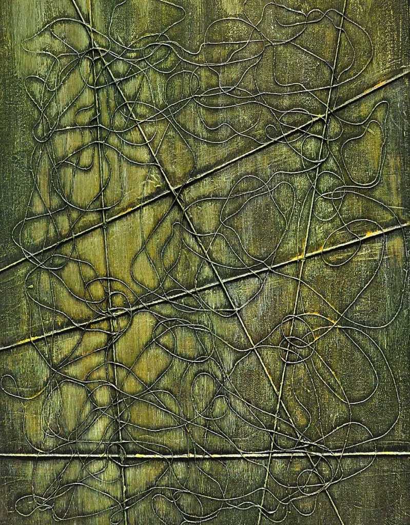
Drippy spent yesterday with its third coat of medium drying. Today, it got a wash of sepia followed by another wash of Paynes grey then another of terra verte. Once it had dried, I scumbled across it with Indian yellow and followed that with some titanium white. Indian yellow is fairly transparent. It does work very well as a dye though. The purpose of it was basically to tint the white. Once that was all dry, I brushed a very dilute glaze of sepia across it, stuck it on an easel and let the paint run down the painting.
I use mostly Senellier colors. Their sepia has a greenish tone despite what the Wikipedia link above says about the color. I do use Utrecht’s titanium white. It’s very heavily pigmented, dense and covers very well. It’s great for mixing as well.
This is on Canson acrylic/oil paper by the way. It’s much different from the Arches product. This has a “linen” texture and is considerably less absorbent. They both have their uses. I do prefer the Arches stuff for drawing. I’m really just trying both to see which I prefer for the “thread” stuff.
I’m going for a sort of “evil garden” feel with this painting. That is where I spent a good portion of the day yesterday. Between the beetles eating my viburnums, the dogs trampling my ostrich ferns and the Central Illinois mid-afternoon sun… that sort of describes the way I feel about them at the moment. Seriously though, it’s a theme I’ve spent a lot of time with over the years. I love working with organic forms. The idea that some of them may have some sort of malevolent intent doesn’t seem like all that much of a stretch.

Leave a comment